
The Details
Role
Lead UX Designer
Team
Design, PM, EM, 5 Engineers
Timeline
July 2024
Tools
Figma
Where We Started
Overview
When creating a store in the Pop-up platform, the ability to add products to your store is a key step in the process. However, the product inventory tab had a lot of room for growth. We aimed to improve the UI, as well as advance the capabilities of product tracking.
Pain Points
Flow for selecting a supplier and setting thresholds was not intuitive.
Product inventory tracking was only store-specific.
Clunky Inventory Table created wasted white space.
Product cards did not effectively display information.
Annotations
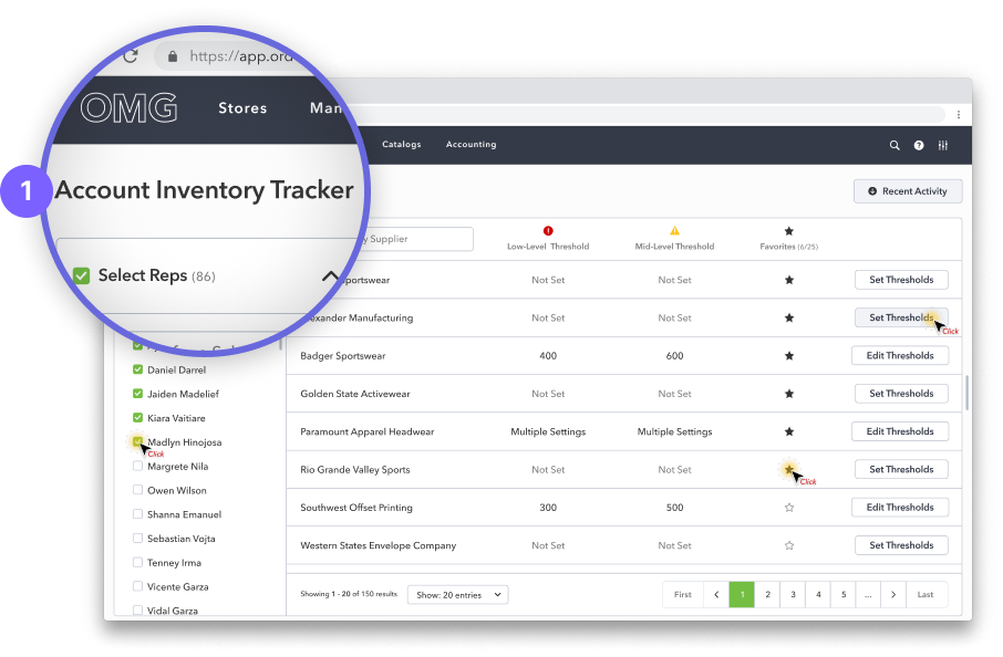
(1) Select Supplier & Set Threshold
Selecting a supplier and setting a threshold took majority of the space; removing from the focal point - the inventory table.
(2) Product Card
Does not expand full width of the section, clustered cards were difficult to read, contained insufficient information.
(3) Inventory table
Does not display critical information at first glance.
The Process
Overview
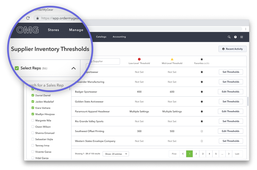
The Supplier Inventory Thresholds (SIT) tracker was created to allow users to set thresholds at the account level, however, Product Thresholds (shown to the right) were not taken in to a account during it’s development. As such, the new SIT tracker was not improving the user experience as intended, and was instead causing confusion.
Pain Points
Naming was not clearly communicating function.
Allowing the user to switch between Supplier Inventory Thresholds and Product Inventory Thresholds was not clearly understood (the modal in the inventory tab exasperated this problem).
Setting thresholds continued to take up a lot of space on the inventory tab.
Annotations
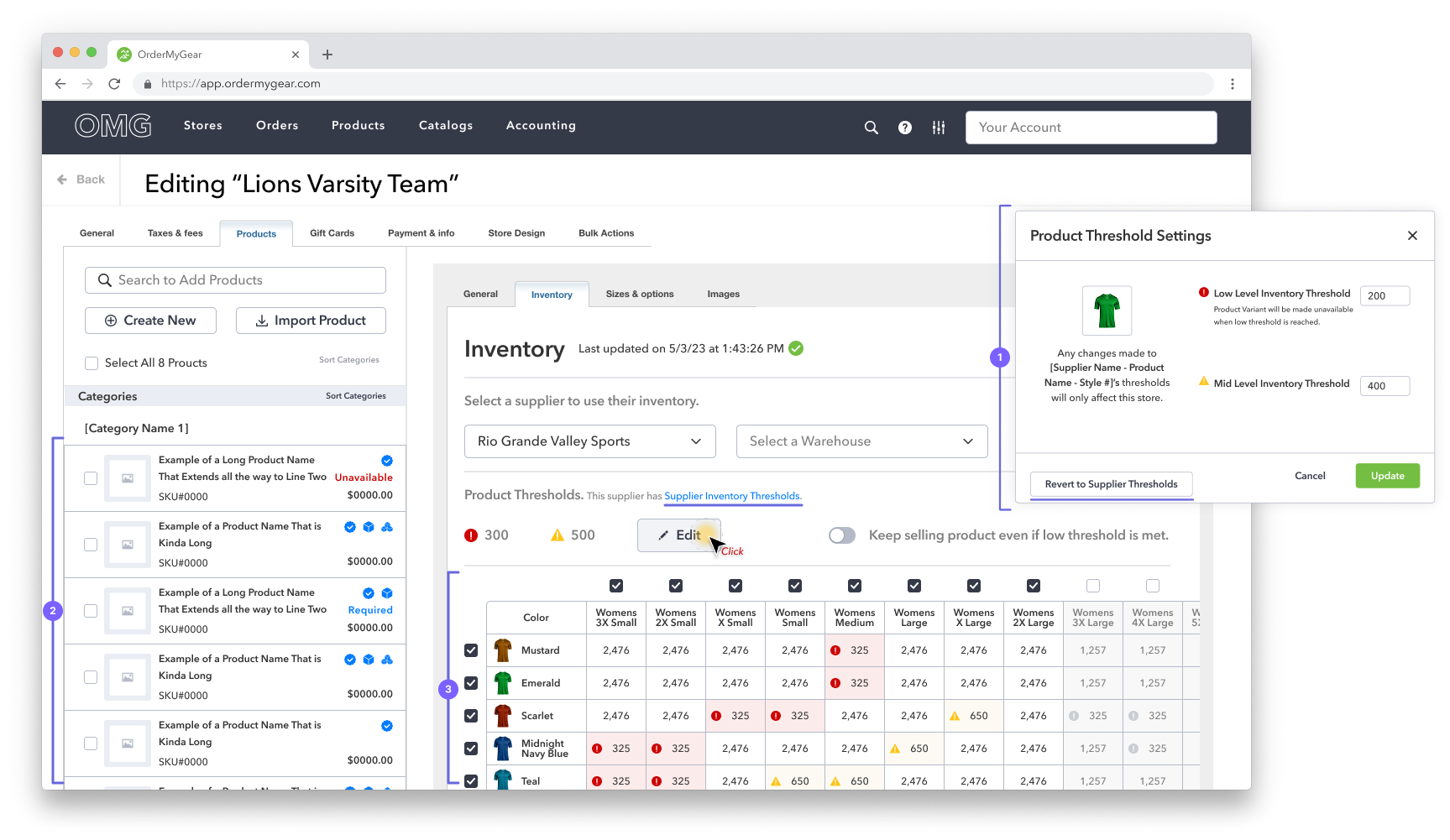
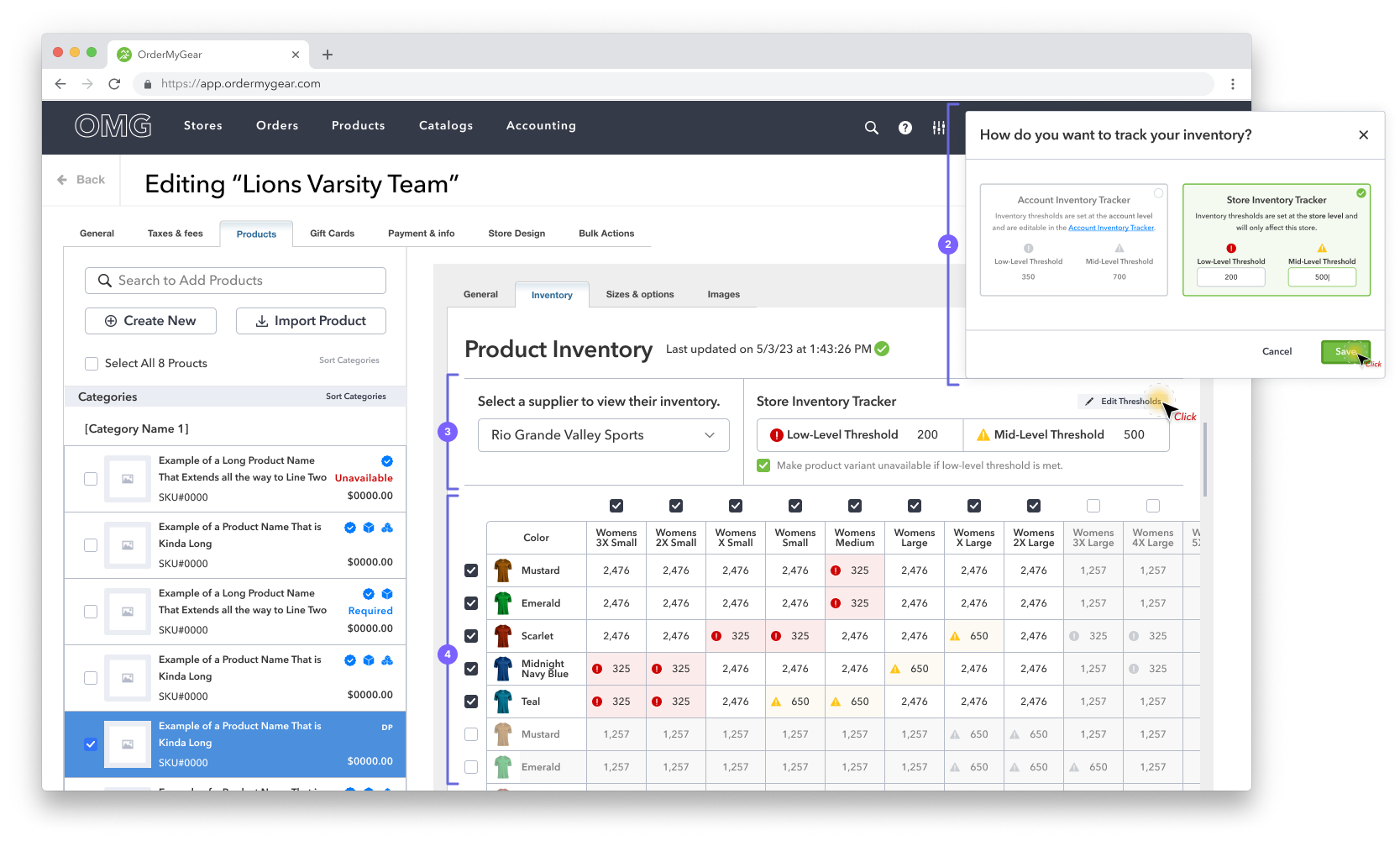
(1) Modal
When guiding the user to switch between Supplier and Product level thresholds, we relied too heavily on additional links and buttons, making the flow overly complicated.
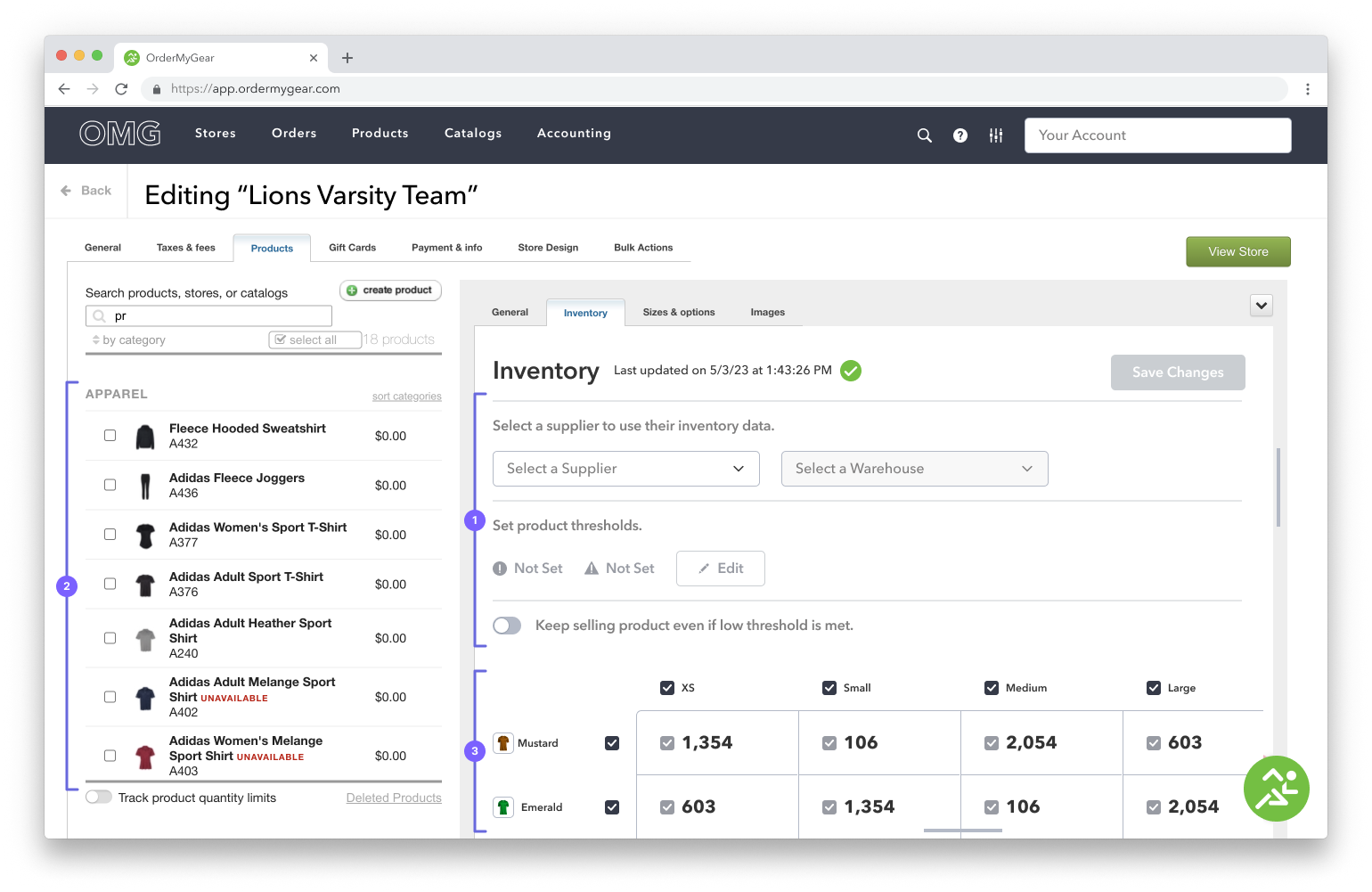
(2) Product Card Enhancements
Cards width expanded to utilize entire section and badges were added to indicate product features
(3) Inventory Table Enhancements
Took full advantage of space, minimized header column and row, improved threshold iconography, reduced individual cell sizes, improved readability.
The Solution
Overview
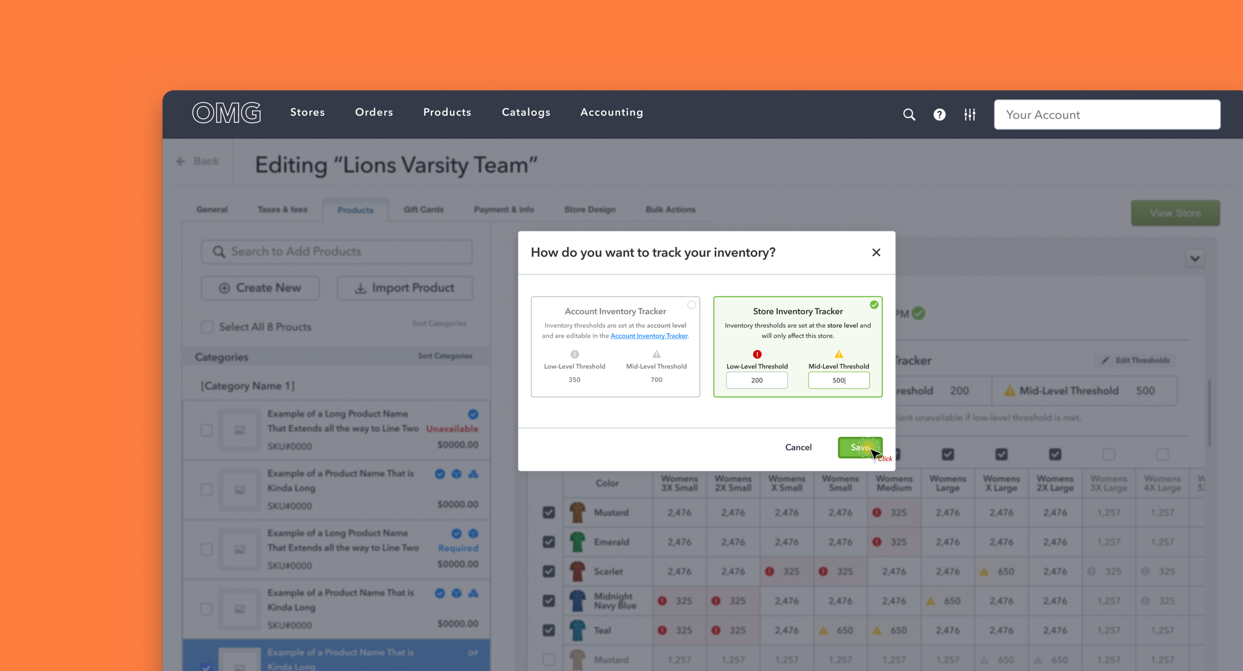
We reassessed Supplier Inventory Thresholds (SIT) and Product Inventory thresholds, now with the understanding that SIT is intended to streamline inventory tracking by being the default setting at the store-building level if it has been configured.
Solutions
Updated name to align with function:
Supplier Inventory Thresholds is now Account Inventory Tracker
Product Inventory Thresholds is now Store Inventory Tracker
Reduced the amount of space used for supplier selection and setting thresholds.
Modal was designed more intuitively, clearly distinguishing the two tracking types.
Annotations
(1) Rename
We chose the term “tracker“ as it speaks more to the function of the feature and less to the numerical setting added by the user
(2) Updated Modal
Modal was redesigned to clearly communicate to the user that they had two options for inventory tracking; Store Inventory Tracking or Account Inventory Tracking.
(3) Inventory Tracker
The inventory tracking section was reduced, allowing valuable space to be reallocated to the inventory table. The text was also updated to make the section as straight forward as possible.
(4) Inventory Table
The Table was moved above the fold, allowing users a more comprehensive view of available inventory.