
The Details
Role
Lead UX Designer, Researcher
Team
5 Designers
Timeline
January - March 2023
Tools
Figma, FigJam, Zoom
Overview
Domastic is a platform that aids home buyers and renters in finding properties and scheduling house tours. The site provides an itinerary tool for organized planning and an agent locator to connect with agents in your area.
The Problem
The client is seeking a complete site redesign to improve the user interface, branding, and over all usability.
The Solution
After conducting a competitive analysis and identifying the clients primary pain points, the team delivered an updated platform design with key features mind:
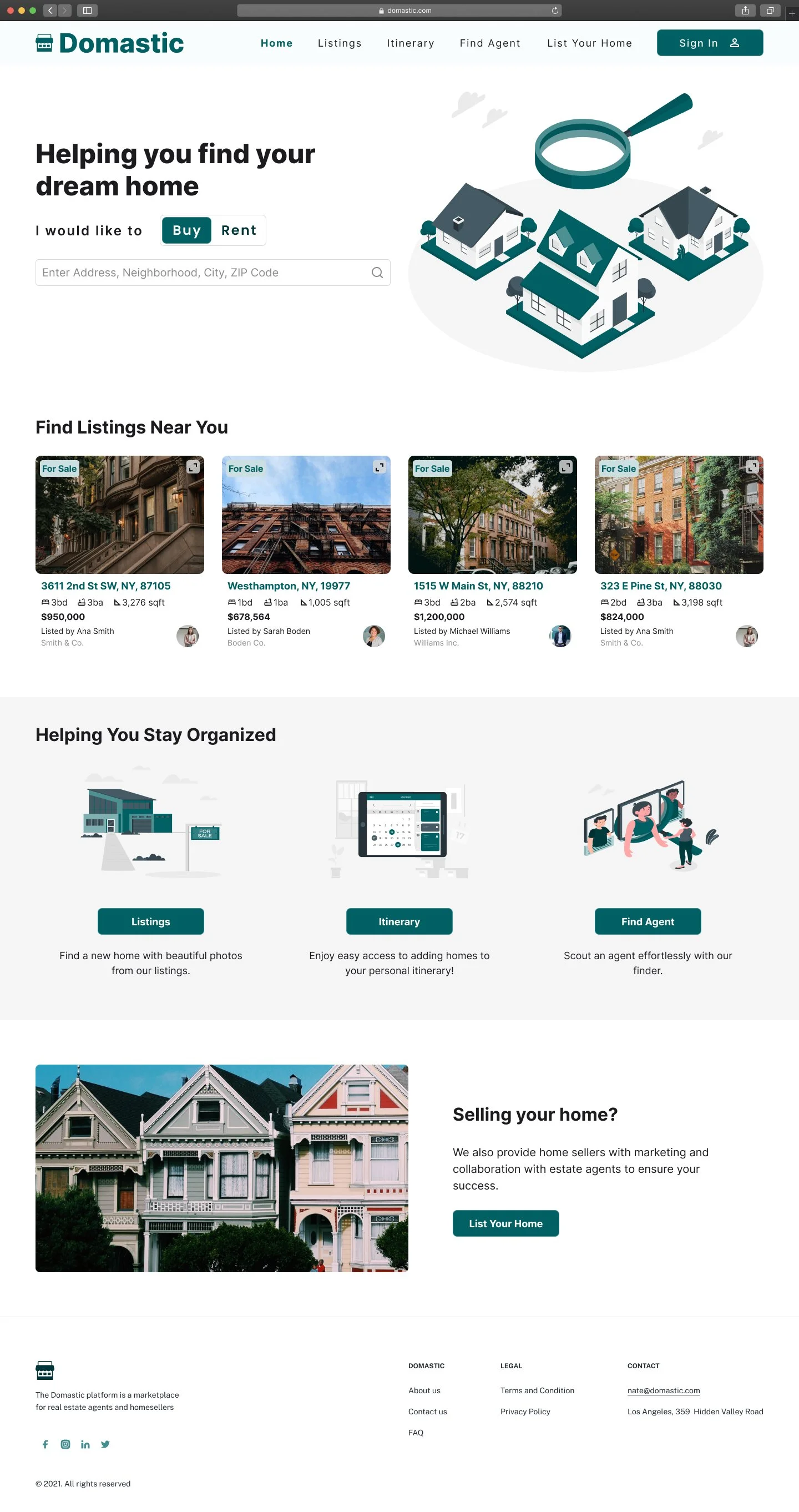
Create a homepage that educates first time users of the features offered on the site.
Redesign the layout of each of the pages to be intuitive and accessible.
Create a style guide that outlines the standard for brand color, typography, spacing, iconography and imagery.


Discovery & Research
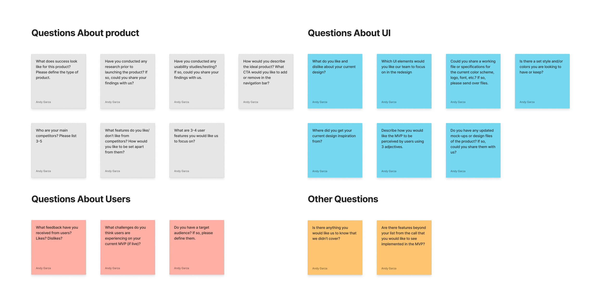
Kick-Off Meeting
The team and I received a client brief to better understand the goals for the platform. From the brief, we learned that the client's target audience are home buyers and renters. These were important factors to consider, as the client defined success as an engaging platform that retained users. The team was tasked with creating platform that was intuitive and innovative.
Client Questions
Following the client brief, my team and I still had a few questions. We received clarity on a few main points:
The client was open to considering a new style guide
The client had worked with realtors to determine the site's primary features
The client wanted to create a site that was not only well organized, but aesthetically pleasing
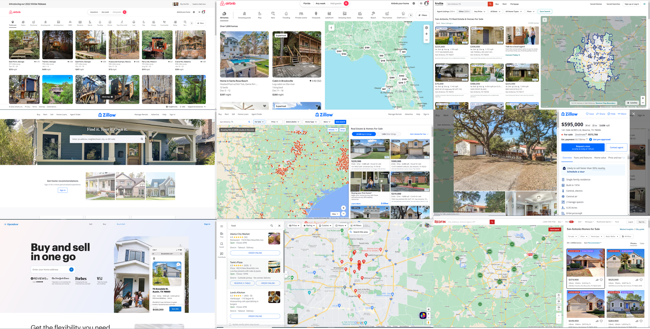
Competitive Analysis
To better understand the market the client is in, I searched through countless home buyer/ rental-oriented sites to evaluate information hierarchy and common themes. This allowed me to compare UX/UI design across multiple platforms to confidently determine areas of improvement.
I found that most home buyer/rental-oriented sites:
Feature nearby, recent listings for convenience
Offer search tools for effective property seeking
Primarily use one color to develop branding
Provide a large amount of information that is expanded into view
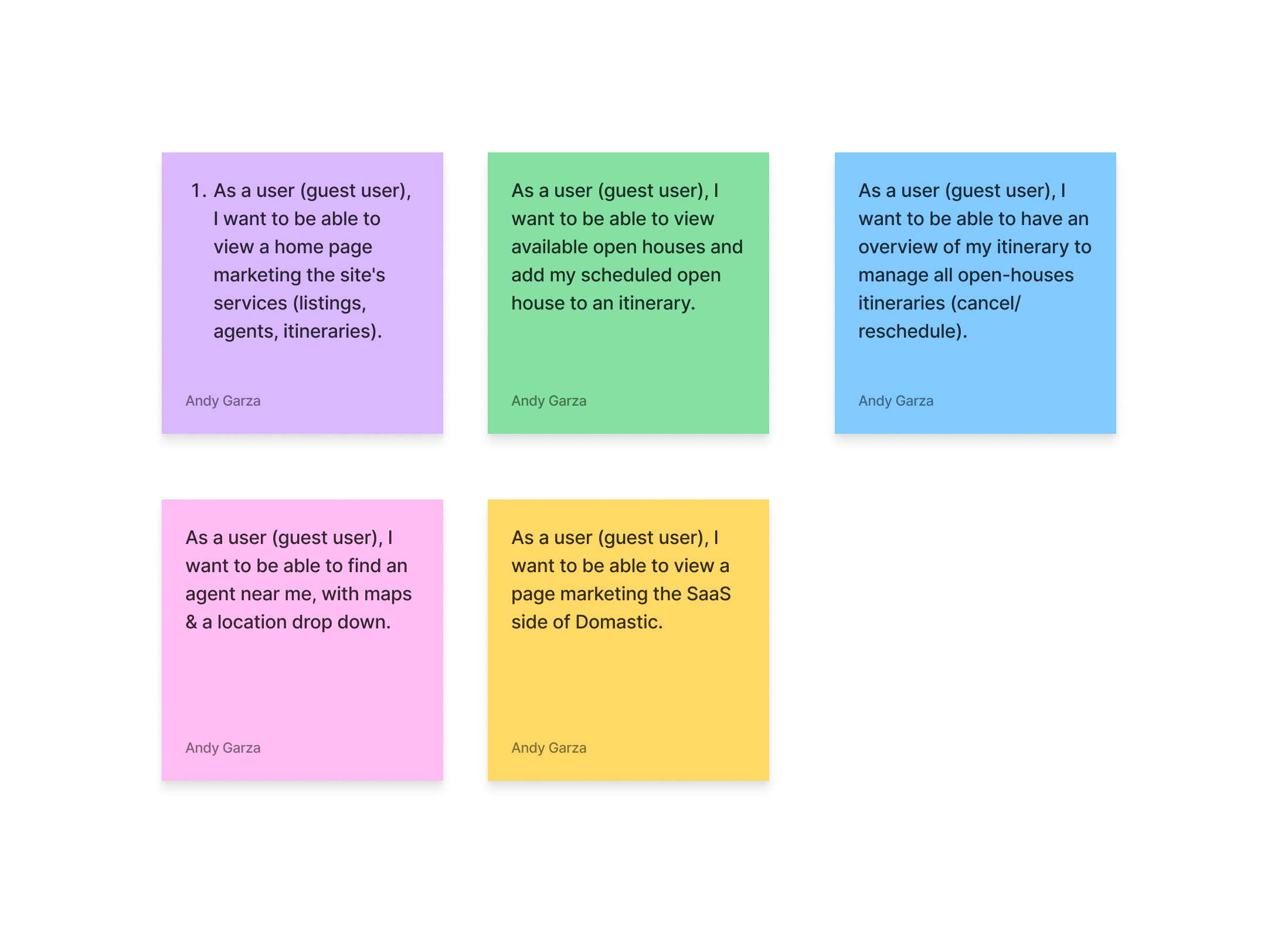
User Stories
We worked with the client to ensure their needs were met and came to a consensus of 5 user stories that were critical to the platforms function:
Homepage - Landing page welcoming users
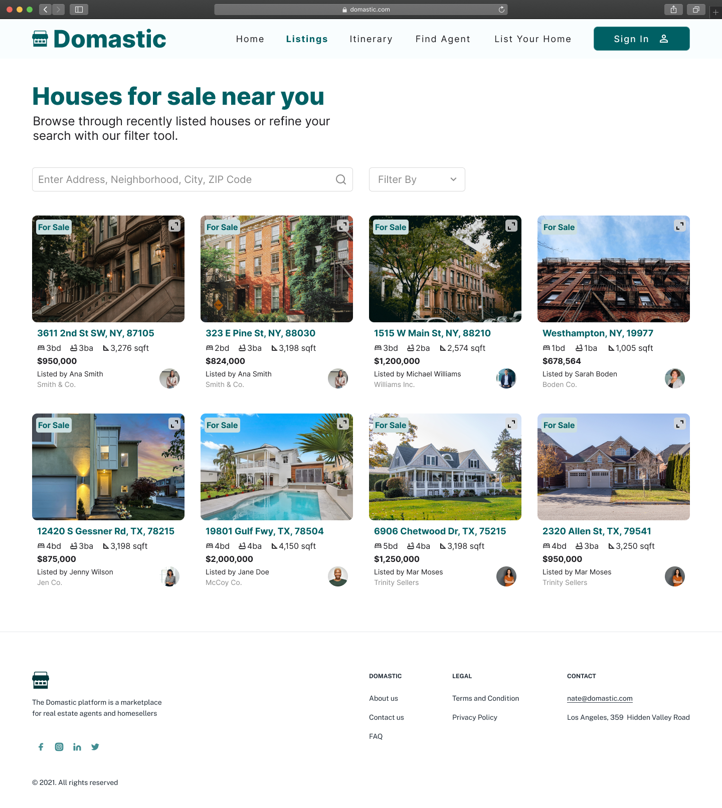
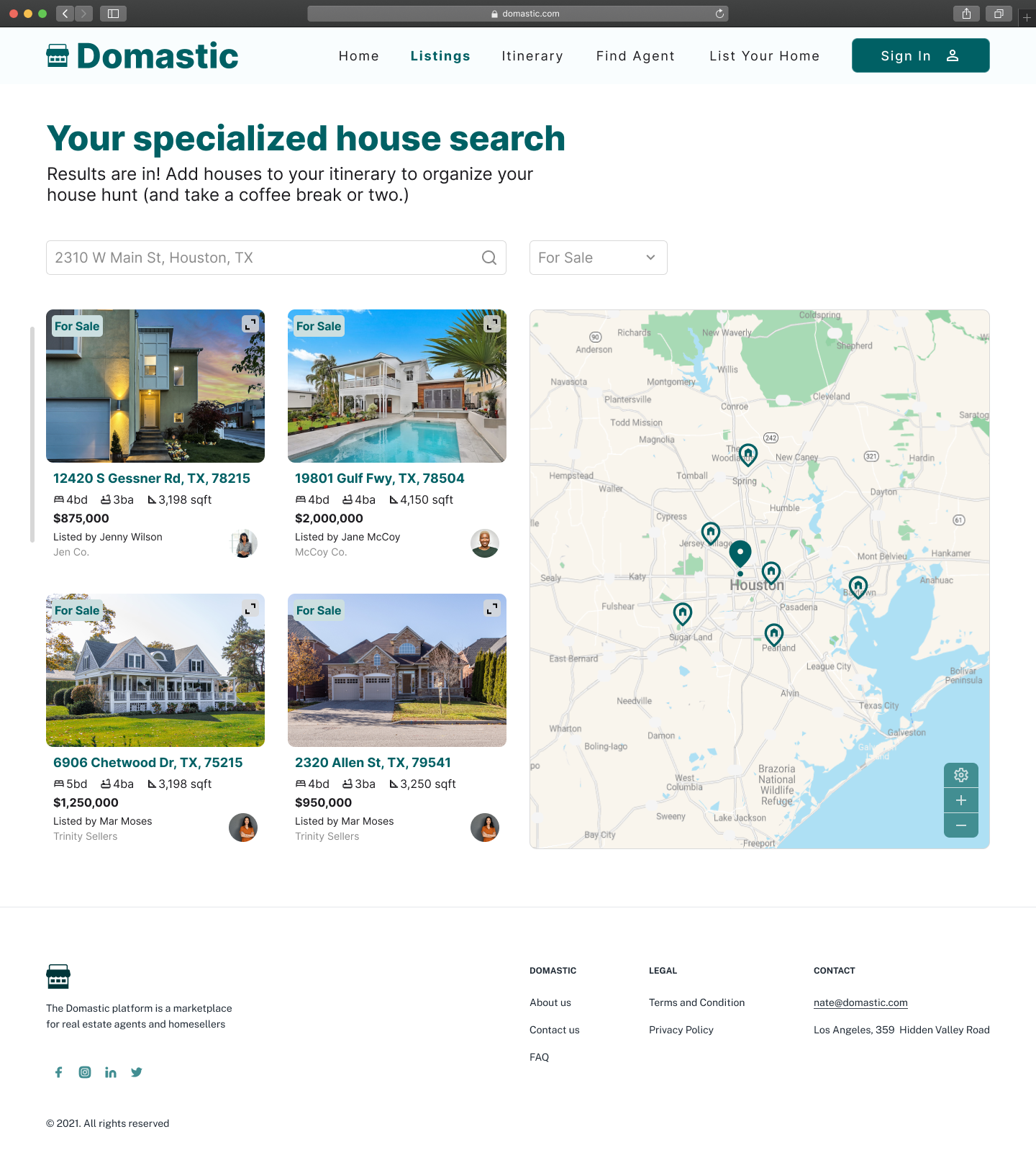
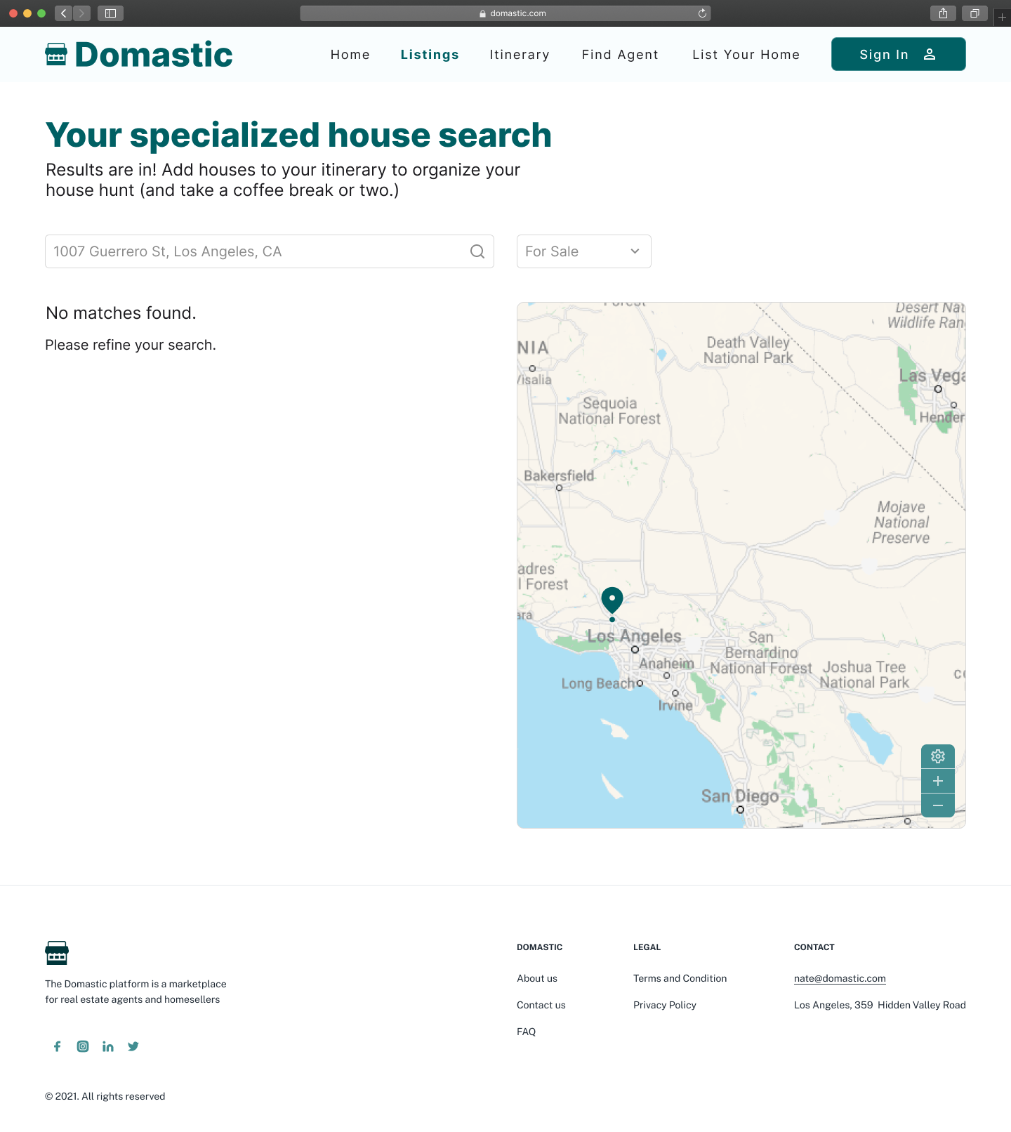
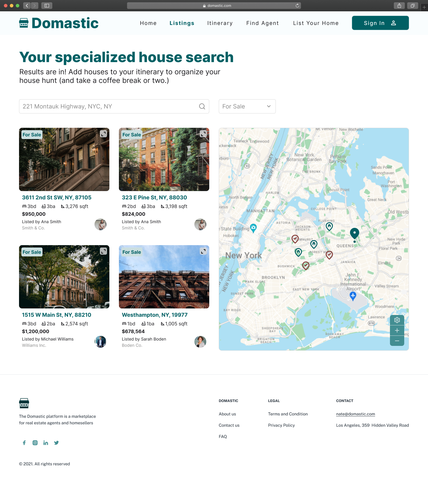
Listings - List of available properties on the market
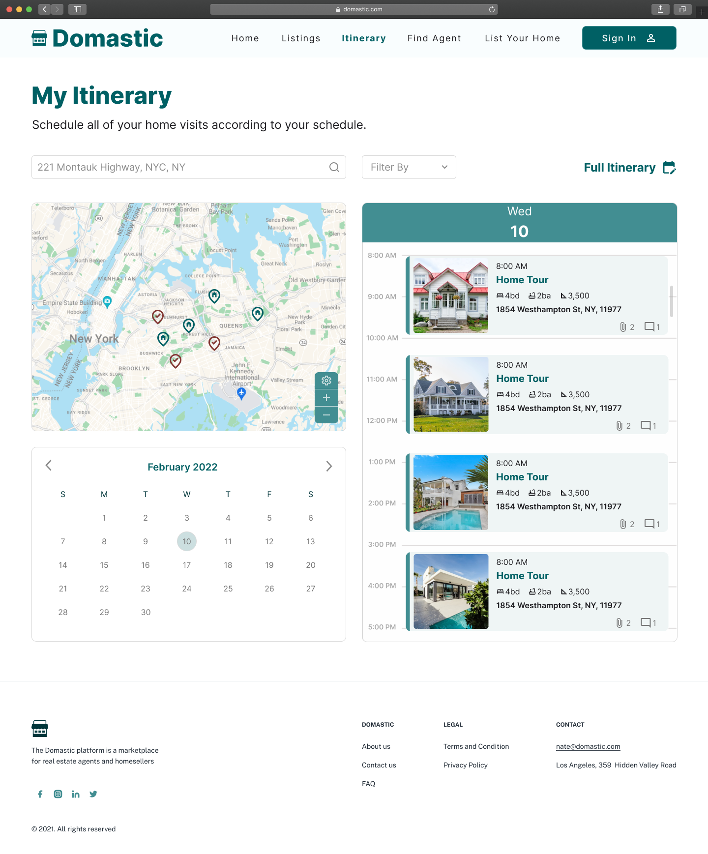
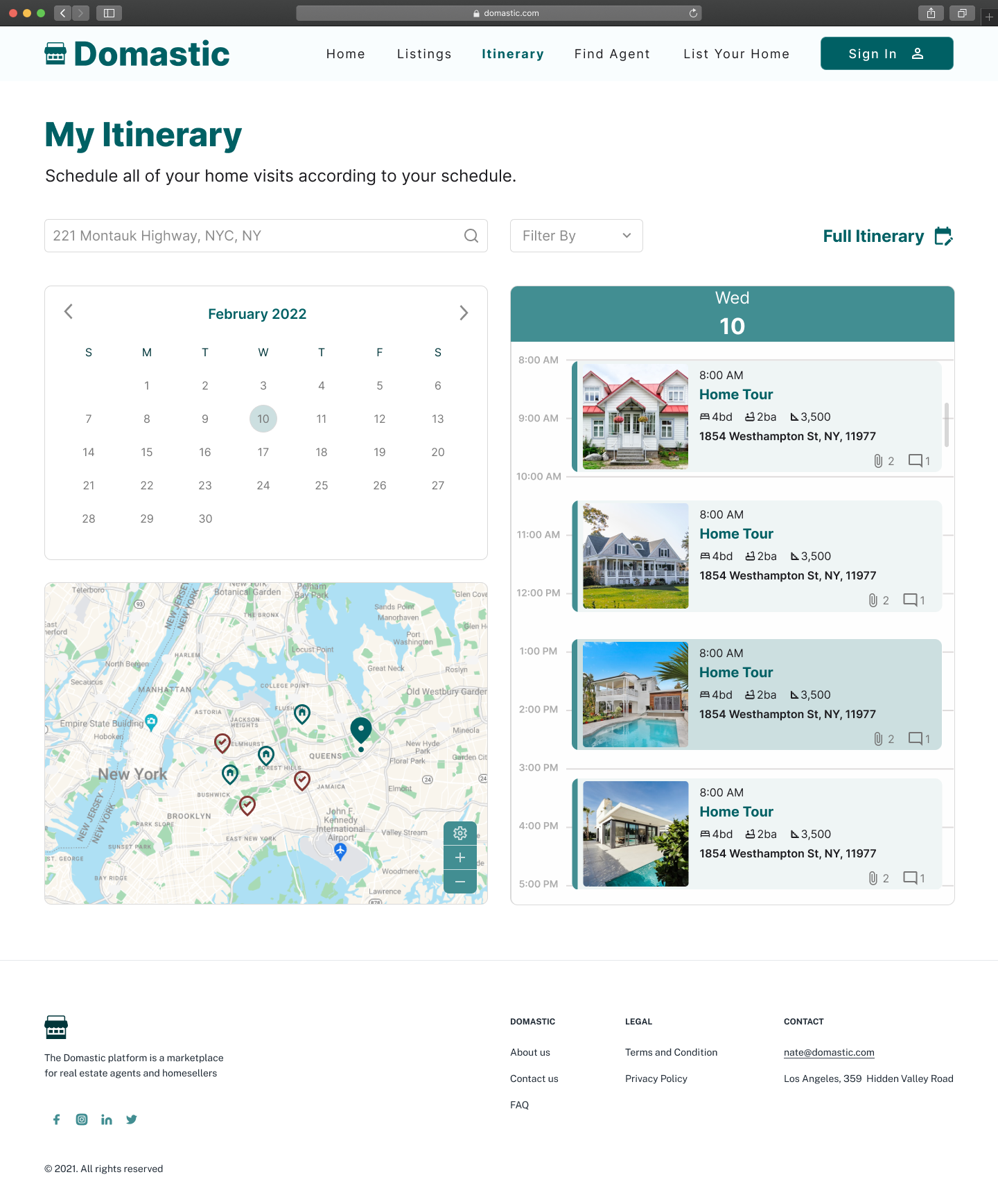
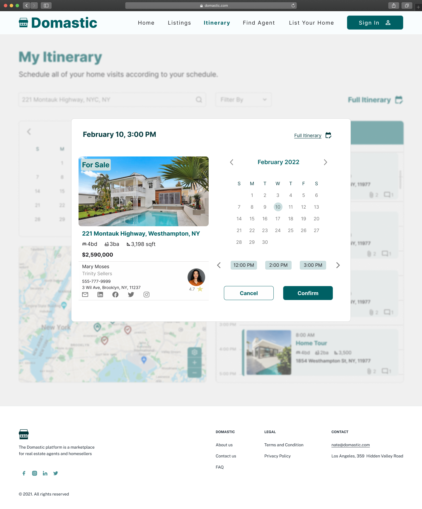
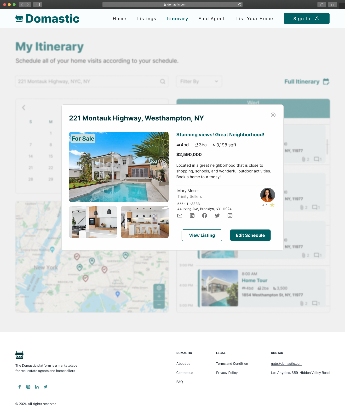
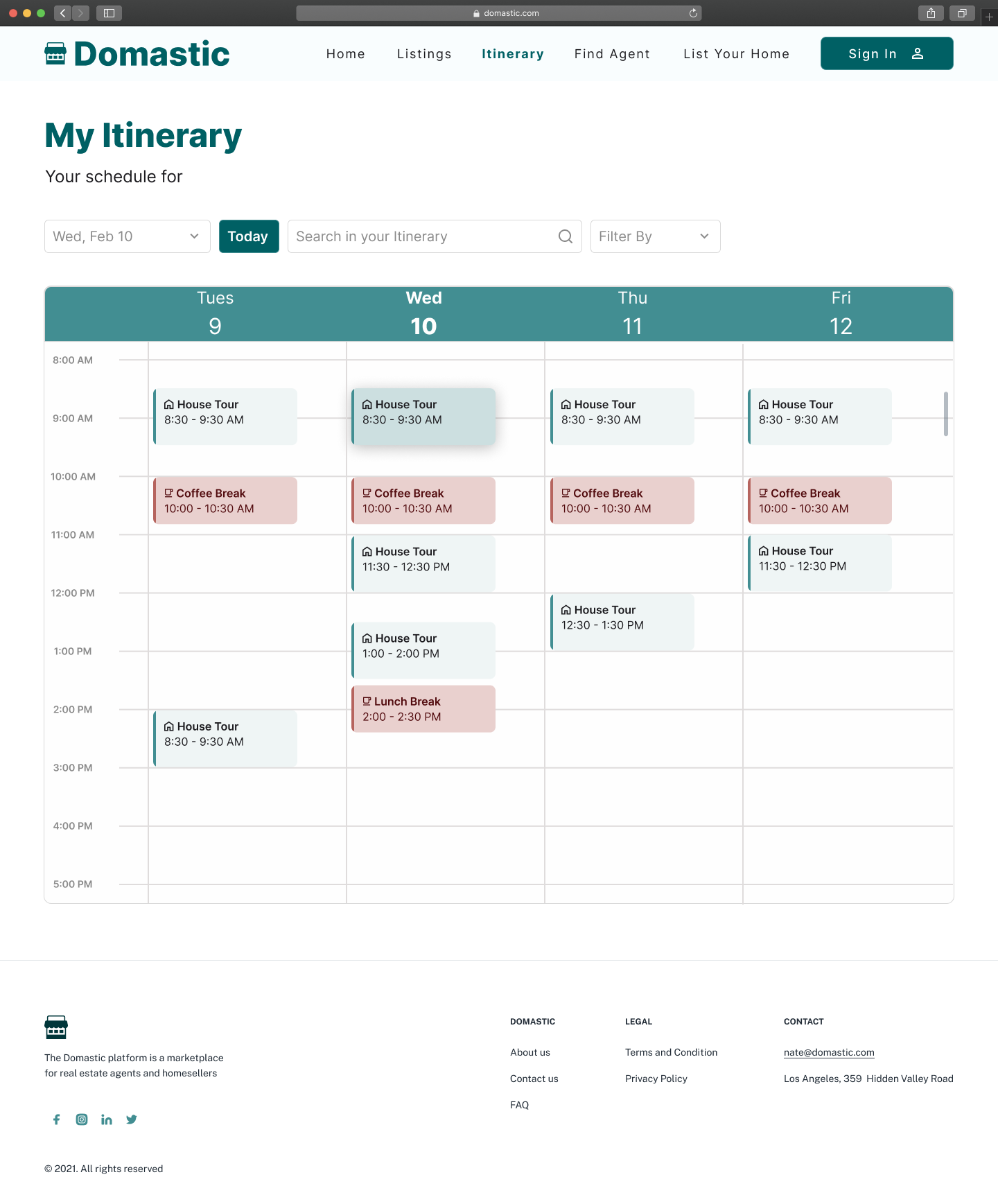
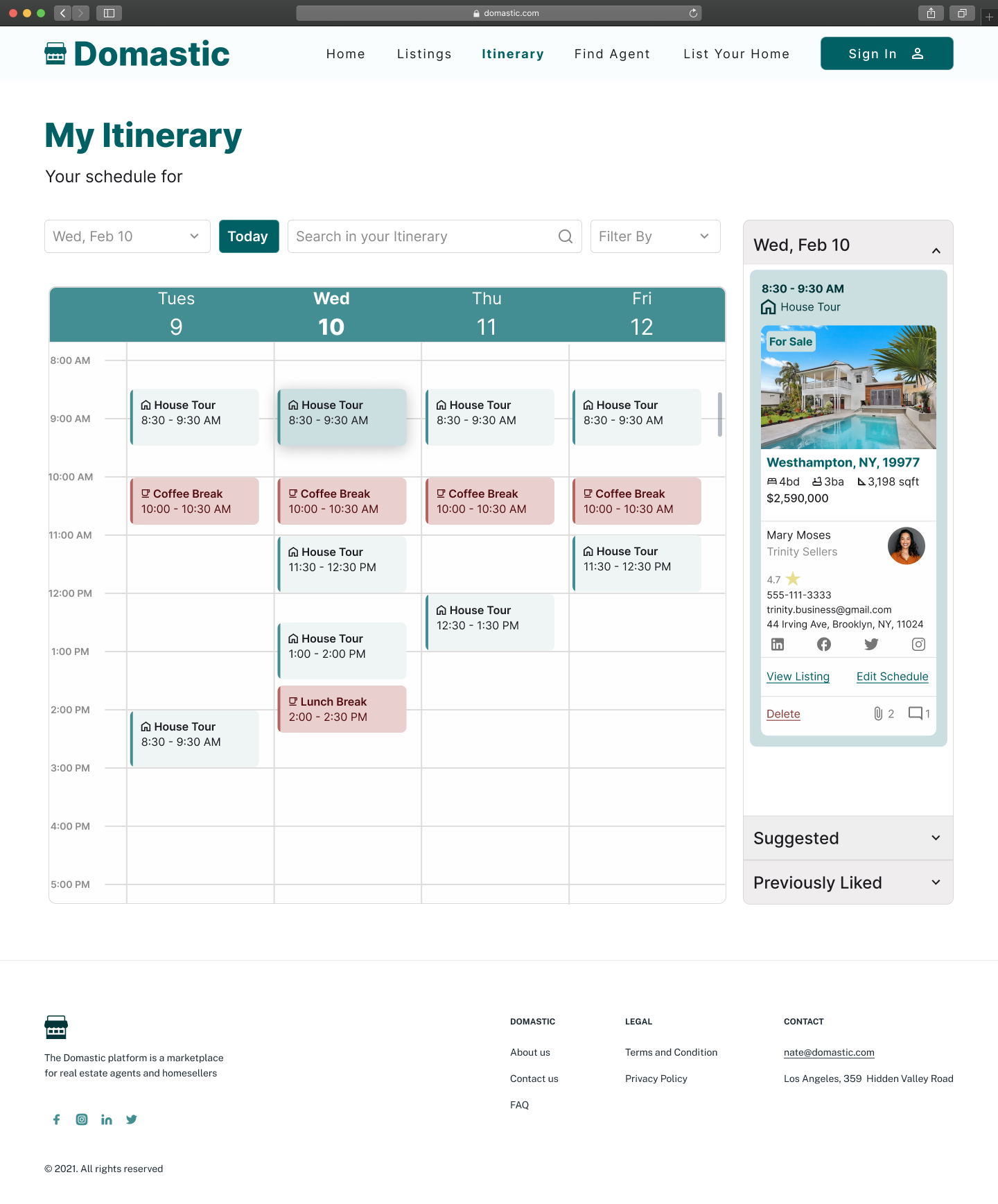
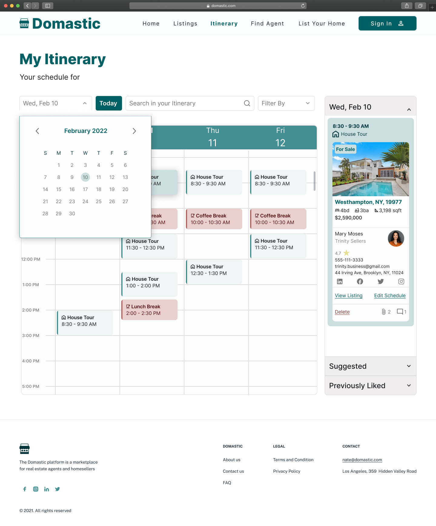
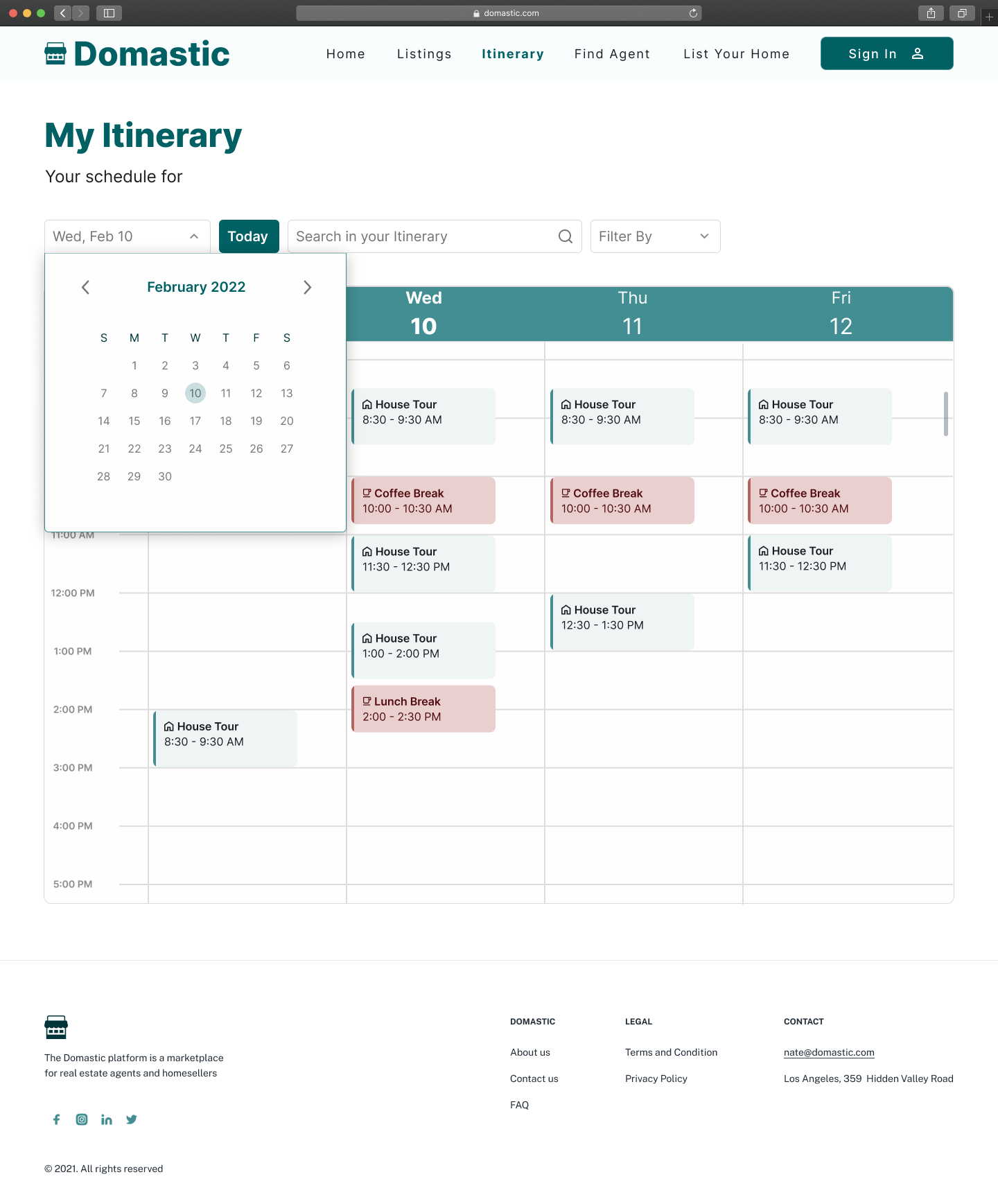
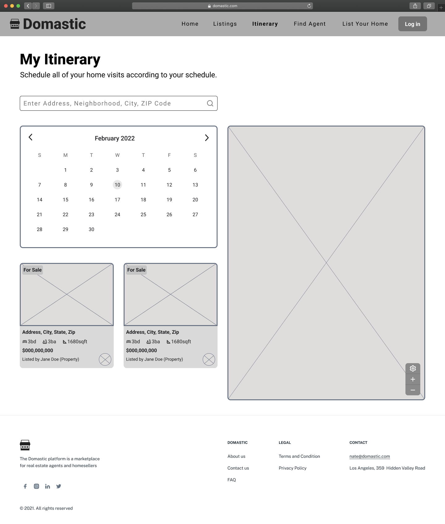
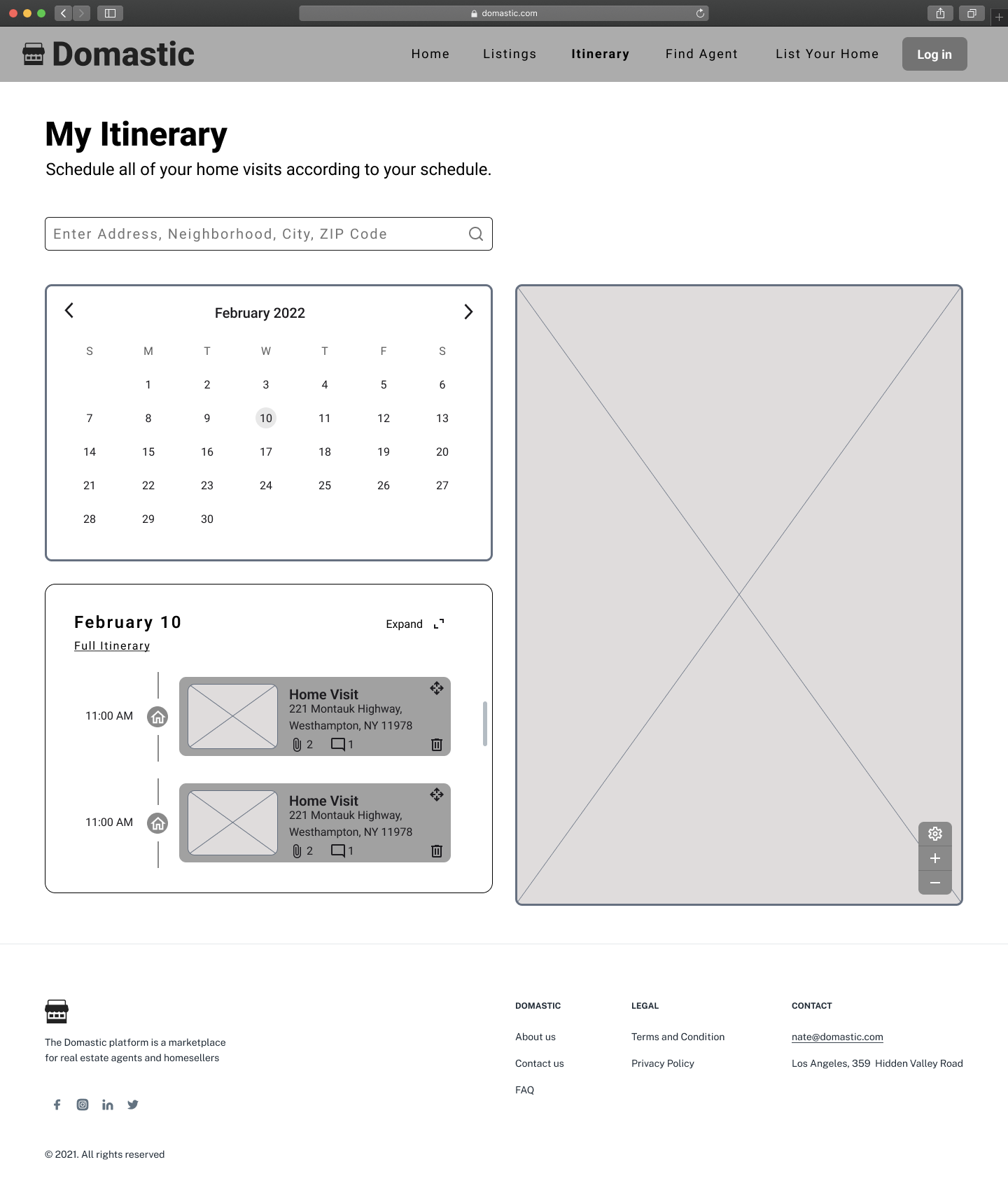
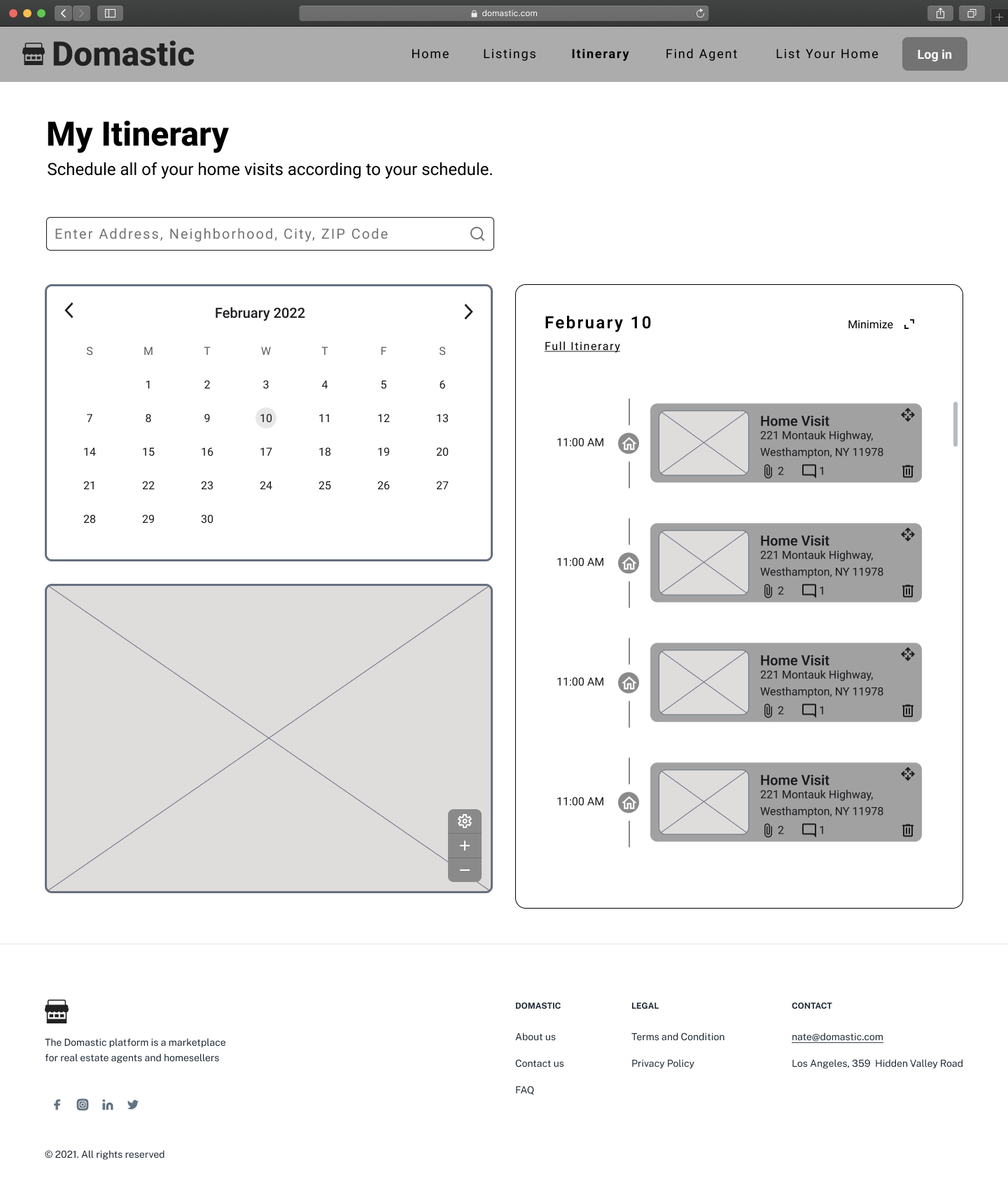
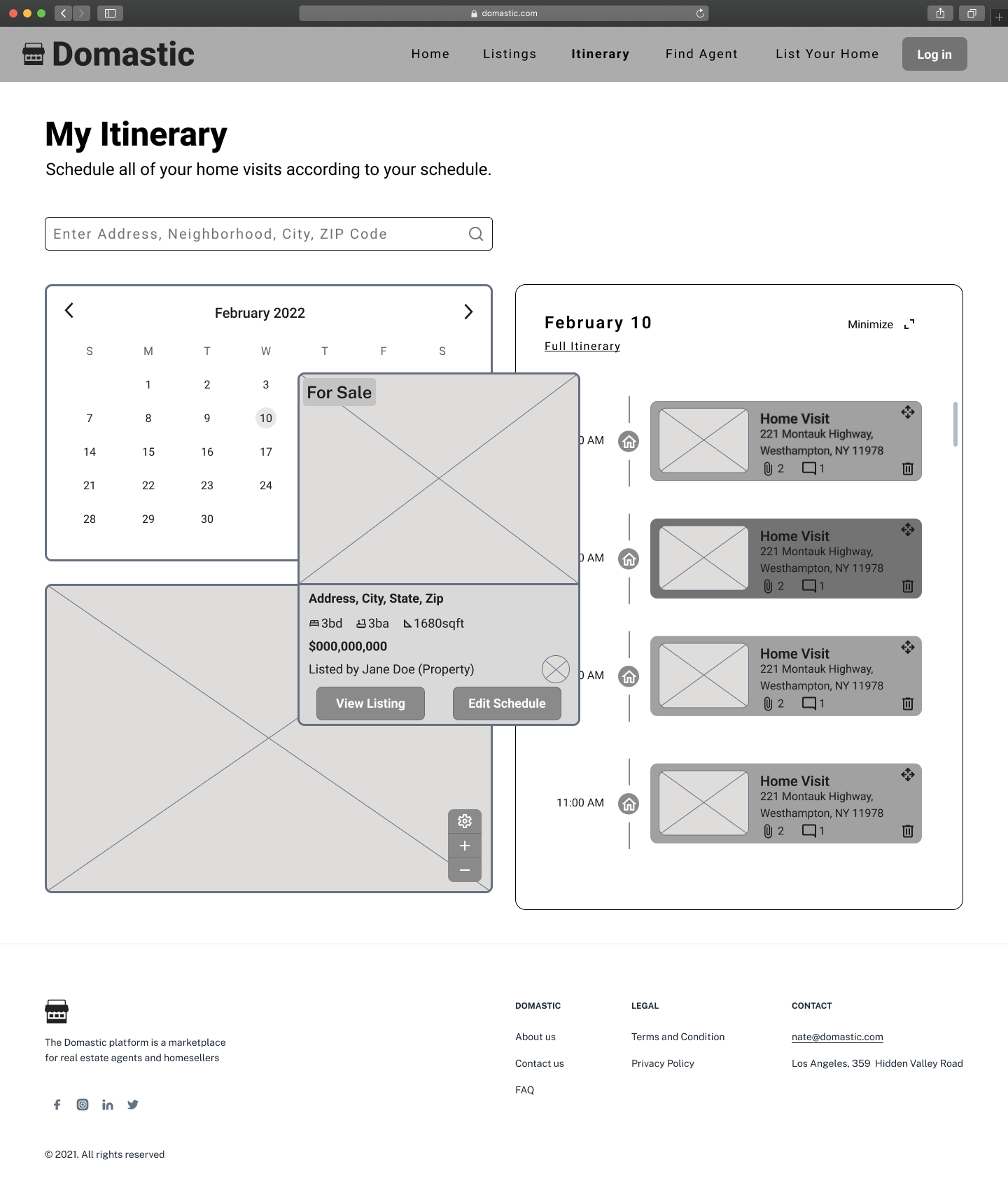
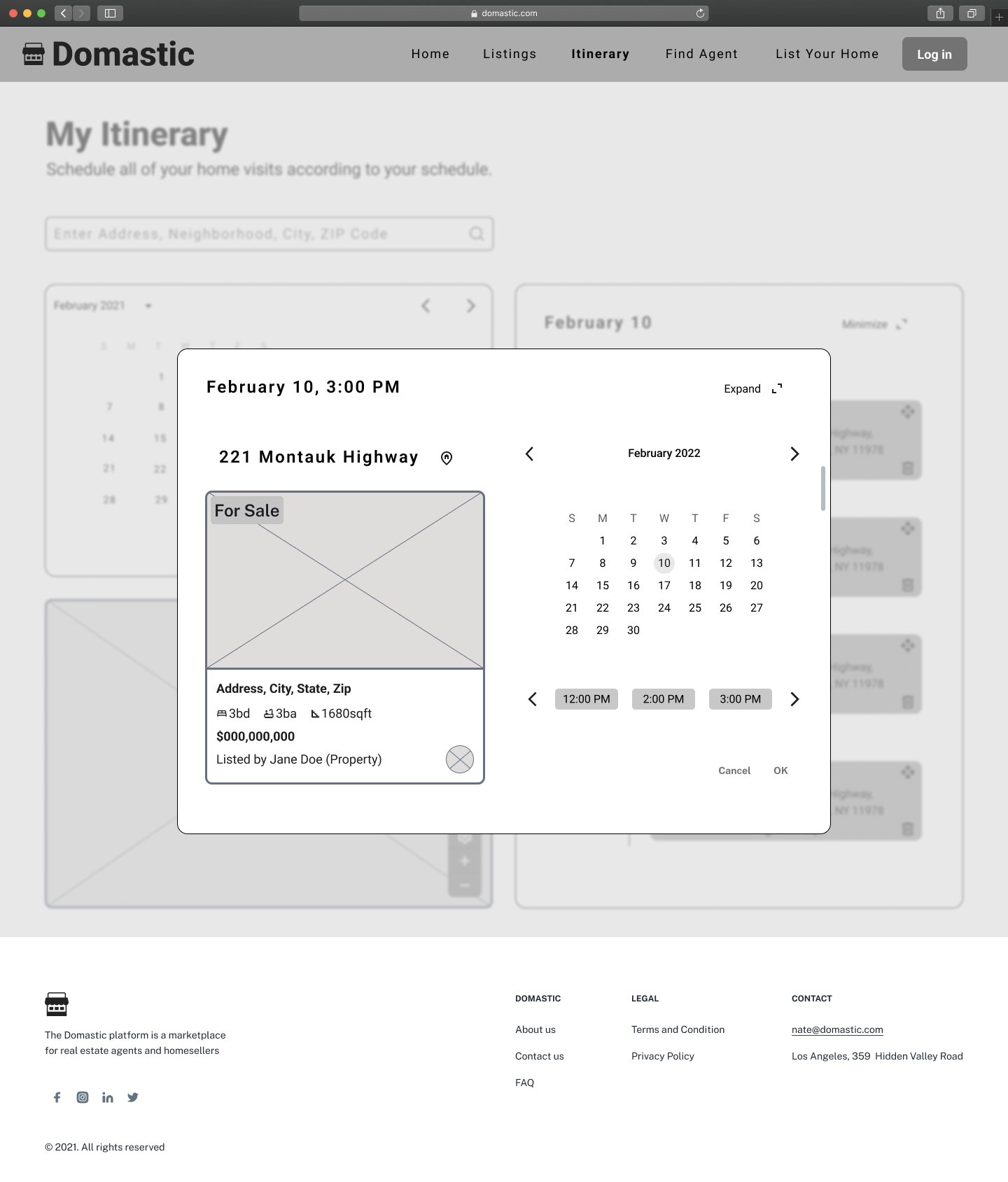
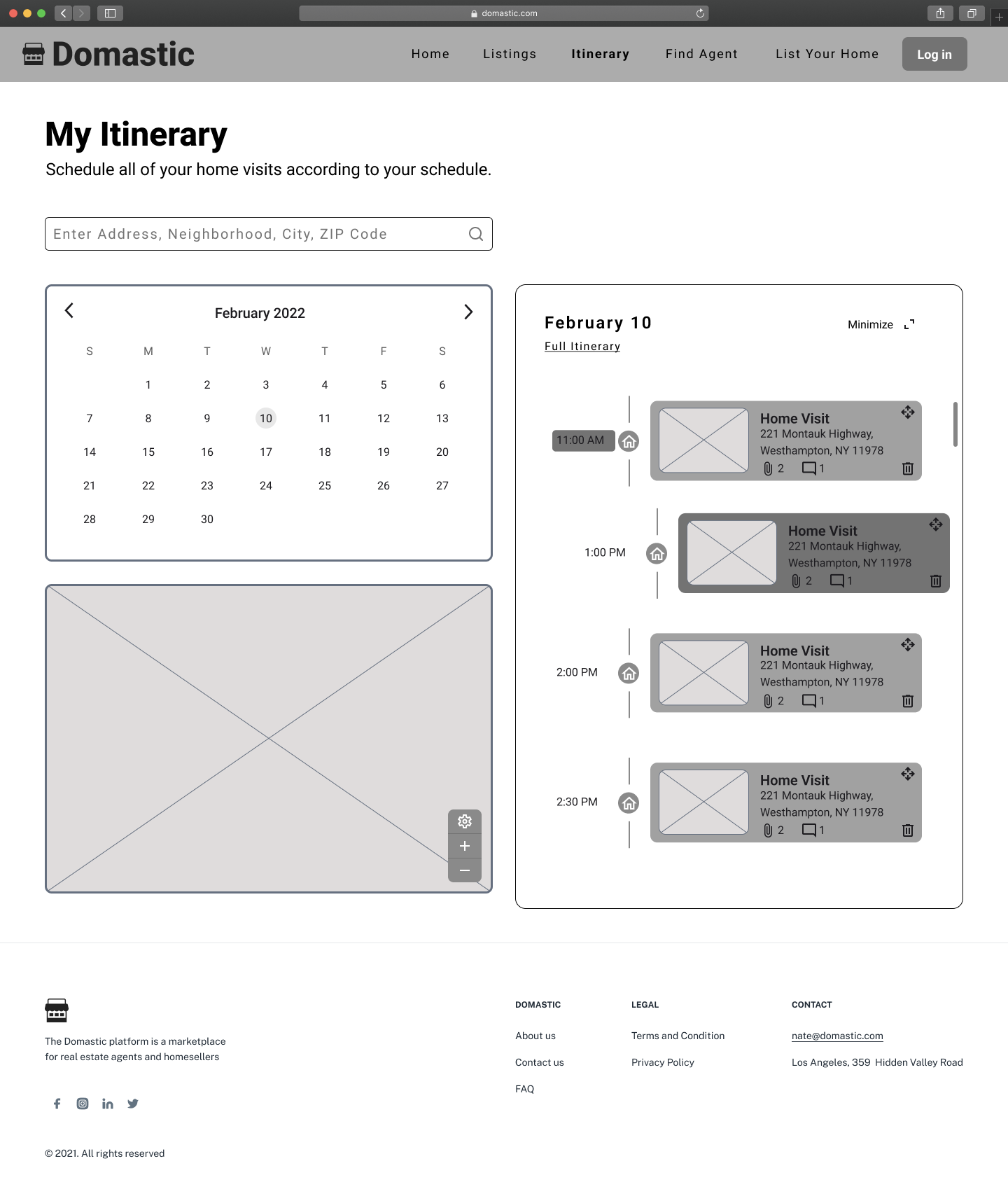
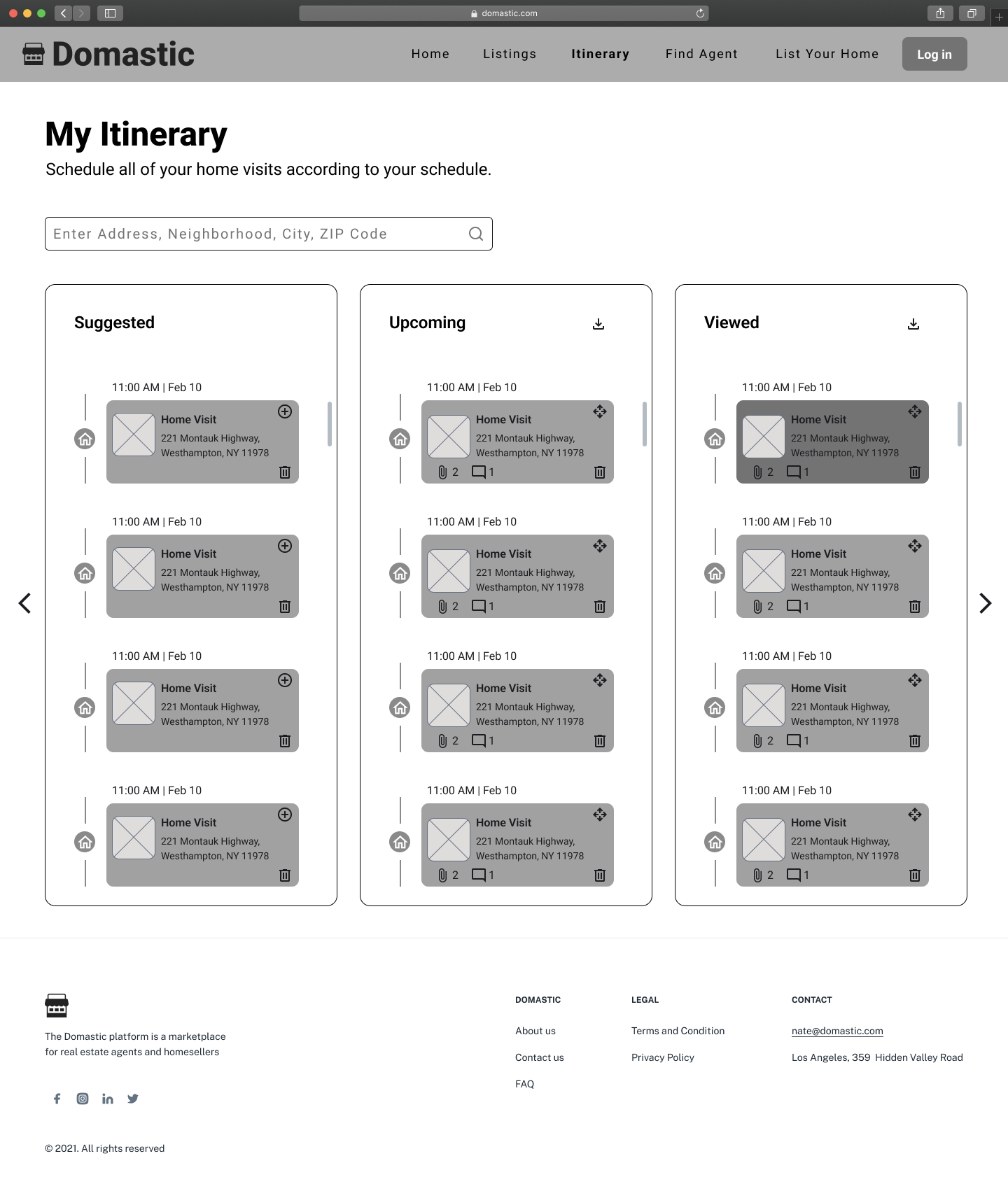
Itinerary - User's personal property viewing schedule
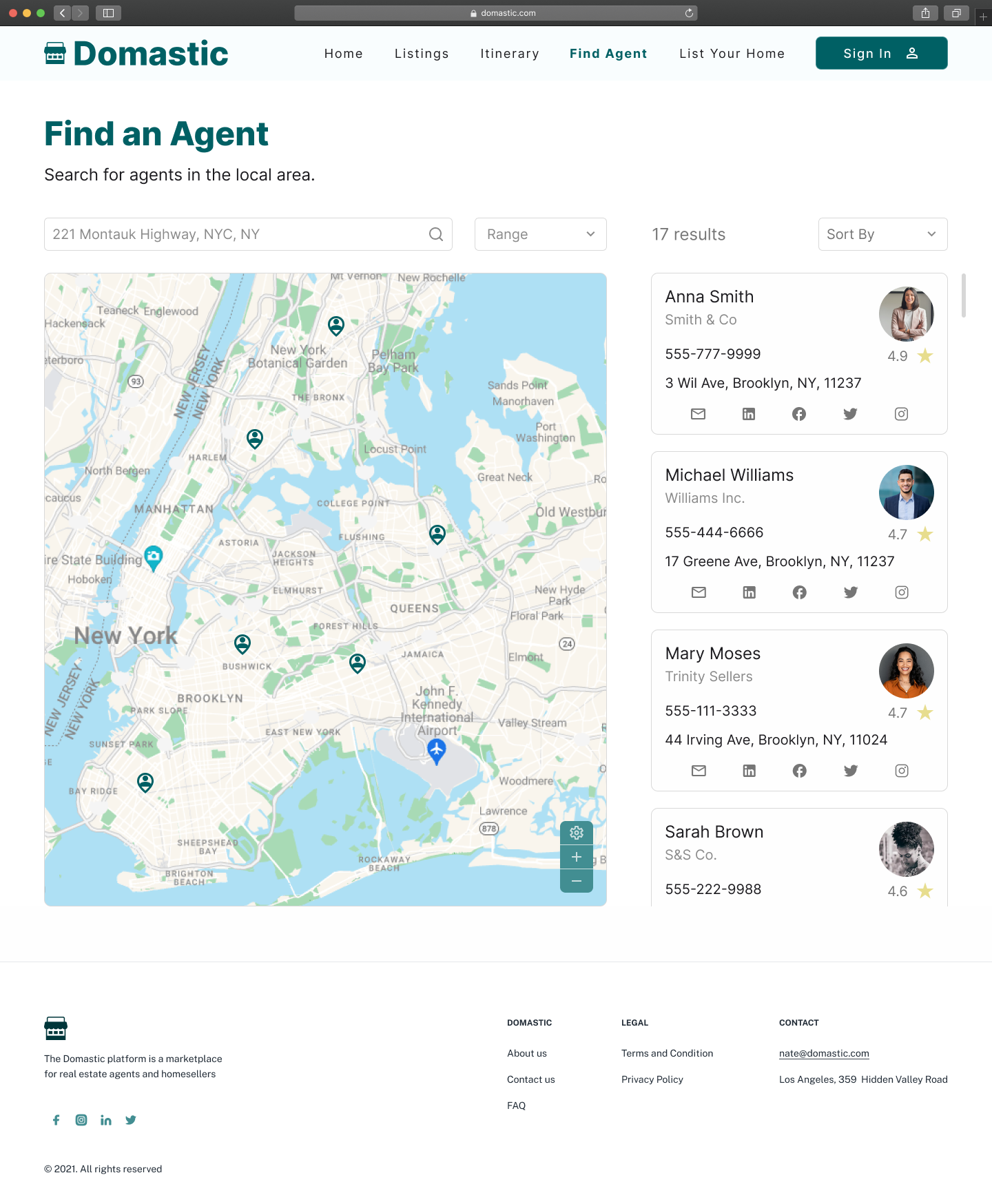
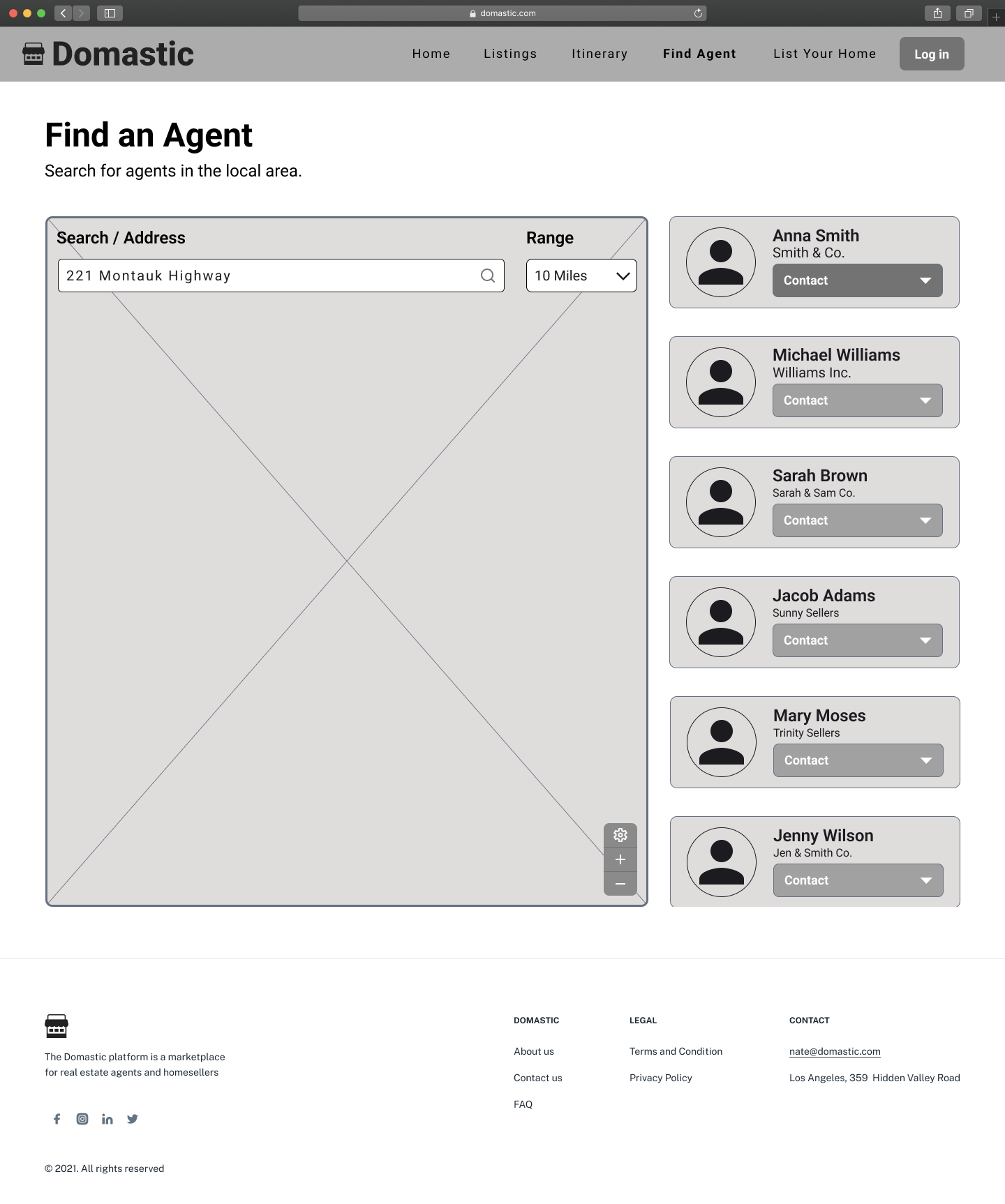
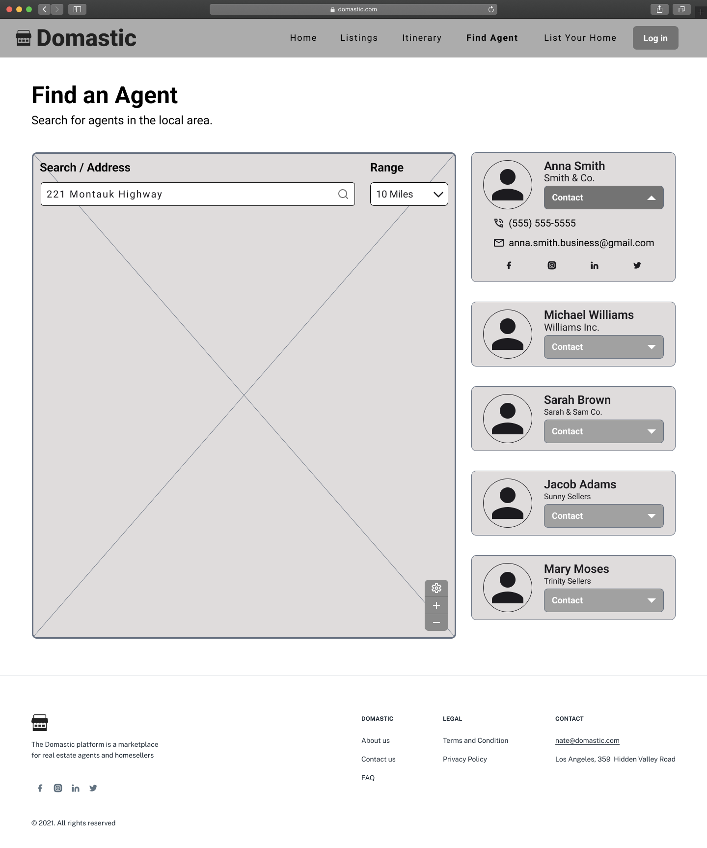
Find an Agent - Tool to find local realtors
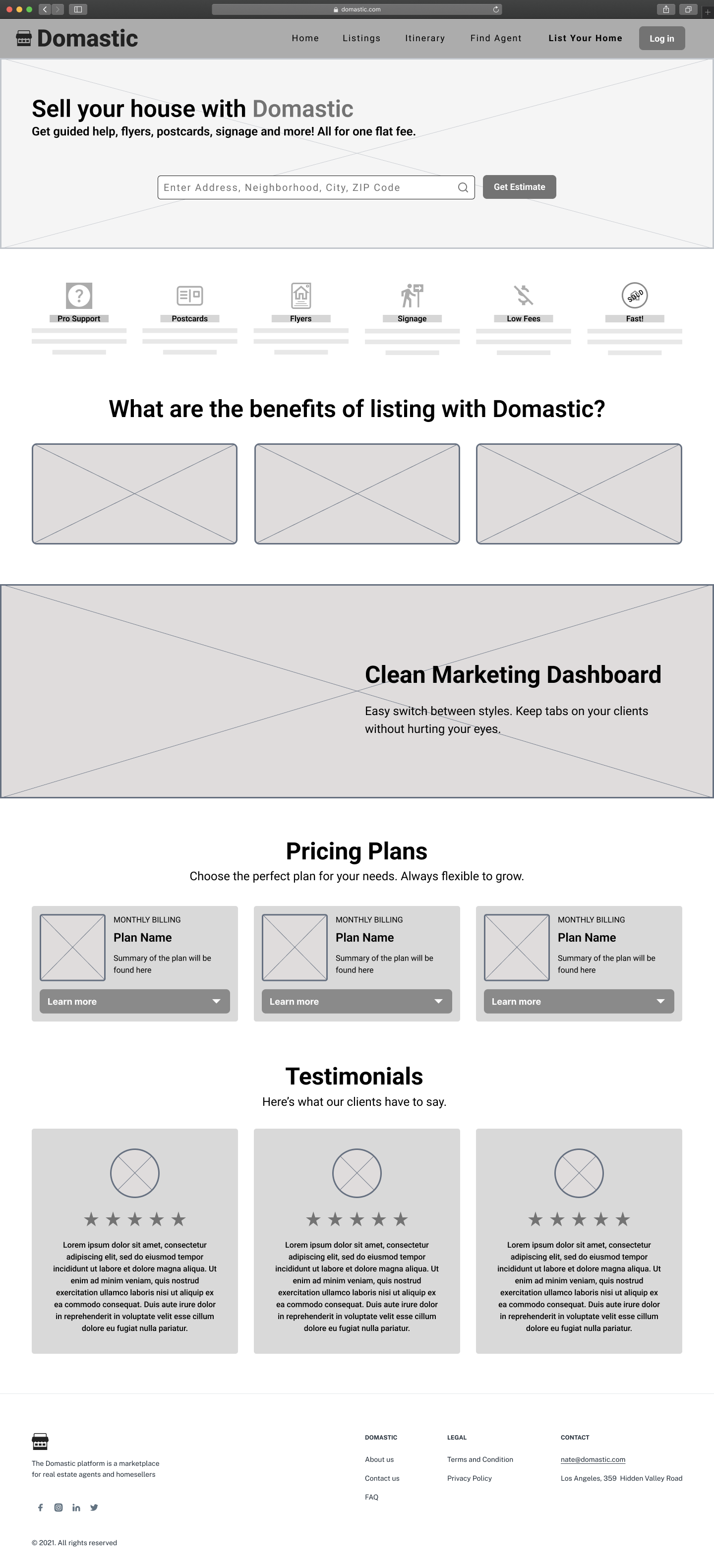
List your Home - Information on how users can list their own home on the platform
Ideation
User Flows
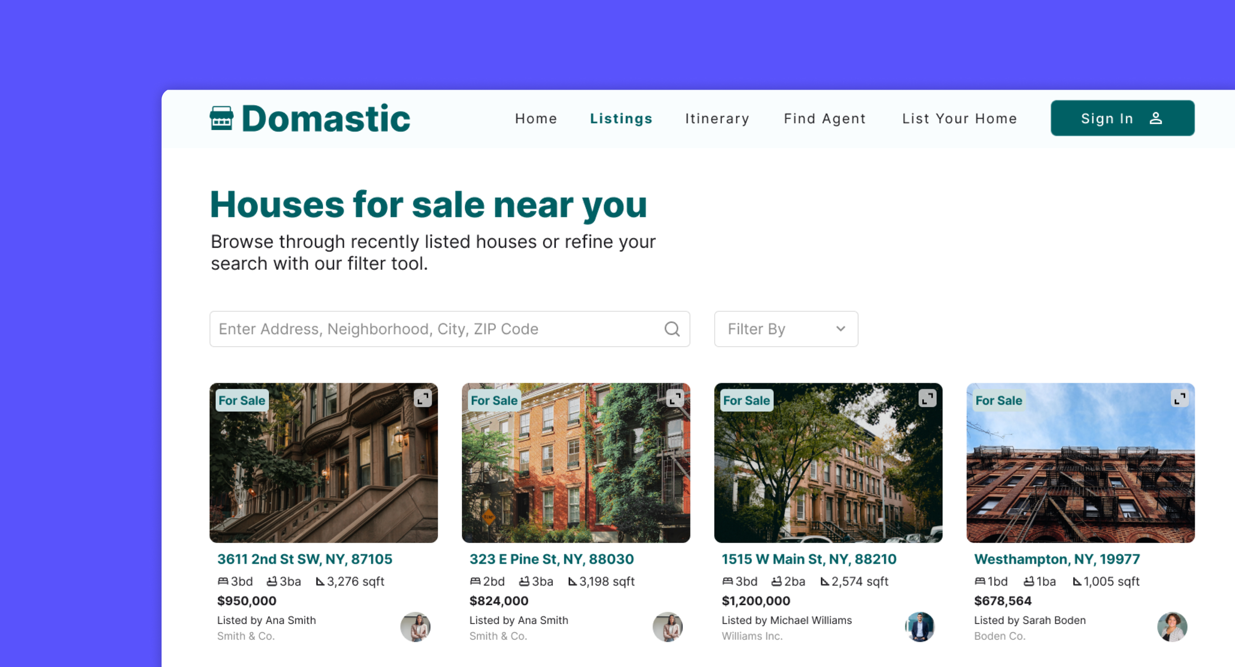
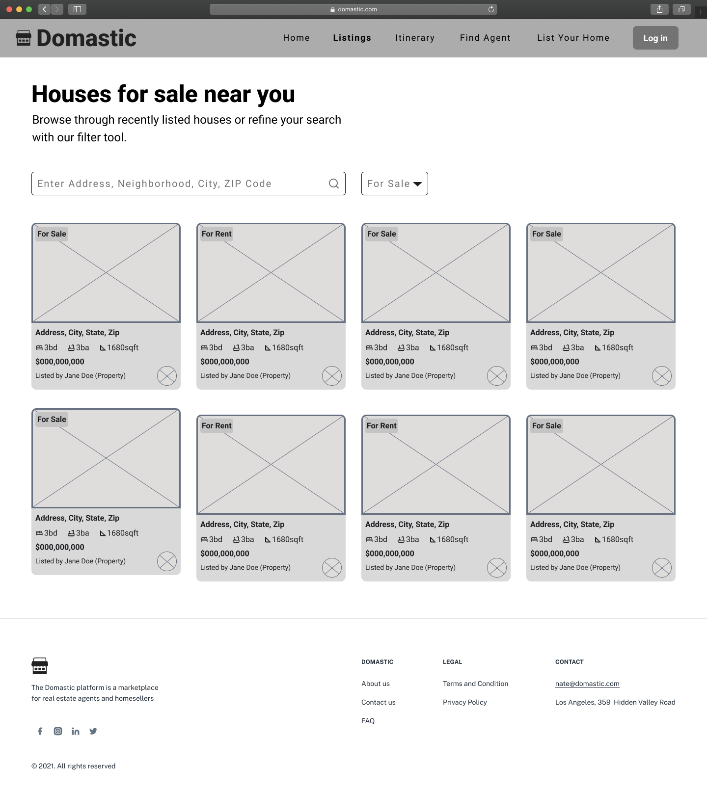
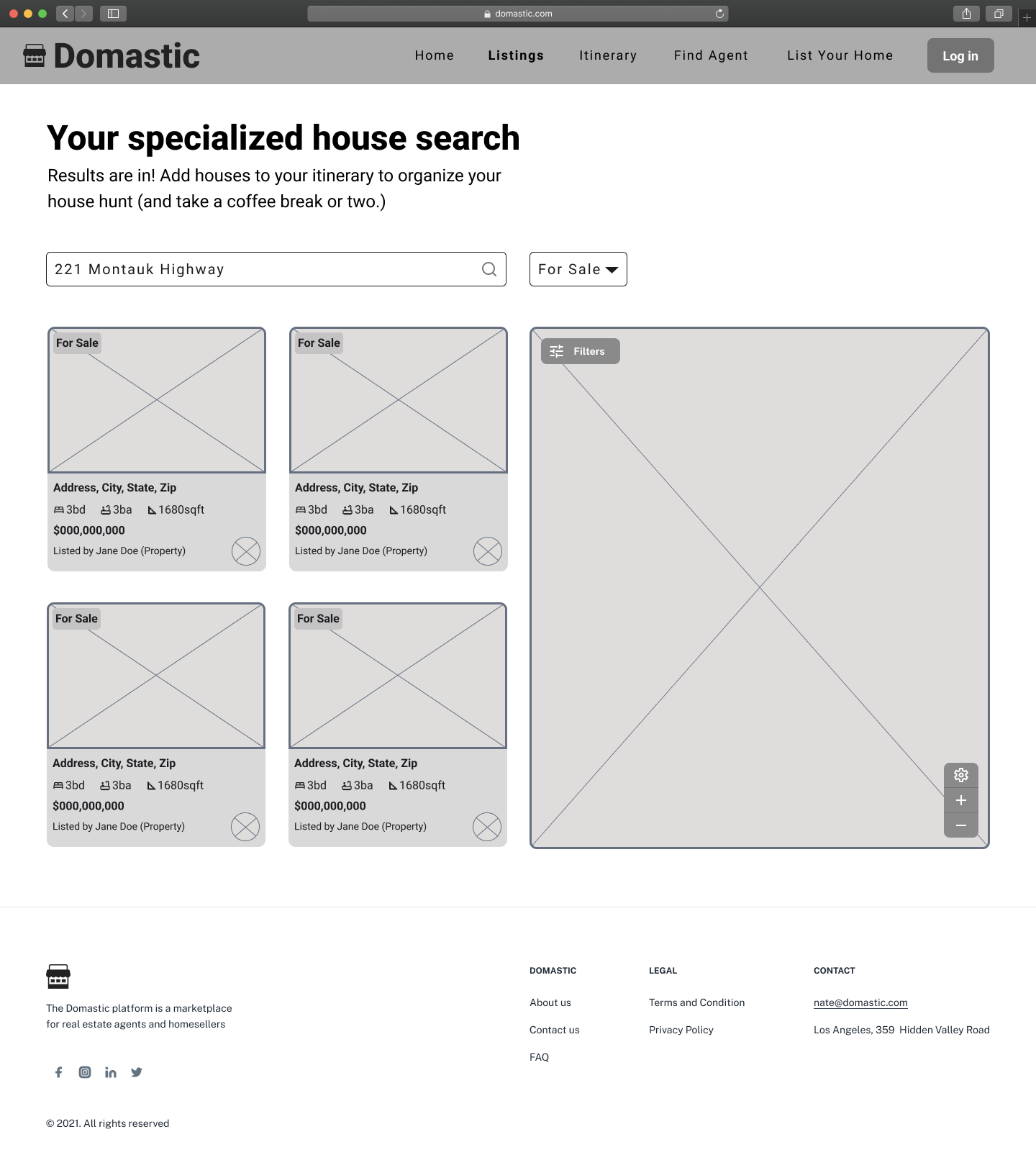
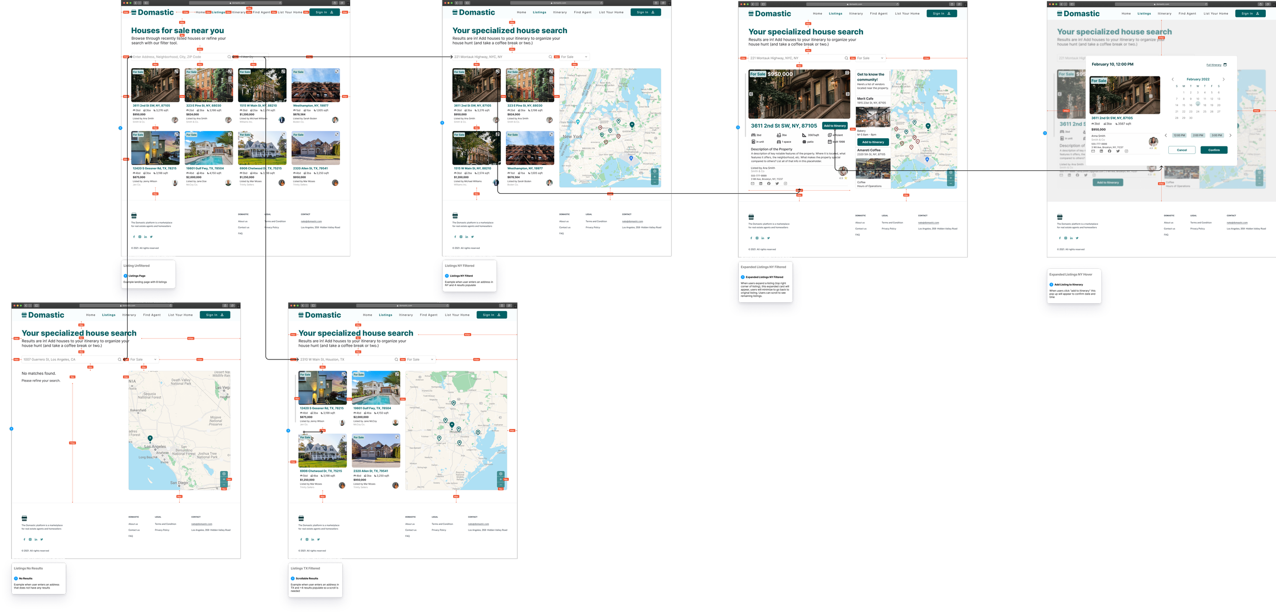
My team and I identified 5 user flows that were critical to the platform's functionality. I worked on the listings page, and my team members were assigned one of the remaining user flows. Each of us were responsible for wire-framing and designing our designated user flows to ensure efficiency. We maintained communication throughout the design process to ensure a cohesive design.
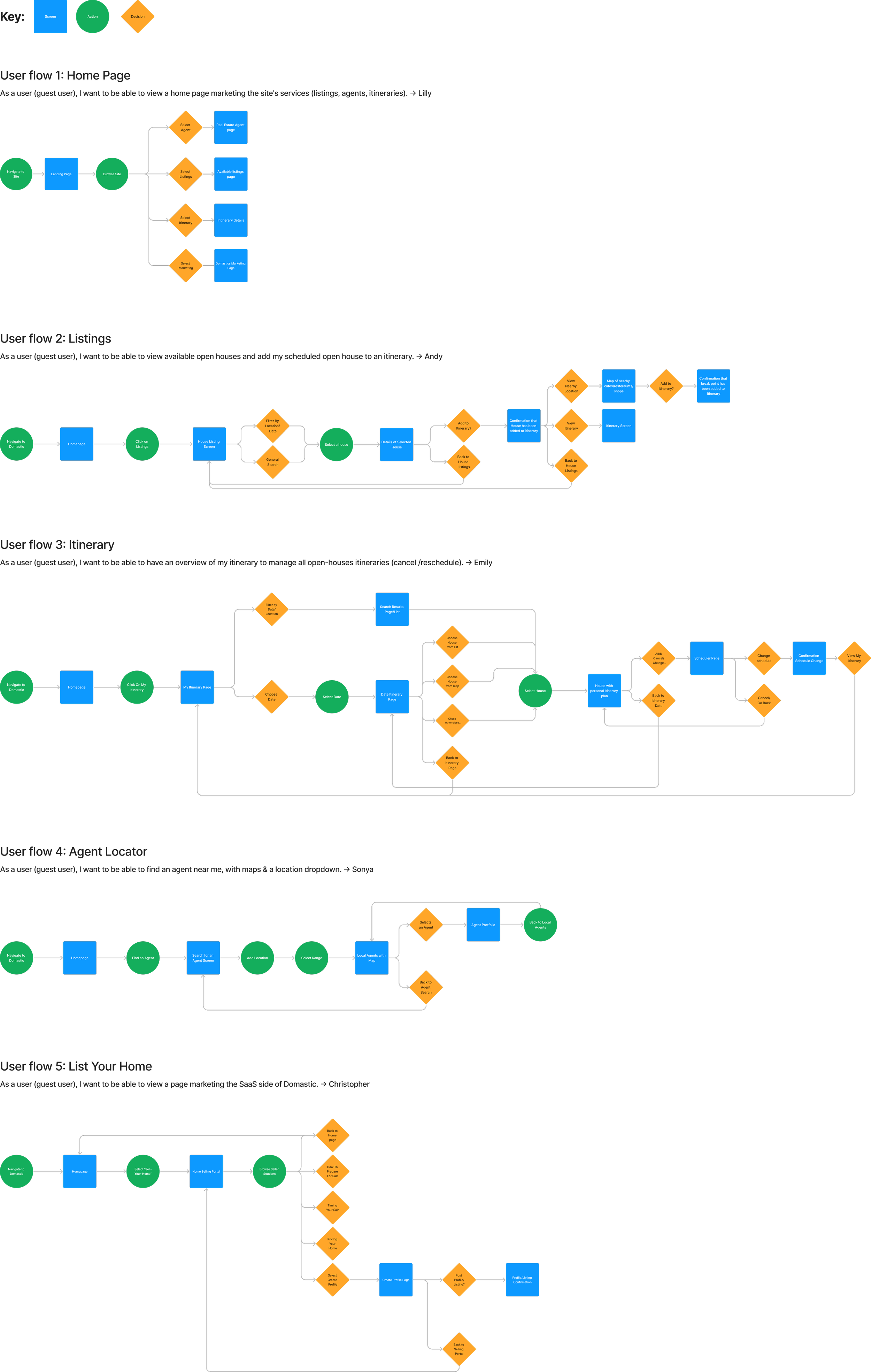
Wireframes
My team and I created medium fidelity wireframes to communicate our ideas to the client prior to proceeding with high fidelity mockups. I worked on the Listings page and each of my team members worked on one of the remaining four screens. We reorganized the layout of each of the pages to make them more intuitive and included new features that made the platform more engaging.

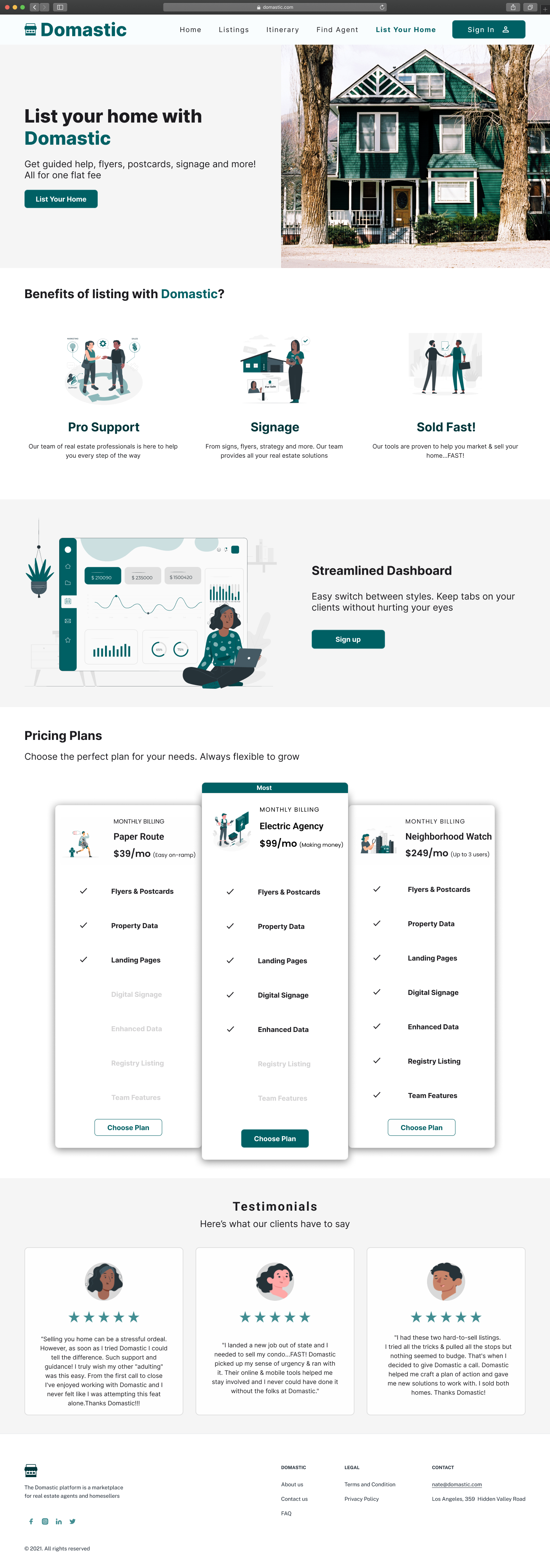
Design
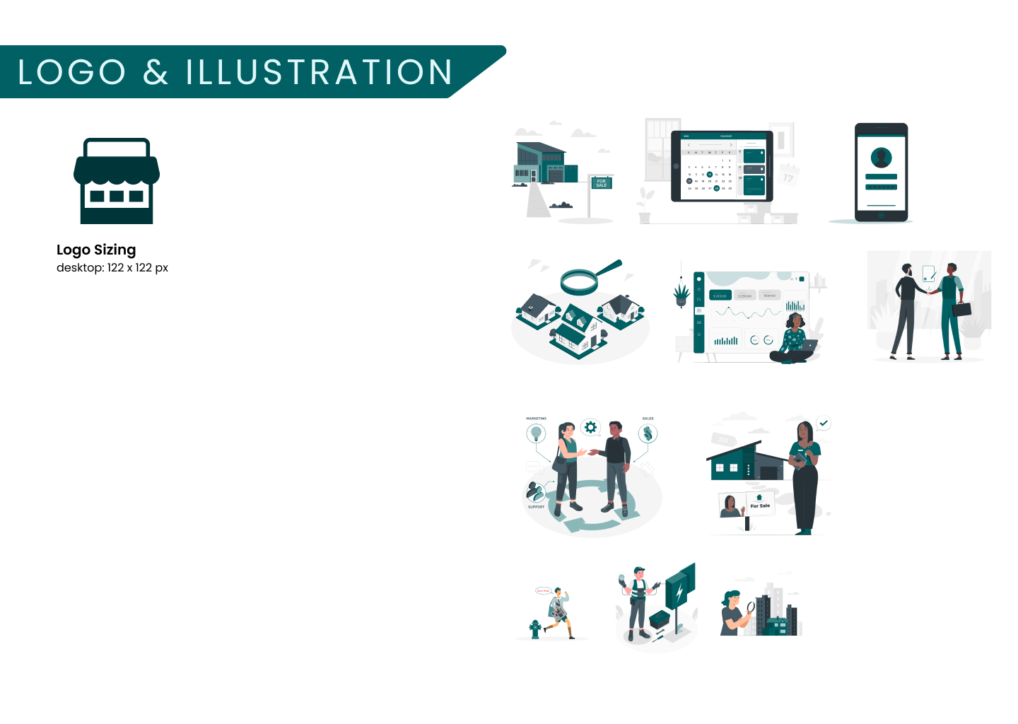
Style Guide
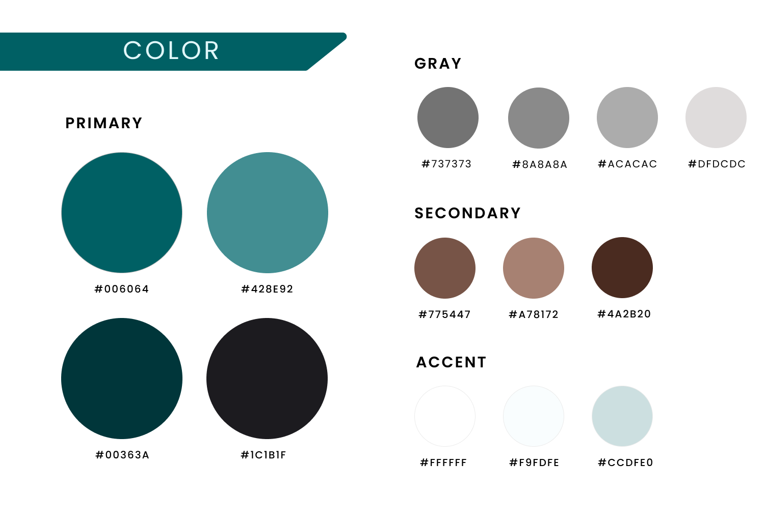
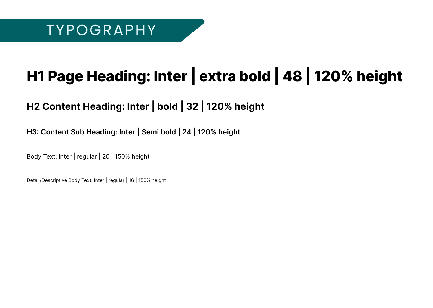
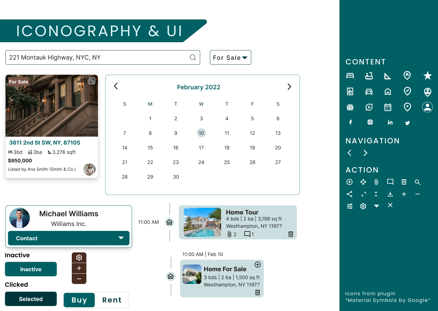
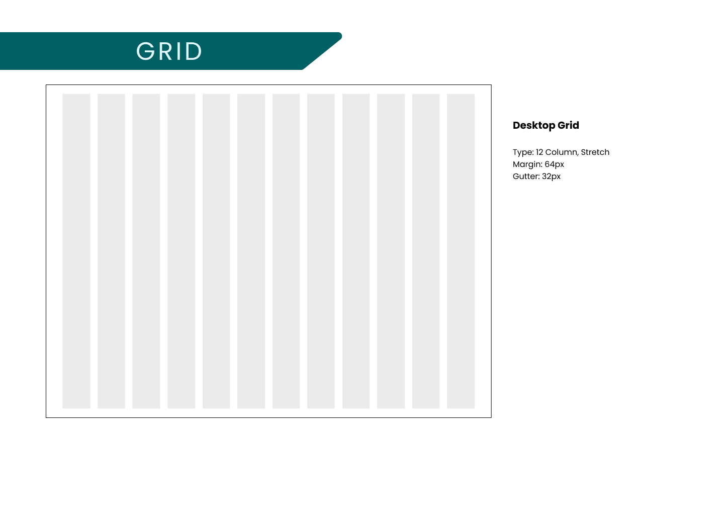
The client was open to exploring color psychology and aimed to establish a brand identity that evoked positive feelings related to change and passed accessibility standards. We developed a color palette that took these preferences in to consideration and centralized the brand color to teal hues. We also set for a standard for typography that allowed for proper balance in hierarchy and spacing. We rounded out the style guide by including regularly used UI elements to ensure the team was consistent. The style guide was constantly referenced through the design process as we went through multiple iterations of the high-fidelity screens.
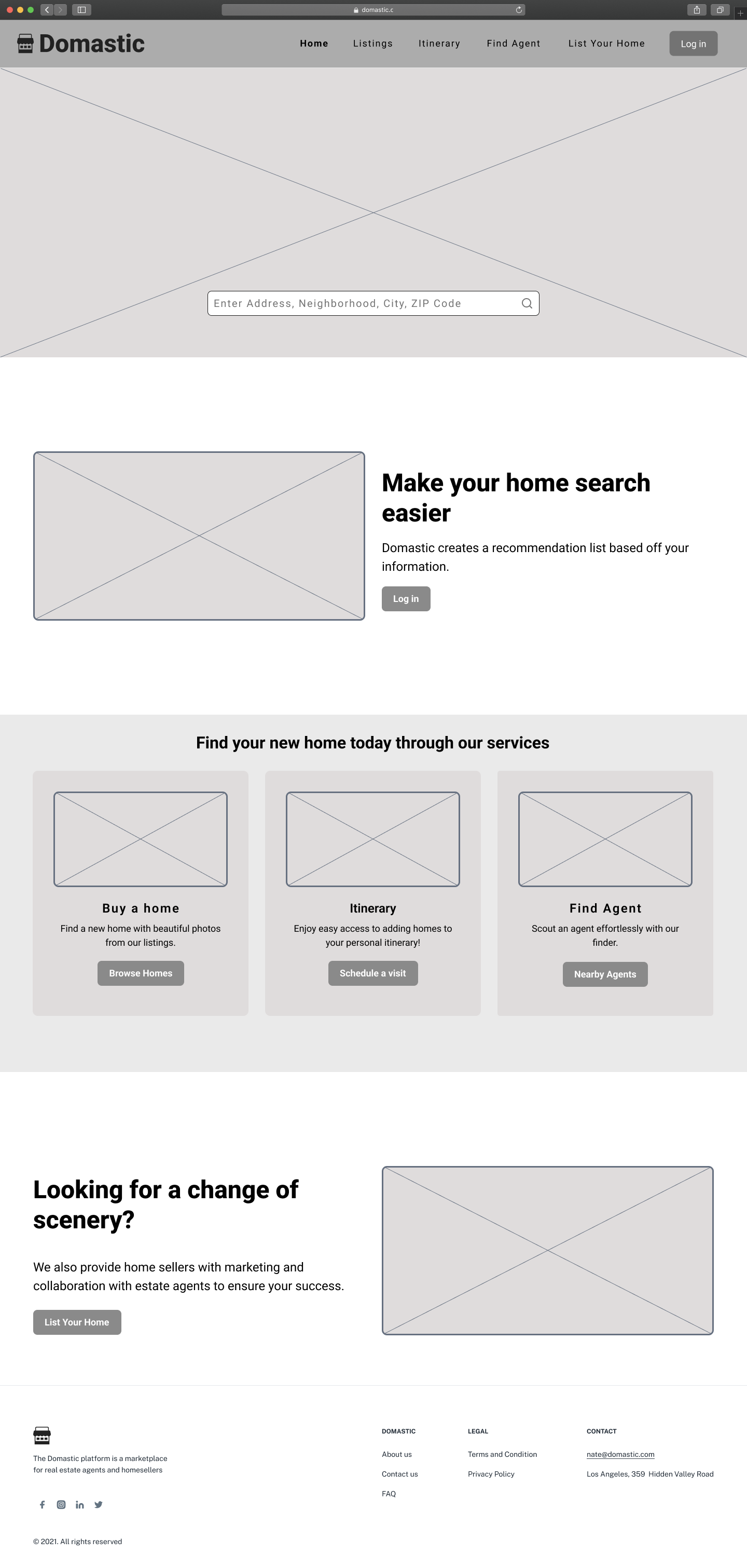
UI Iterations
After sharing UI iterations with the client, they determined iteration #2 made the most sense functionally and aesthetically. The team worked to distribute the style throughout the site. I worked on the Listings page and my team members each worked on a separate page. We collaborated closely to ensure the site was cohesive and maintained a standard for proper padding, font sizes, spacing, and colors throughout the platform. We also each created components to ensure there was consistency throughout the screens for items used repeatedly. We went through three rounds of revisions to come to our final designs.
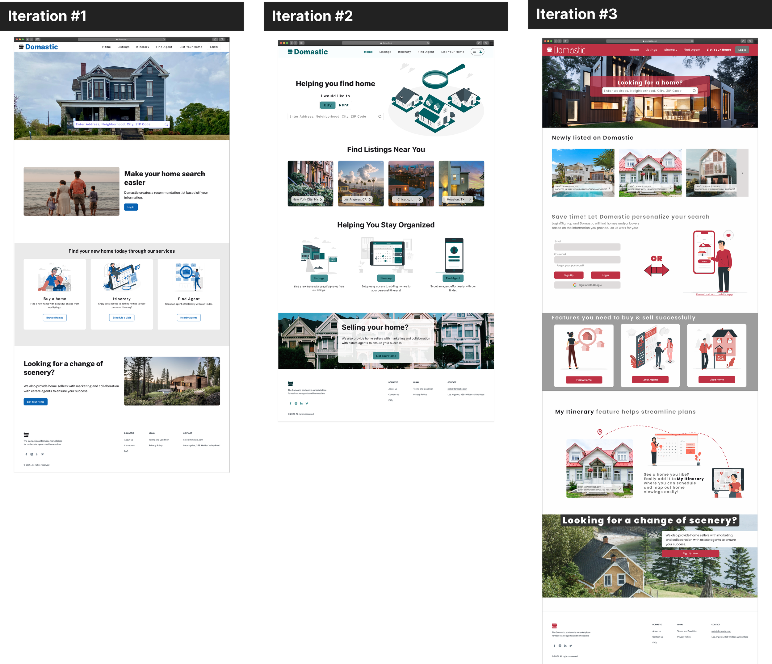
The client shared with us that they took inspiration from Airbnb and Zillow. We utilized these preferences to find areas of growth. We aimed to make Domastic user centered and diversified against competitors
High Fidelity
Hand Off & Reflection
Developer Hand-off
Once the final HiFis were approved, we began to annotate all of our work. We provided measurements between each of the elements on every screens so that the developer clearly understood how to properly space and align all items. We also annotated each feature on every screen so there were no unanswered questions on exactly how each of the user flows should function. The style guide was also shared with the client to maximize the developer hand-off process.
Reflection
Leading this project was a fulfilling task that emboldened my communication skills. I learned valuable lessons in working with a team, connecting with a client, and maintaining contact with project managers. The resulting product was intuitive, engaging, and greatly admired by the client. I'm fortunate to have grown in my leadership, research, and design skills.