The Details
Role
Lead UX Designer
Team
Design, PM, EM, QE, 5 Engineers
Timeline
June - August 2025
Tools
Figma, v0, Confluence, Zoom
Overview
As the OrderMyGear ecosystem grows, we need a single-source of truth that enables our internal users to view all of the accounts in our system. This single entry point will allow internal teams to view, manage and service clients in a manner that is efficient and most all, scalable with the ecosystem.
The Challenge
Currently, accounts in the ecosystem have identifiers that are individualized based on the solution, rather than unified based on their account. We need a method to consolidate multi-use accounts within the ecosystem to better service users.
The Solution
An internal global account service that establishes a single, global identity for every client across the app suite. This identity will communicate and synchronize with each of the OMG applications and 3rd-party tools to establish a single source of truth, enable an integrated user-experience, and empower internal teams to support their clients.
Discovery & Research
Kick-off
We began the research initiative by meeting as a team to understand the current methods of account management. Each application in the OrderMyGear suite required their own management system. As the ecosystem grew, this compartmentalization posed concerns for maintenance and required greater efforts from our client-facing teams to maintain. We spent time in each management system to better understand areas of redundancy across platforms, as well as areas that may no longer be needed as we looked to consolidate the management in to a single service. We recognized that each application serves a unique purpose, and aimed to unify the systems in a manner that does not neglect any of the individual needs of the applications.
Internal Stake Holder Interviews
Following the team meeting, myself and the team PM met with our Accounting, Sales, Client Success, On Boarding, and Support teams to understand how their day-to-day was effected by having to manage separate account management systems. Unsurprisingly, our teams had become accustomed to the cumbersome system. As users walked through their processes, they recognized areas of improvement and the lengthy account set-up process for the Pop-up platform was of particular note. Ultimately, users were excited at the potential of a more efficient system, but hesitant that key pieces of user information and billing would be overlooked. We assured users that we were carefully reviewing each system and were prioritizing maintaining features, over a haphazard removal of features in the aim of consolidation.
Ideation
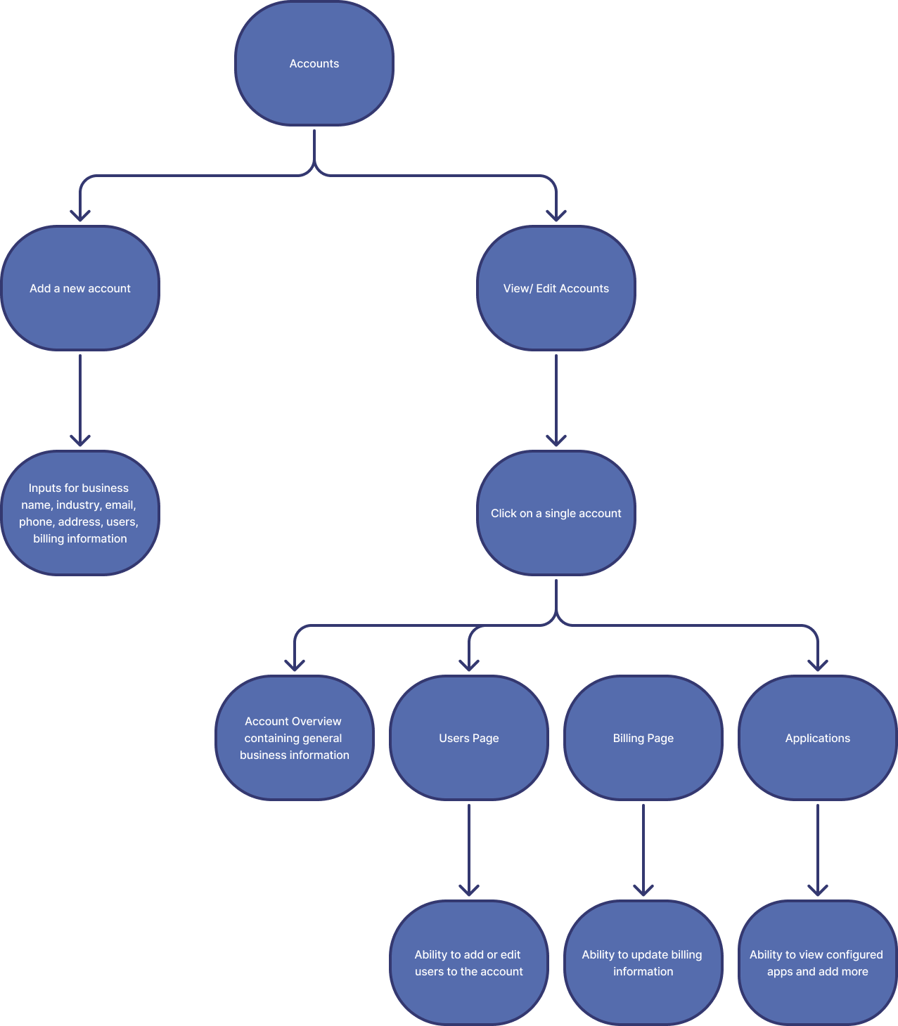
User Flows
After meeting with our client-facing teams, we understood the key-elements of account set-up and management. I took the information and began to organize the user flows for how our users might navigate to each of these key pieces. I met with the team’s PM and EM to gut-check the user flows and following their confirmation, I began to work on the account service prototype.
Mock-ups
We utilized v0 to quickly prototype a working model. This aided internal-stakeholders in conceptualizing the account management service and elicited excitement. Users were able to click through the prototype, better understand how we aimed to unify the app suite under a single source of truth, and air any concerns they had. By utilizing v0 we were able to more quickly get to user interviews.
Design
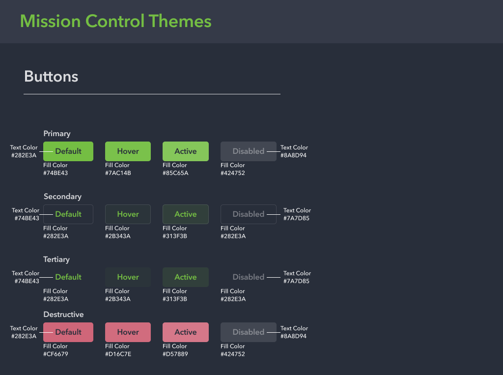
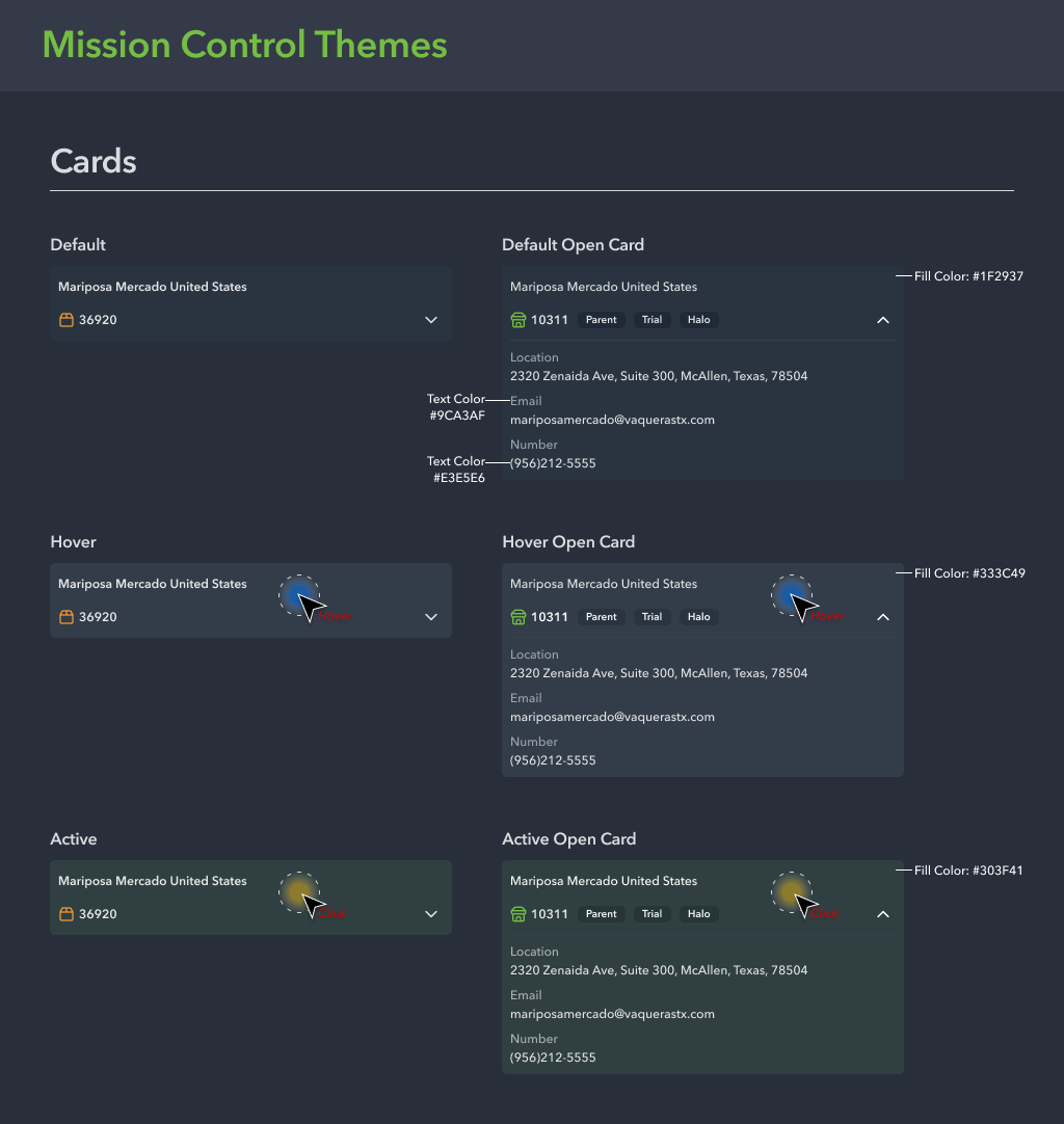
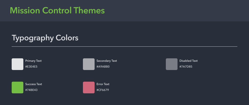
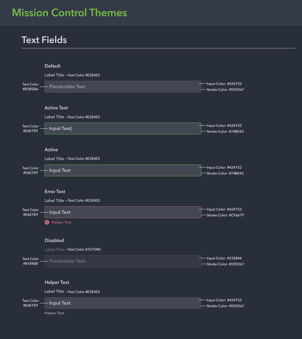
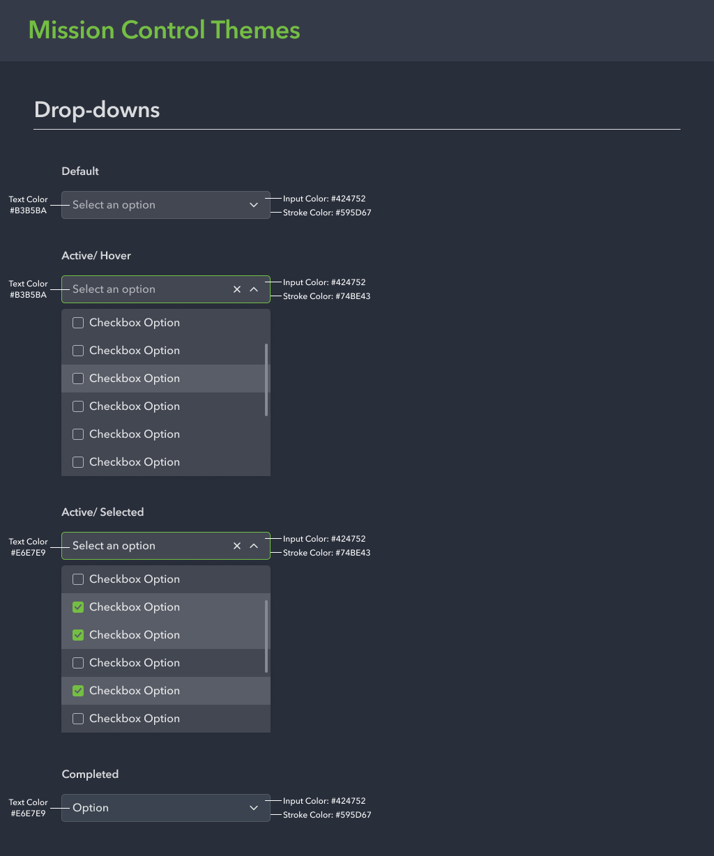
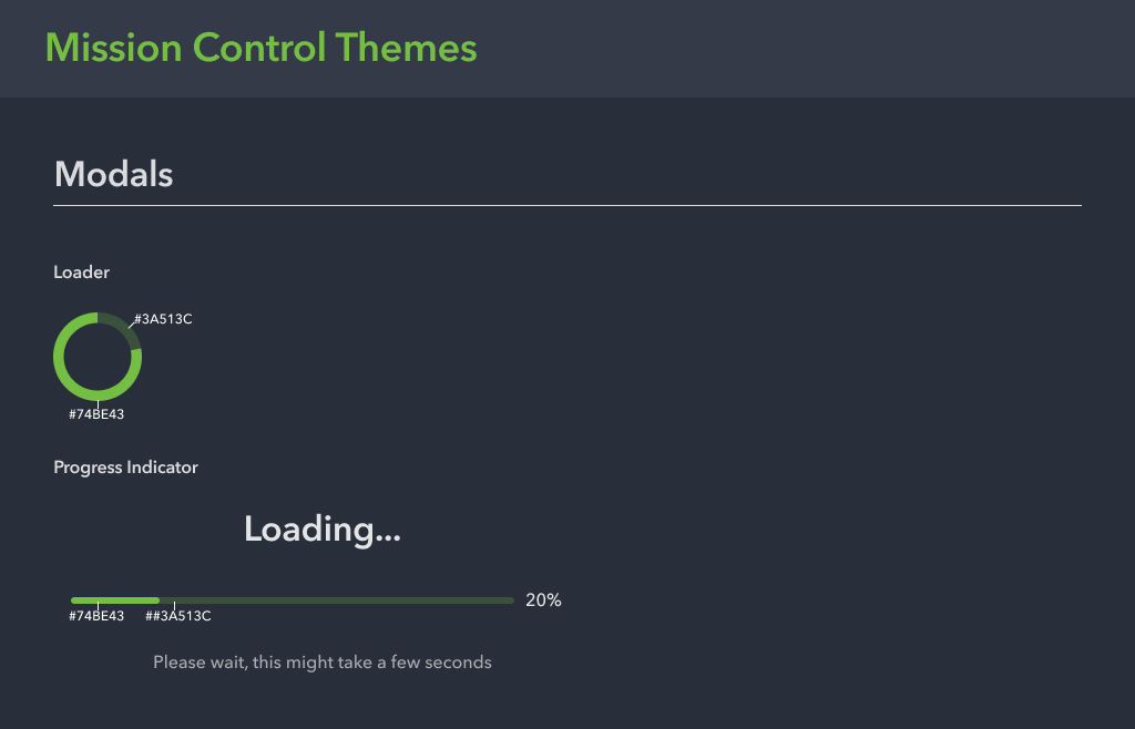
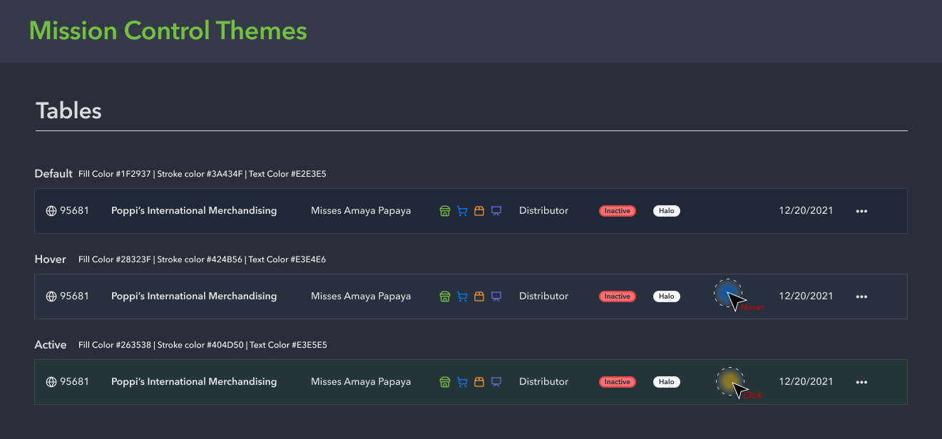
Style Guide
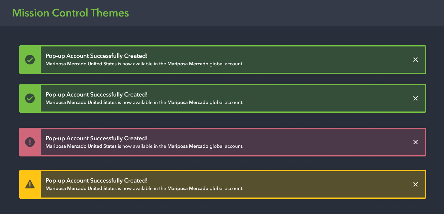
In addition to ensuring Global Account Service met all of the primary user needs, because it was an internal tool, our PM tasked me with refreshing the UI. This served as an exercise for both myself and our engineering team to implement UI that was up to date, deviated from the constraints of our current design library, and sparked joy from internal users. I opted for UI elements that would not pose too much of a technical constraint to our engineering team by utilizing Lucide icons and ShadCN UI elements. The toughest battle I faced was creating a dark-mode component library from the ground up that matched OrderMyGear’s branding.
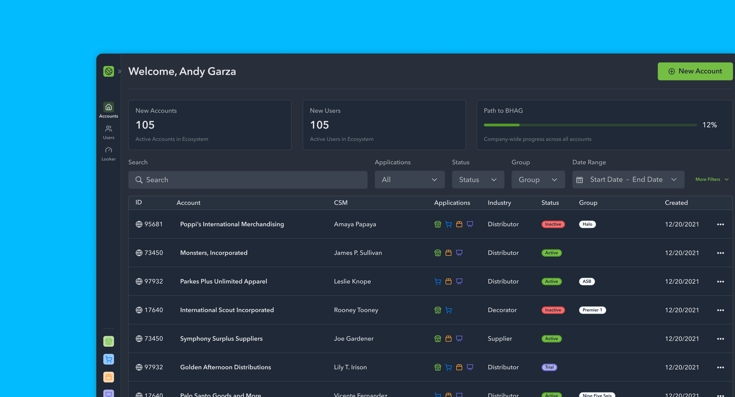
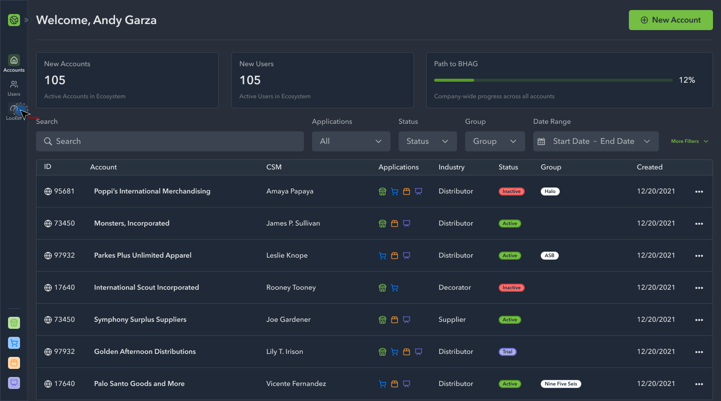
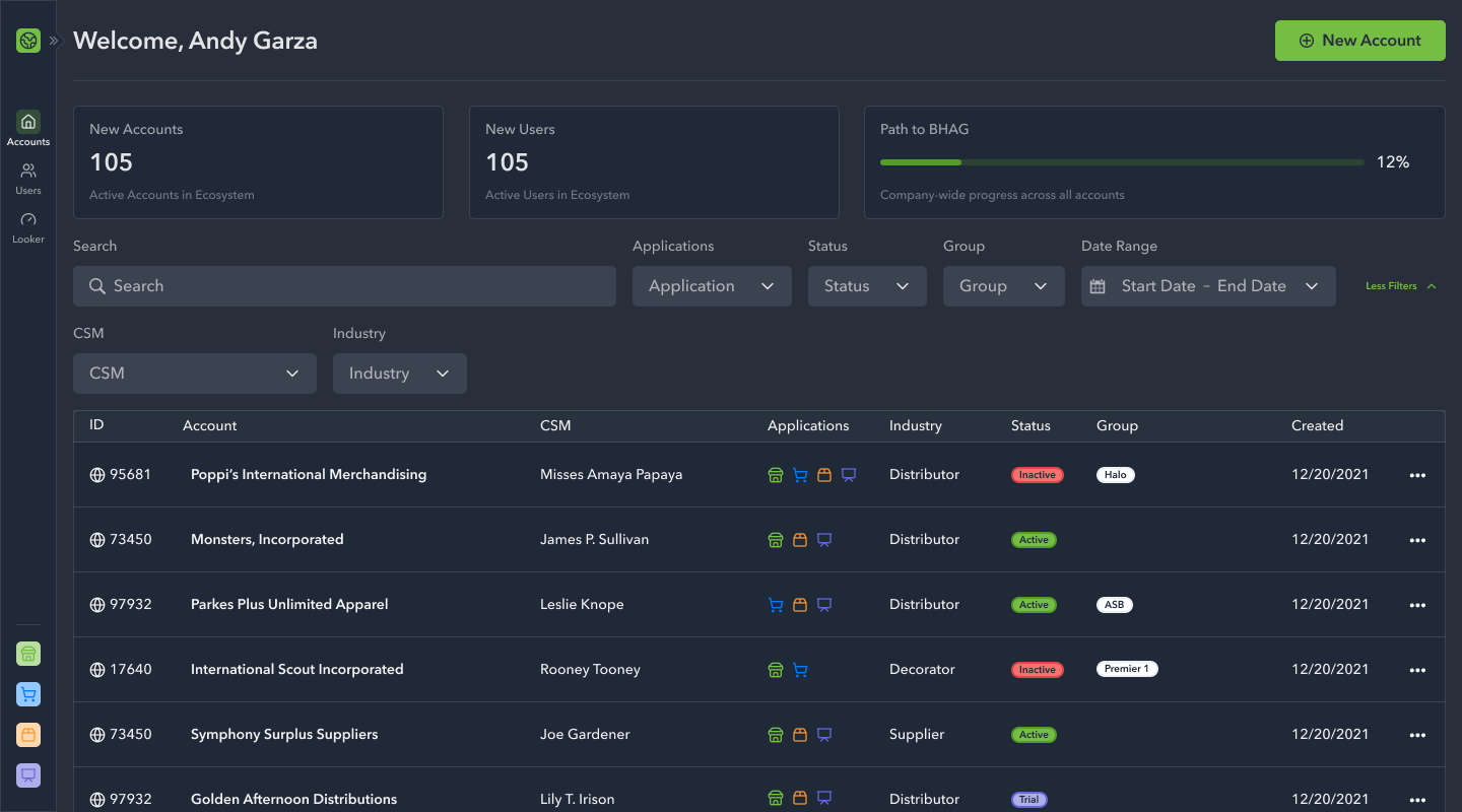
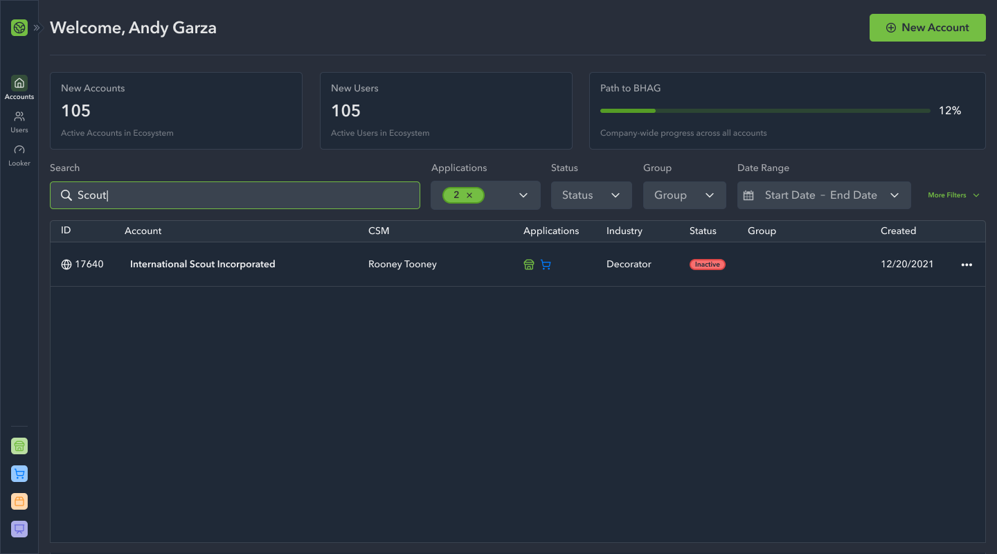
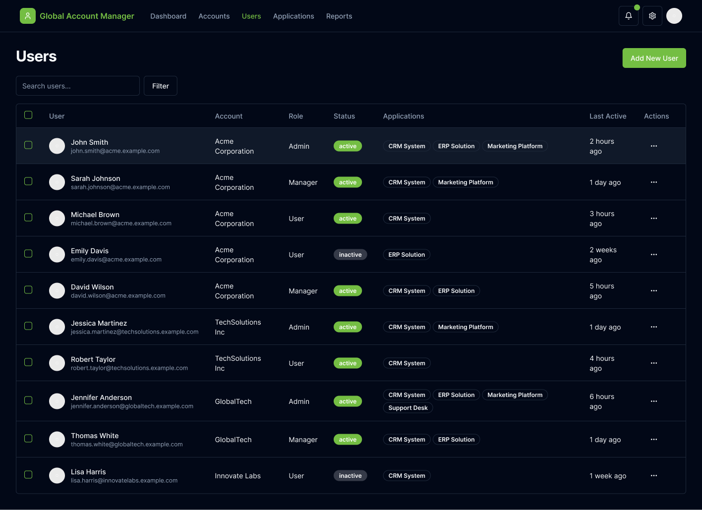
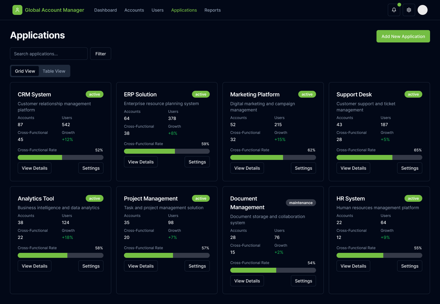
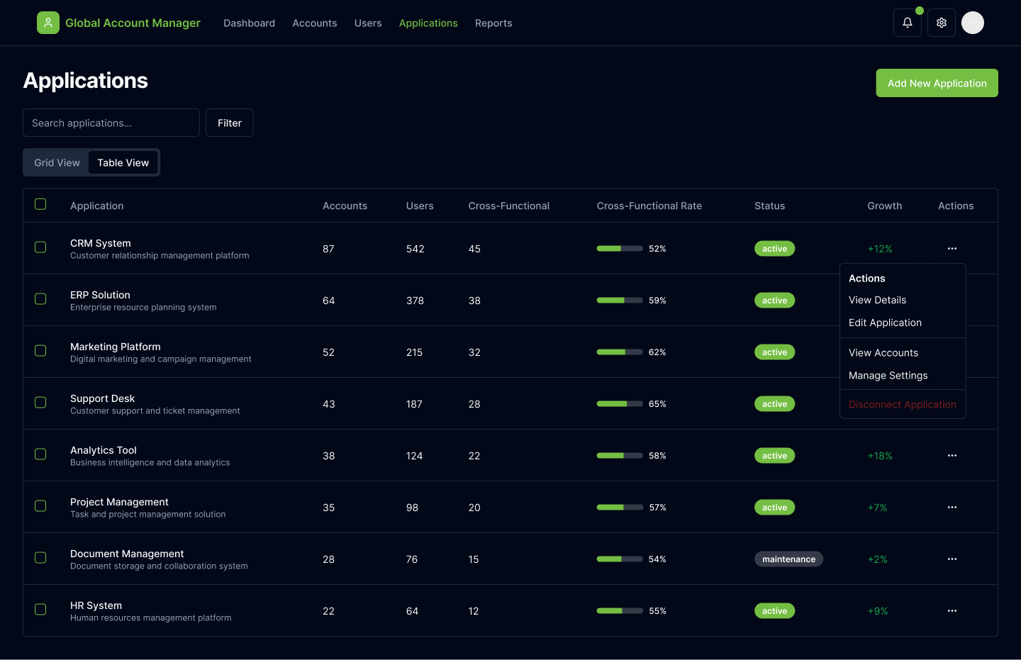
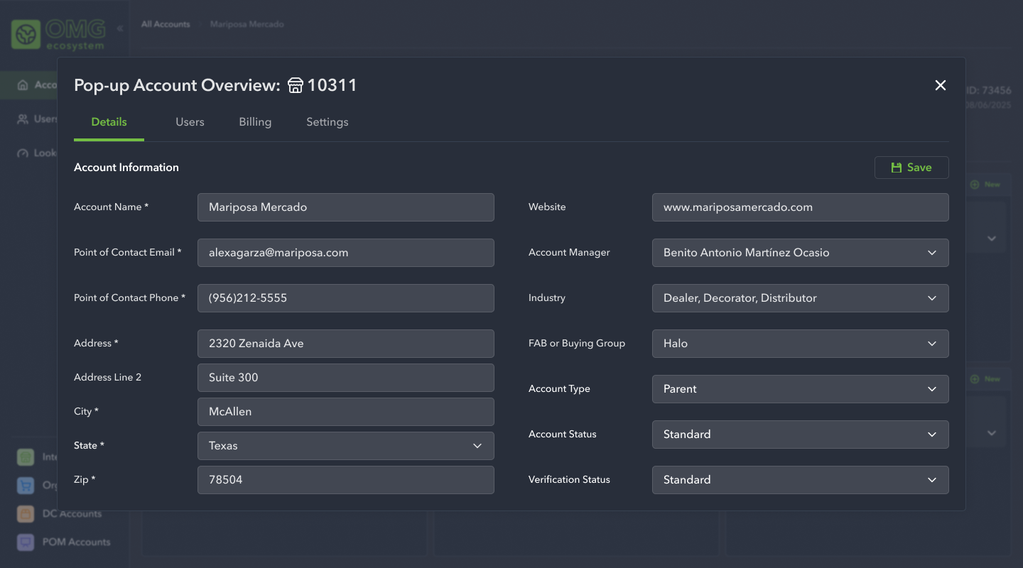
High Fidelity Designs: Phase 1
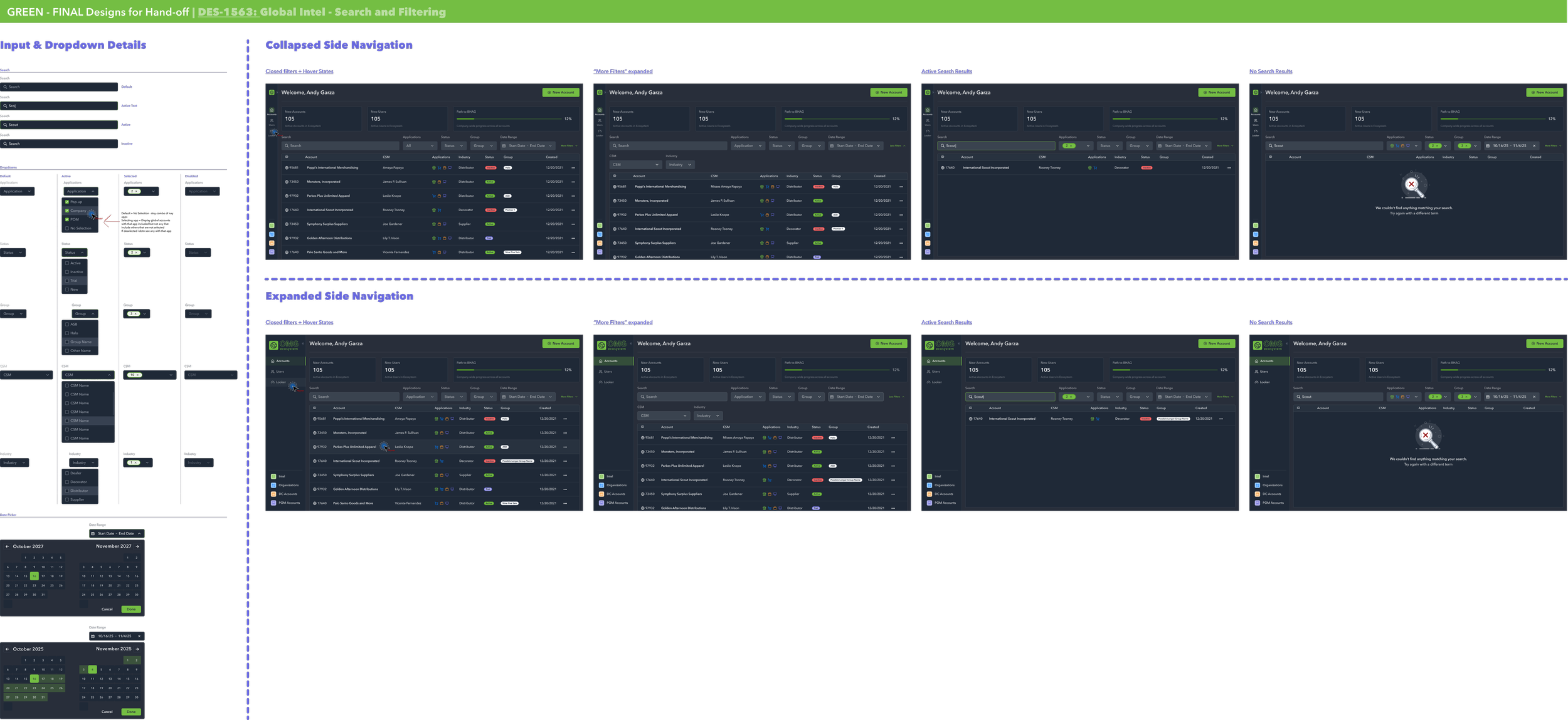
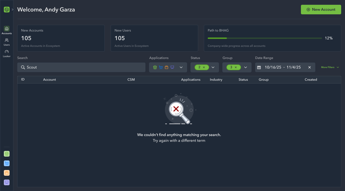
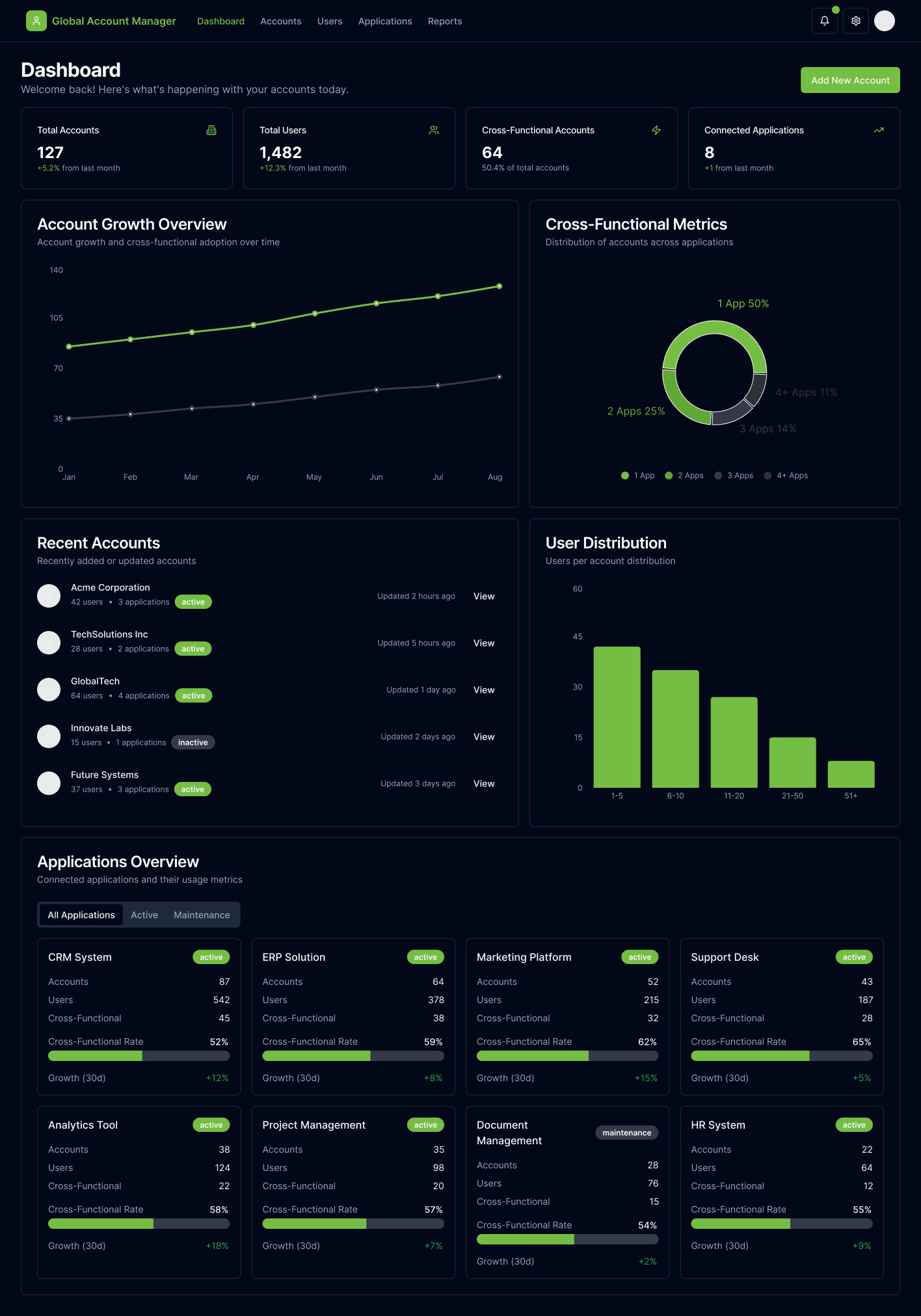
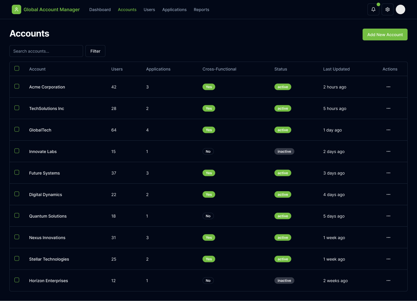
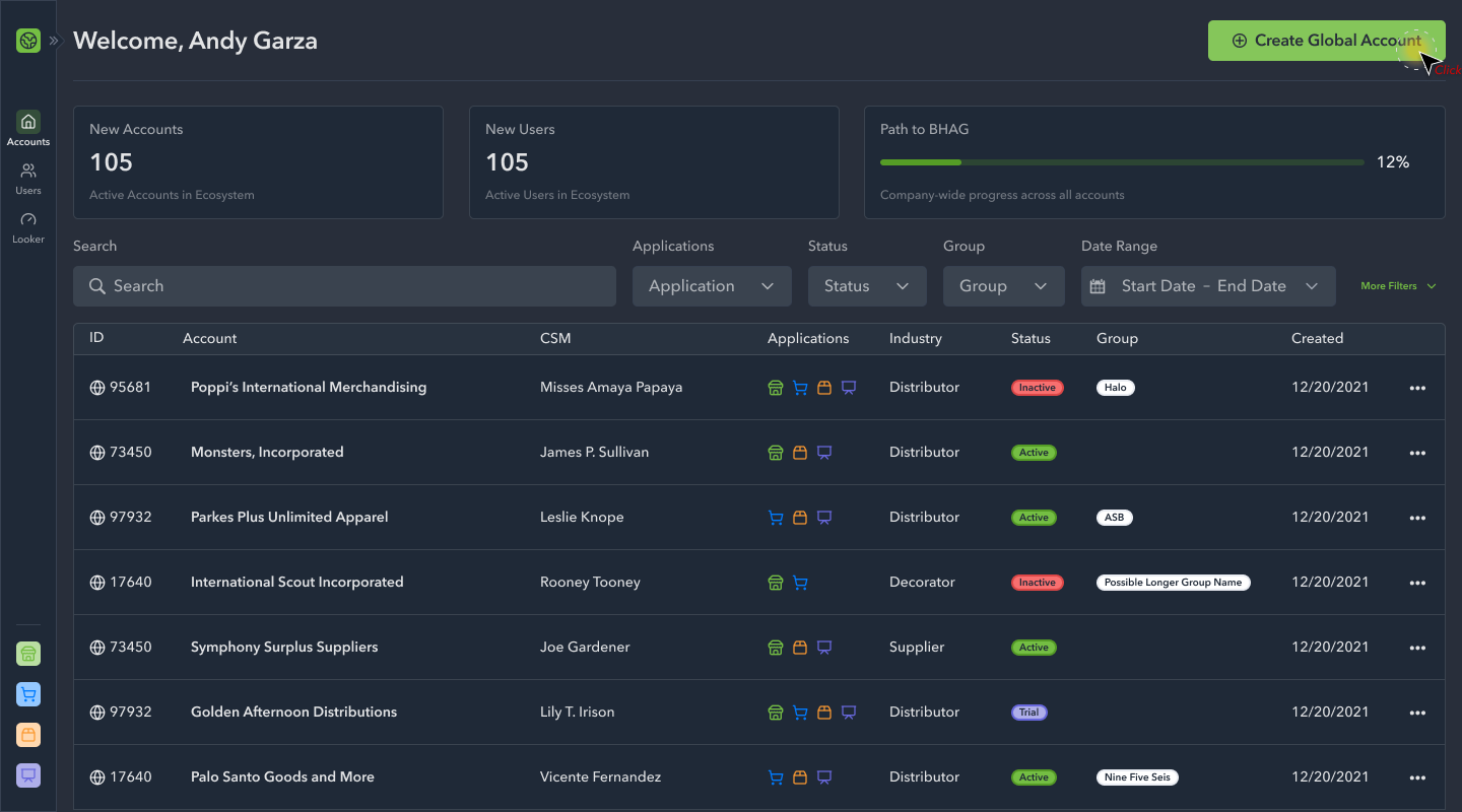
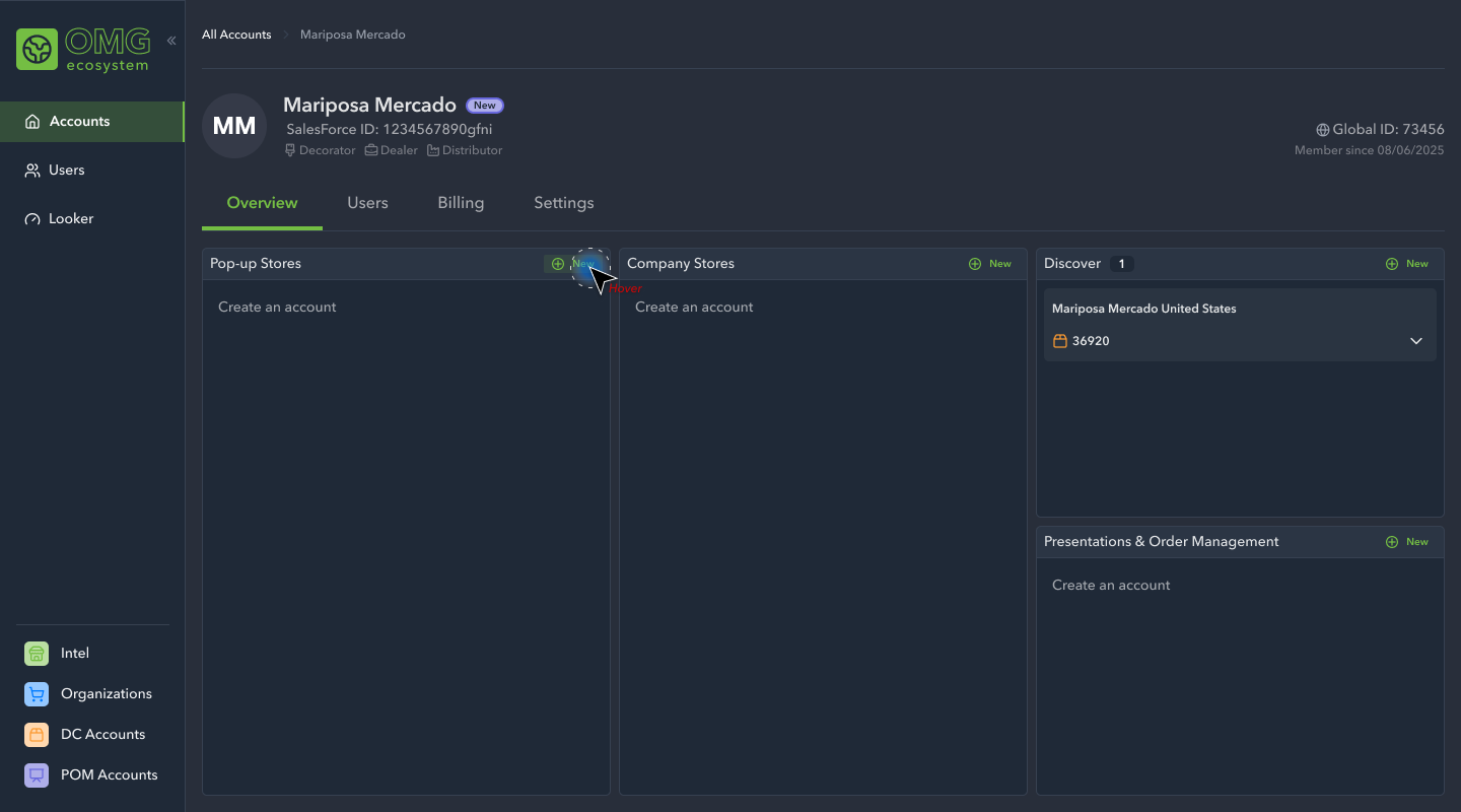
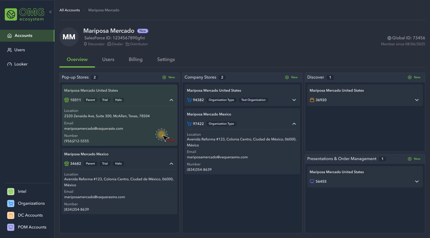
We kicked off the design initiative by establishing the navigation, the home page, and the search experience. This gave the engineering team a starting point as we continued to explore the primary actions of account set-up and management under a unified system.
High Fidelity Designs: Phase 2
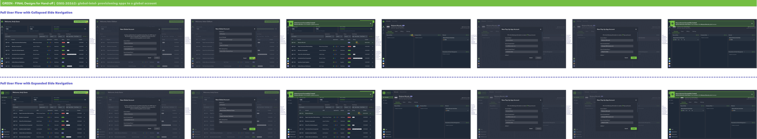
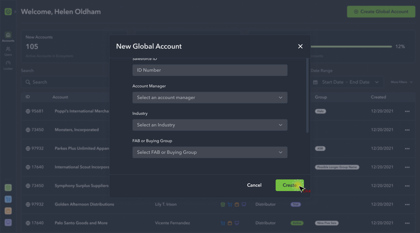
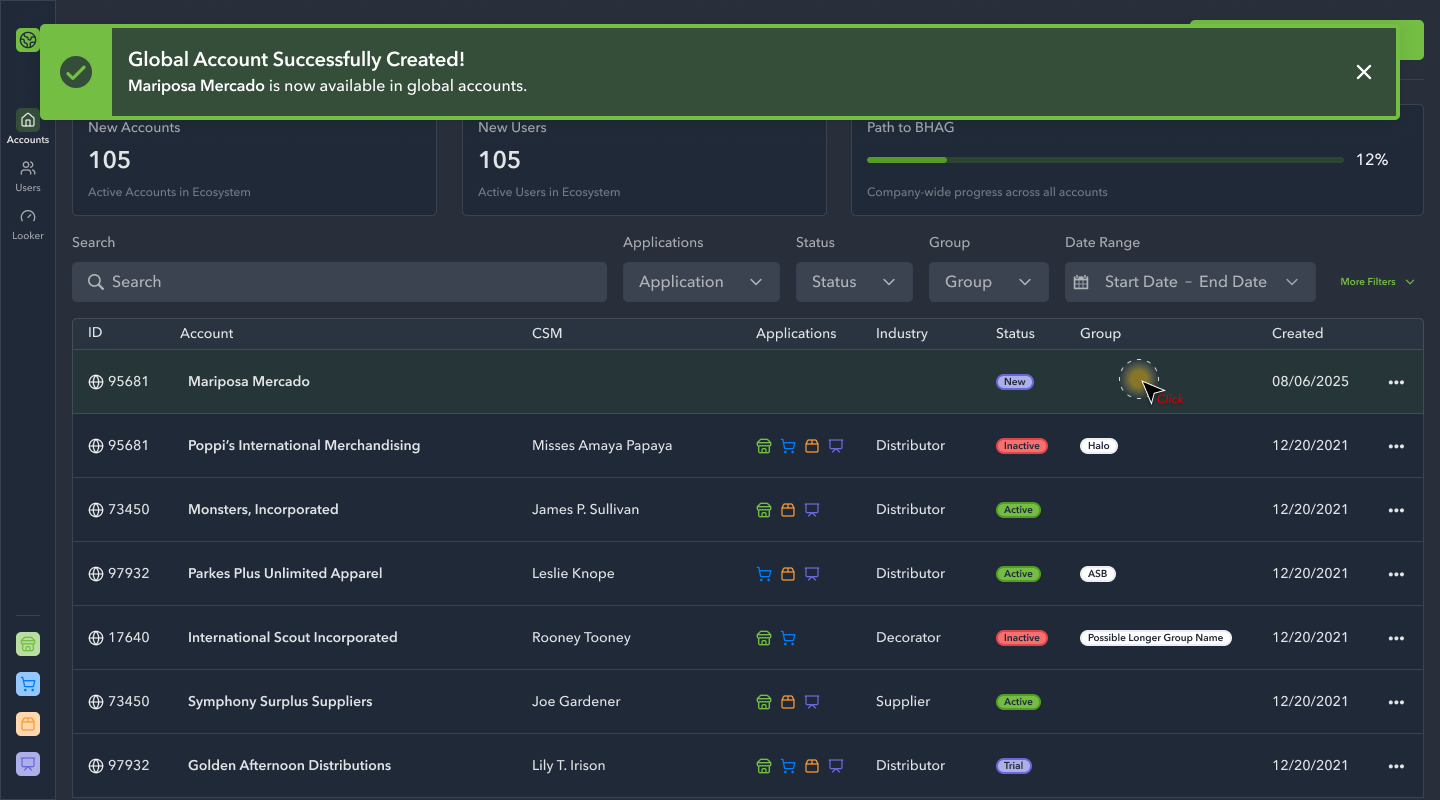
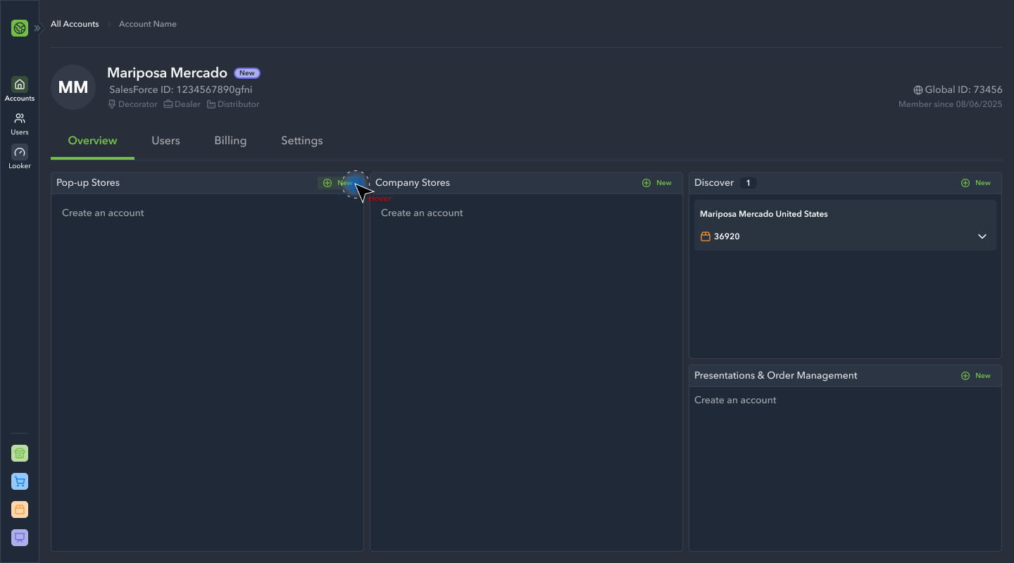
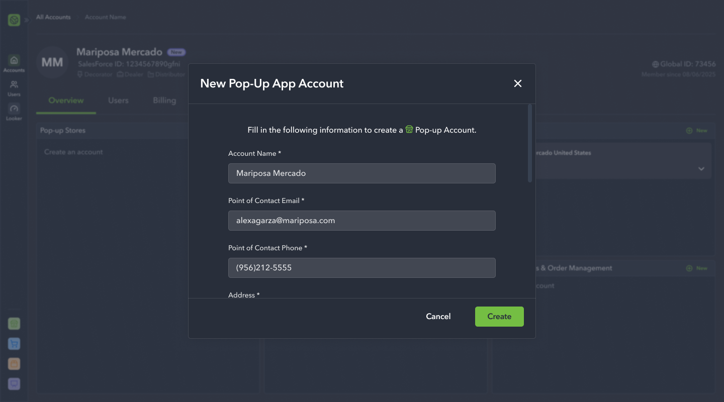
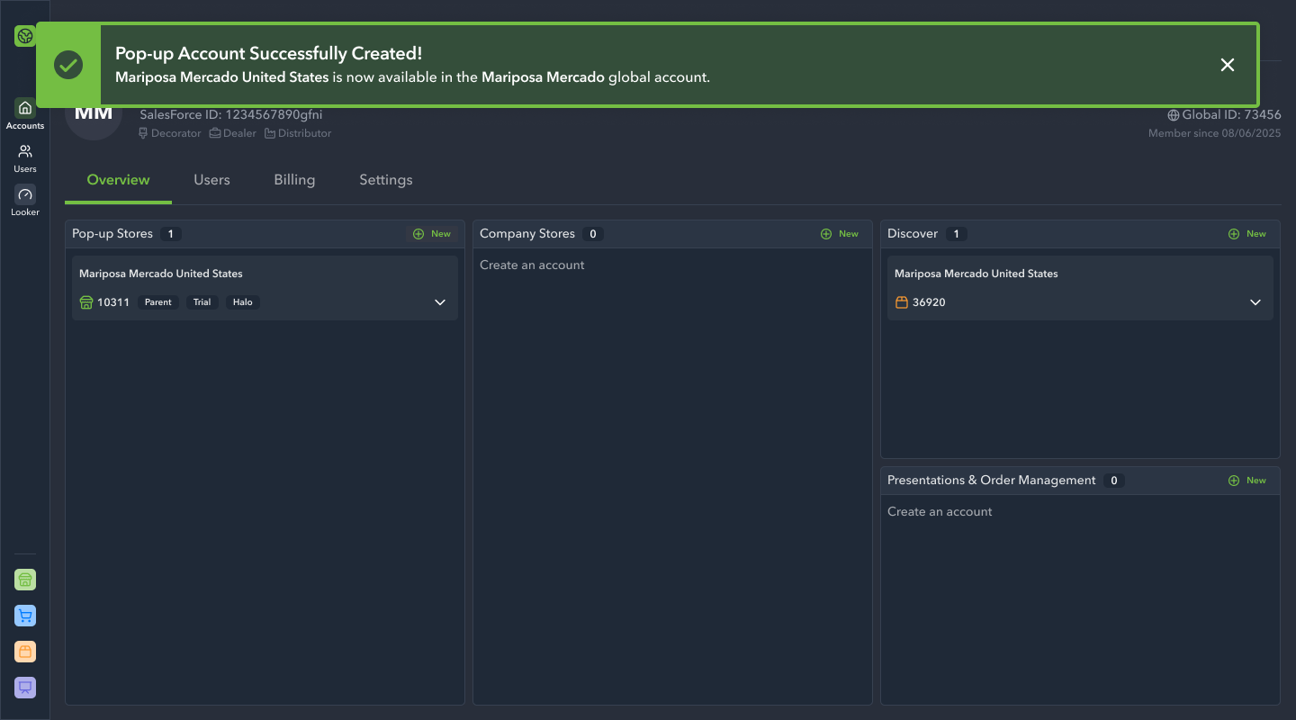
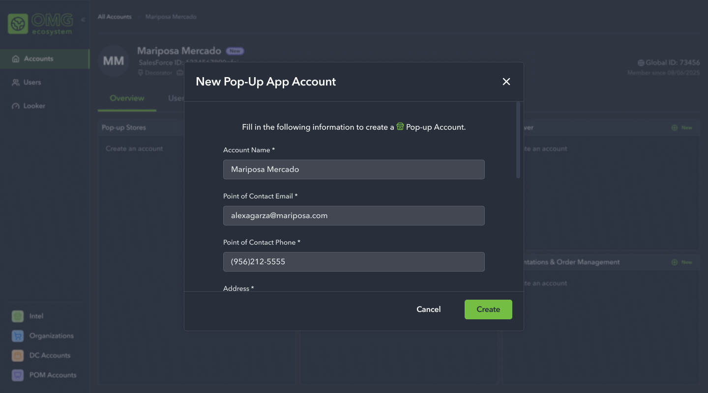
The next initiative we focused on was account creation. This included creating a new user account from the homepage, as well as provisioning app accounts to an already created account.


High Fidelity Designs: Phase 3
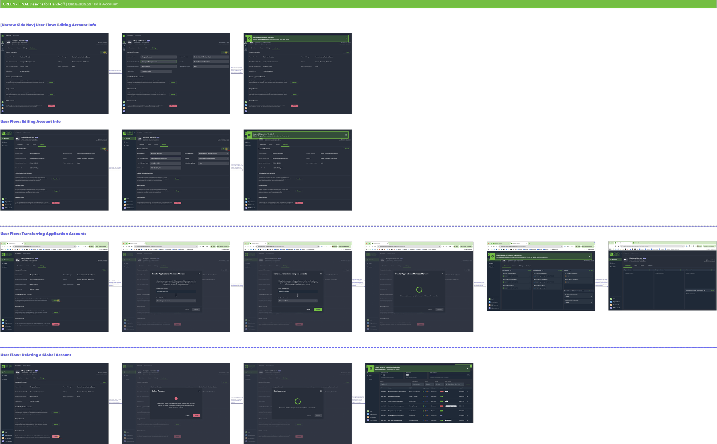
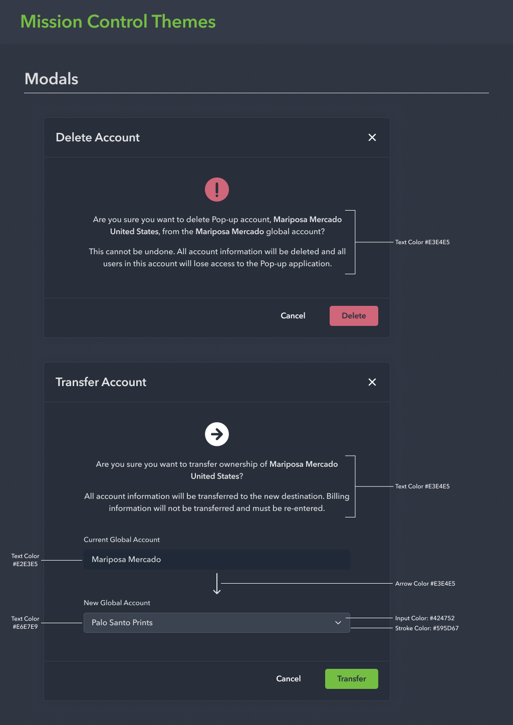
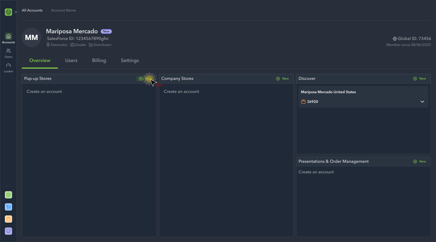
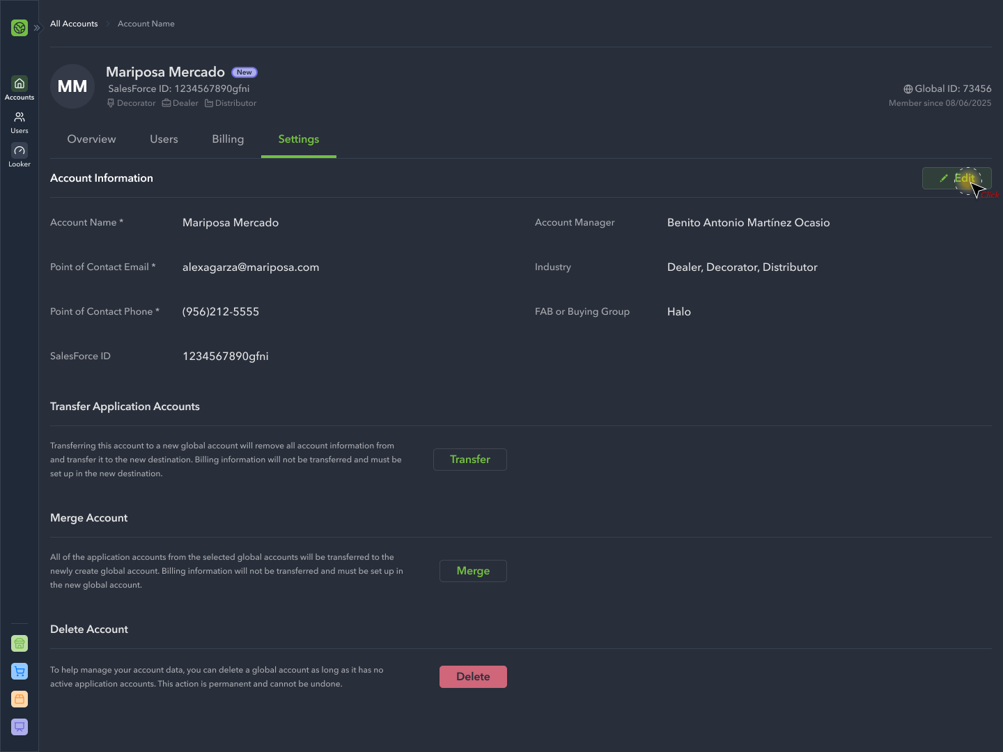
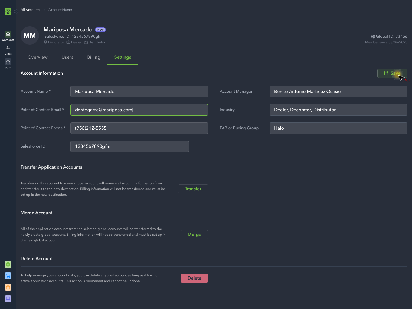
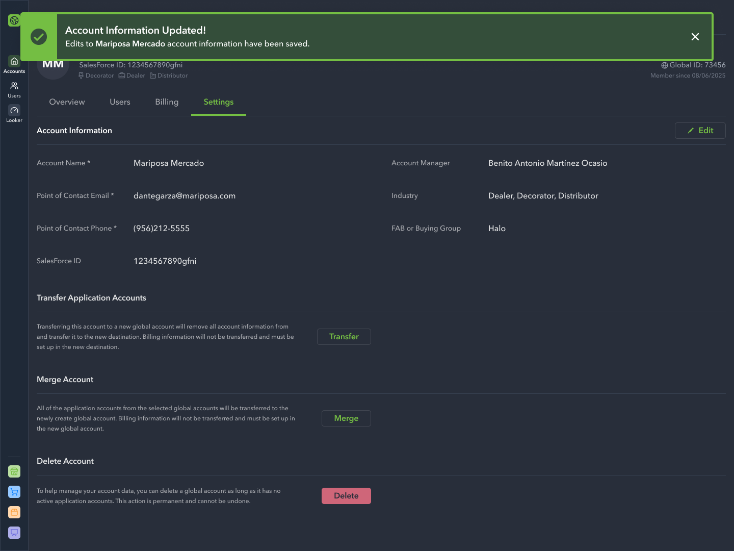
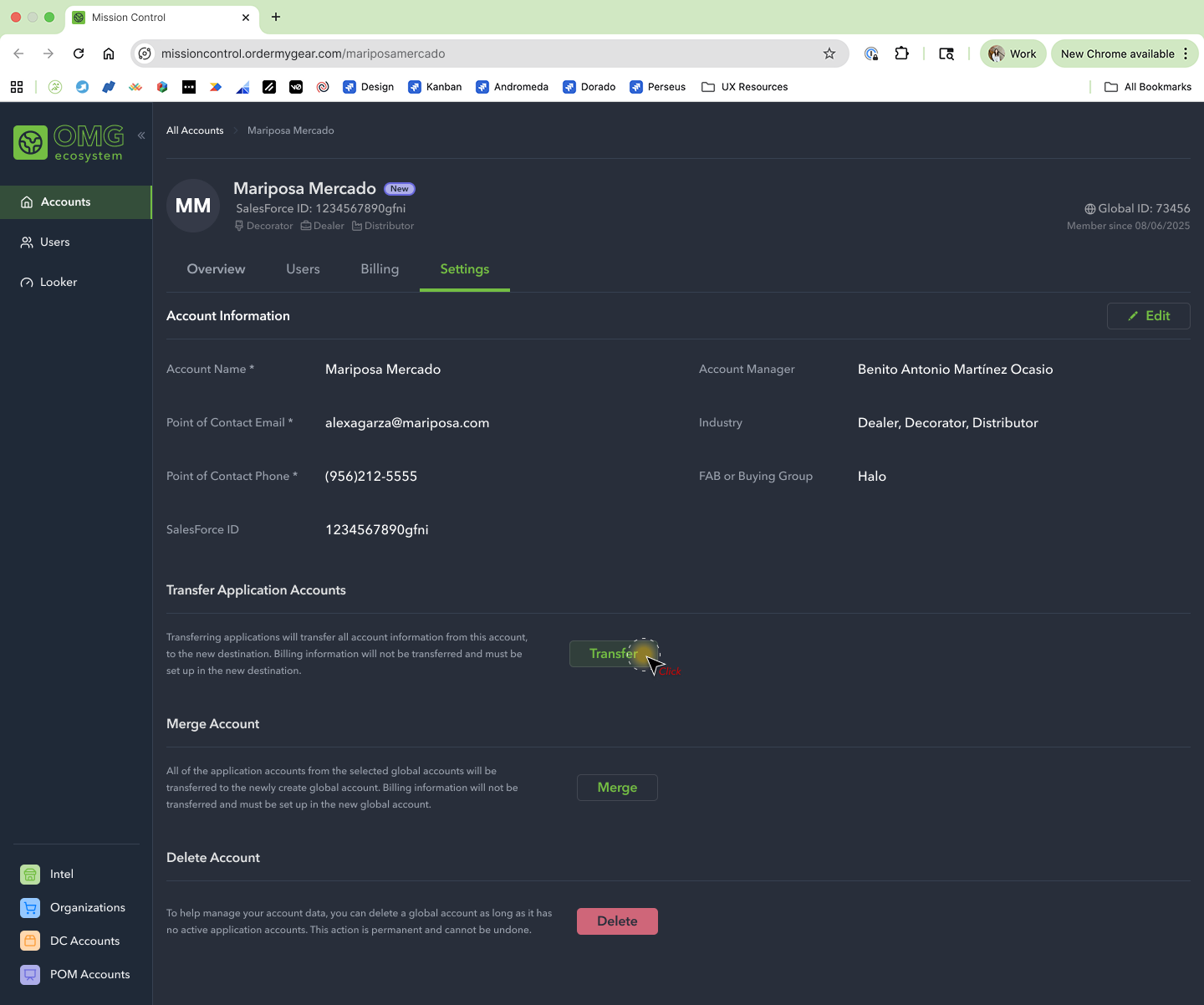
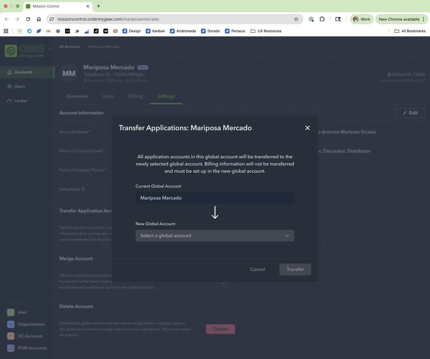
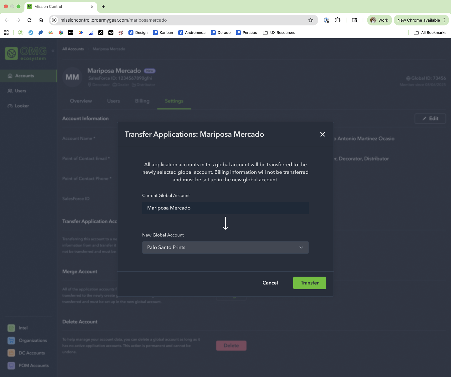
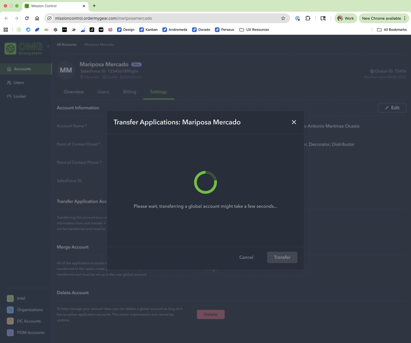
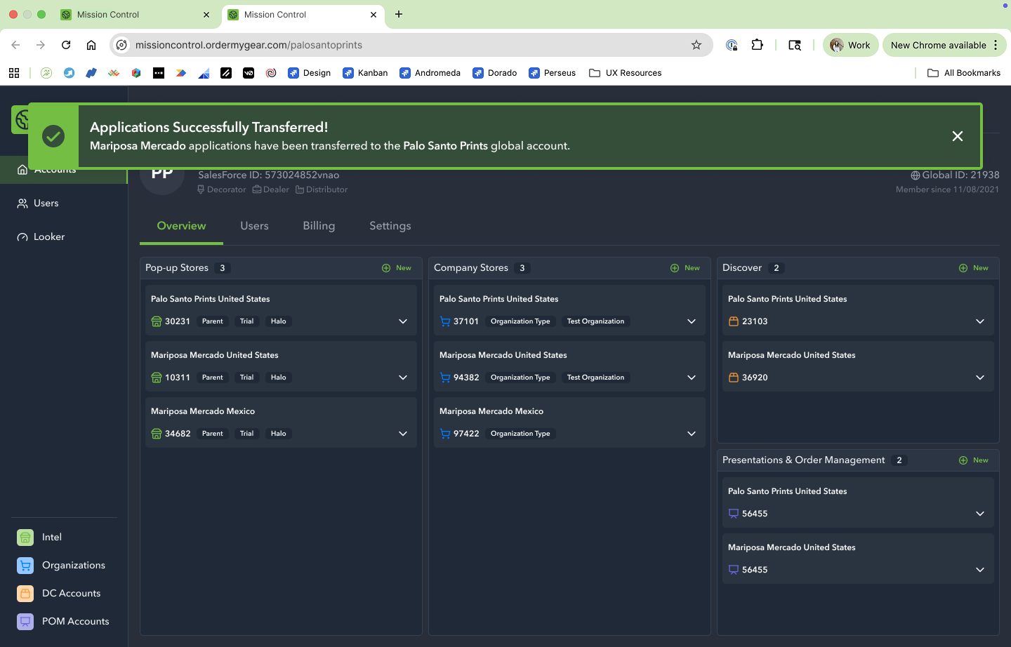
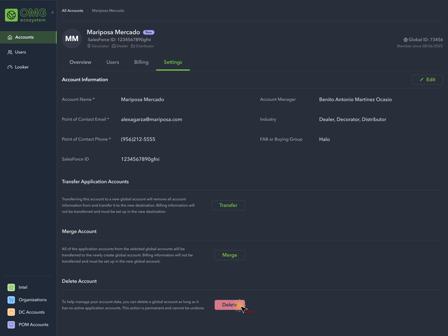
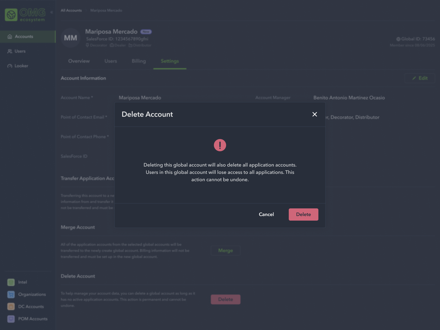
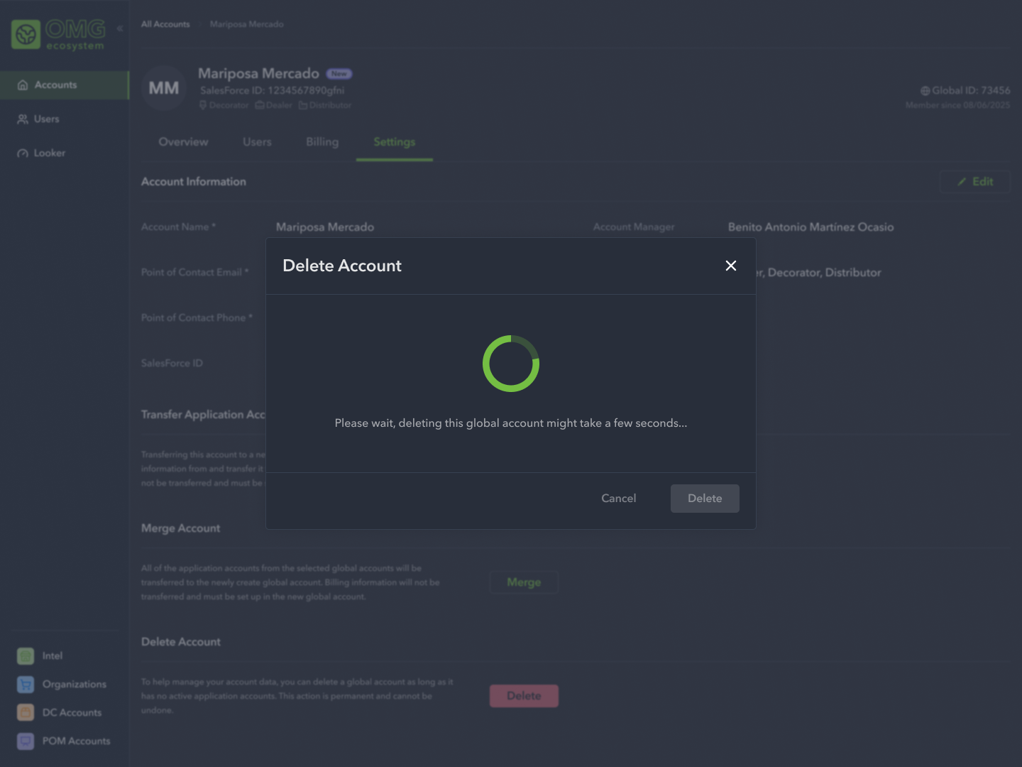
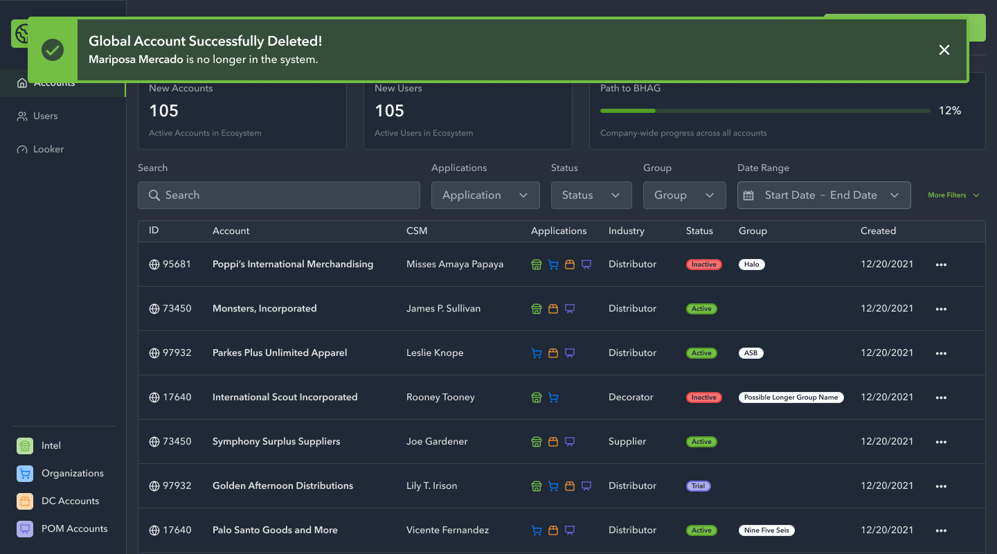
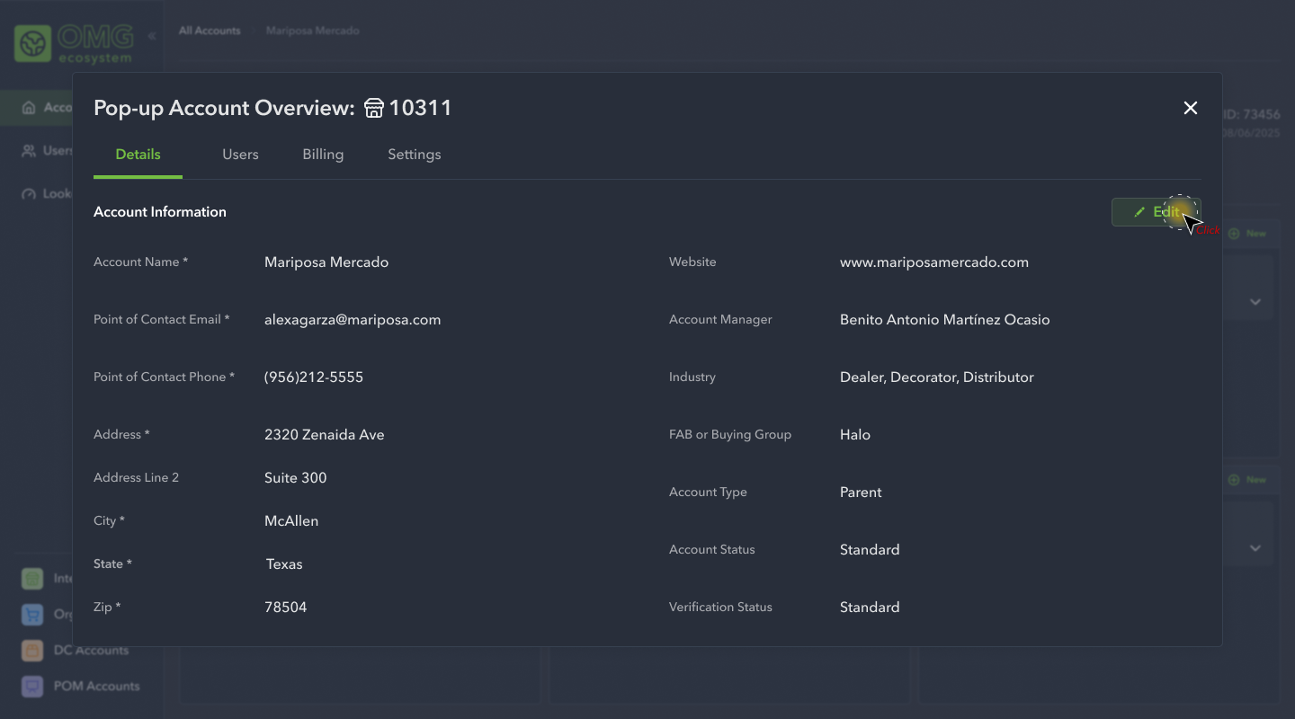
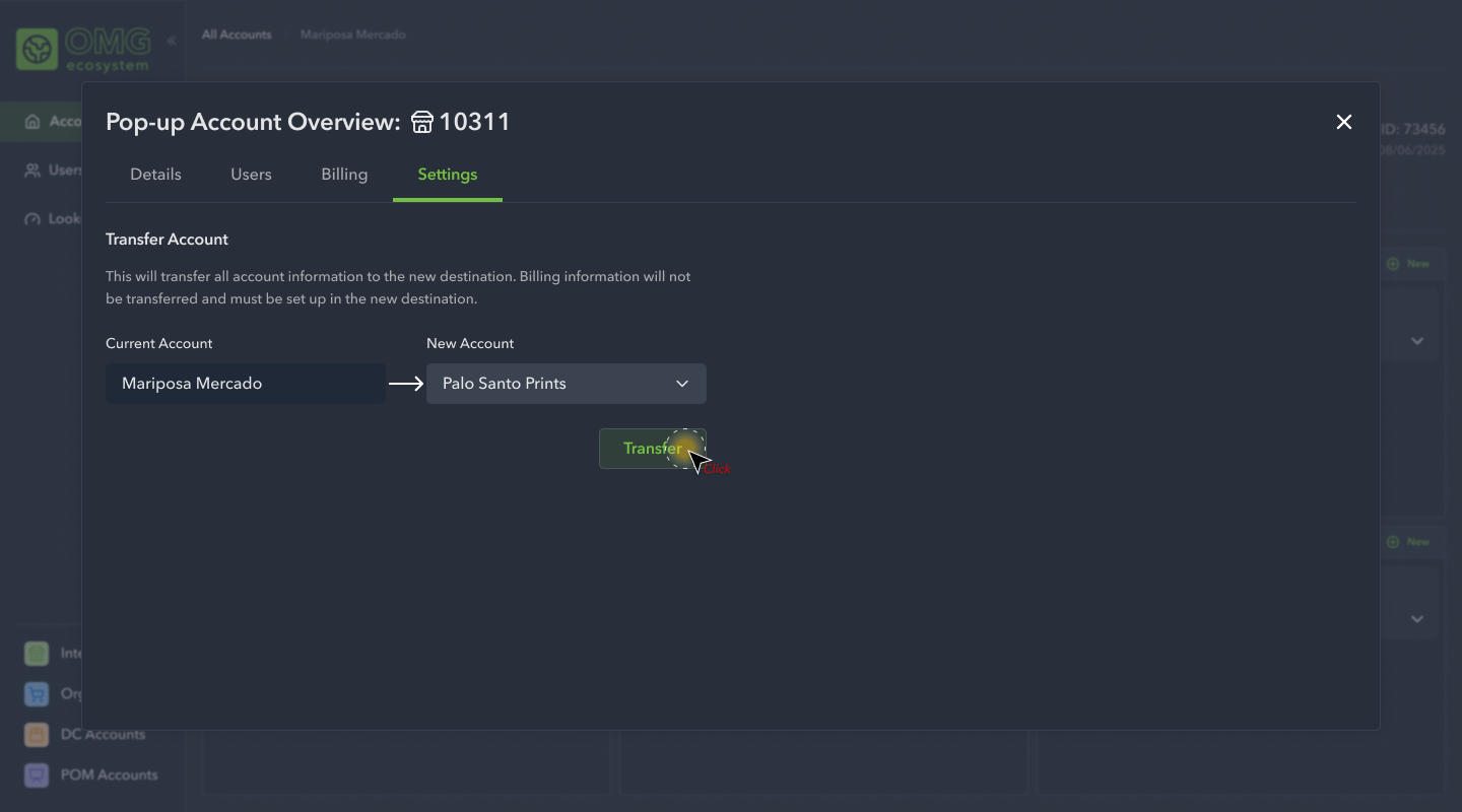
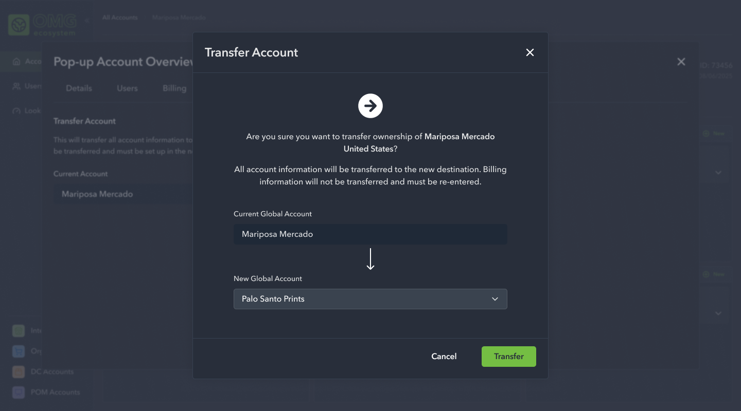
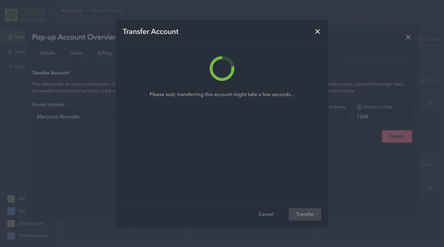
The third initiative we focused on was how users would edit account information, how users might transfer accounts, and how to delete global accounts.
High Fidelity Designs: Phase 4
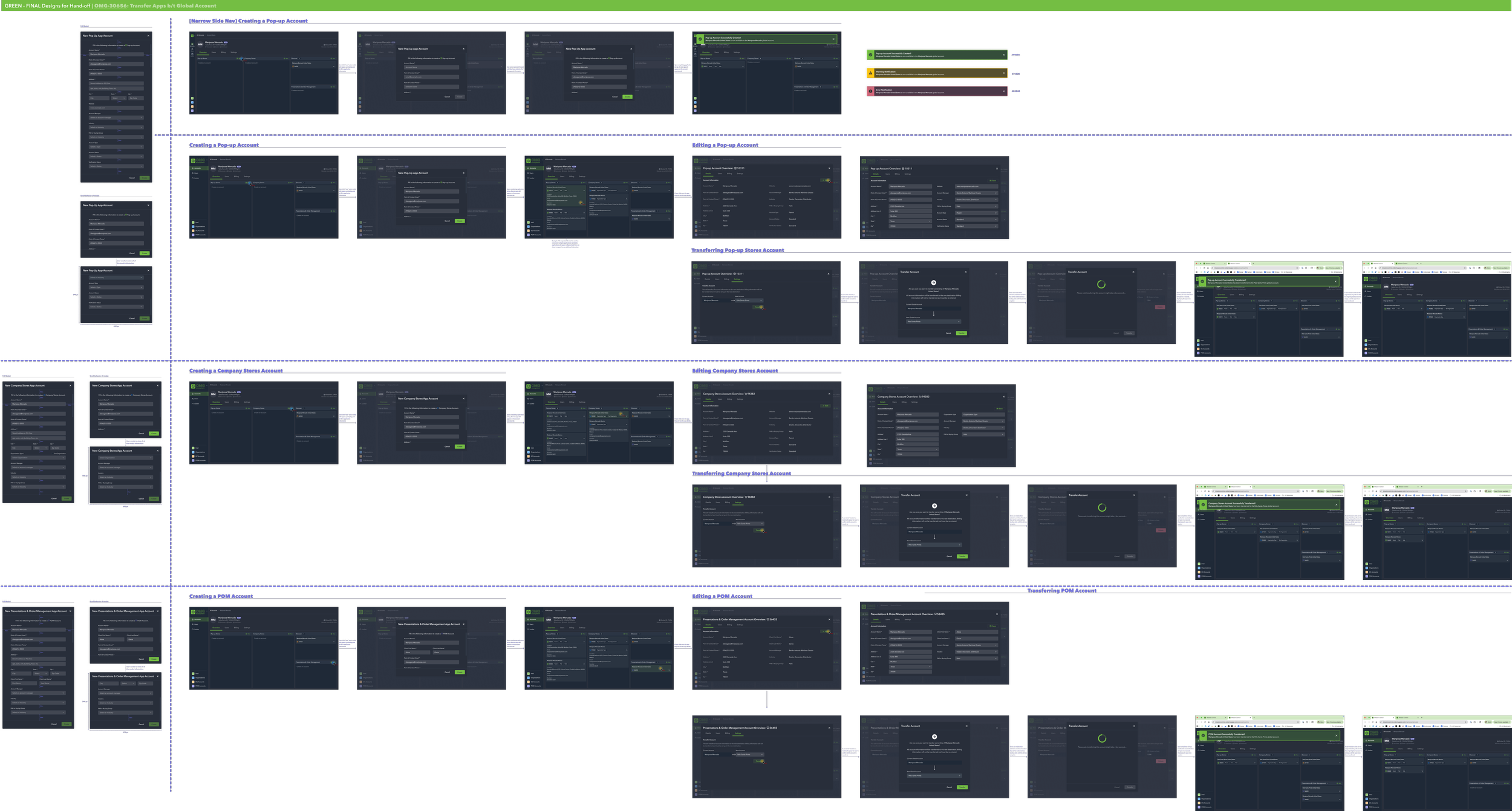
Finally, we rounded out the initiative by working out how users would create and edit app accounts, within a larger global account. Each app required unique information so we took care to ensure the process was clean, efficient, and did not neglect an critical pieces of information.
Hand-off
Following each major phase of the design process, the team would meet to review the newly completed work. Our PM would kick-off the meeting by providing context to the engineers, and I’d take over by reviewing the user flows with the team. This gave us the opportunity to air any questions or concerns, as well as determine the priority in how we might approach the work. Following the conclusion of the meeting, once the work was fully refined and pulled in to a sprint, I’d meet with the engineers on an as-needed basis to review and approve their work. The team was provided a style guide and fully annotated Figma file of the design work for their reference.
Refinement & Planning