The Details
Role
UX/UI Designer, Researcher
Team
4 Designers
Timeline
August - November 2022
Tools
Figma, FigJam, Zoom, Slack, Loom
Overview
LIFO is a food delivery/pick-up service that connects Indian college students with local businesses. Their app is dual-facetted, offering a business profile for vendors and a student profile for clients. LIFO aims to create a mutually beneficial relationship between students and small businesses by centralizing all of your food service needs into a single platform.
The Challenge
The client is currently testing out the minimum viable product for both the business and student accounts offered by their app. She would like us to focus on making the vendor side as intuitive as possible for easy onboarding and order tracking and improve the flow and functionality of the student side. For both, the client would like to improve the overall user interface.
The Solution
After conducting competitive analysis, we designed a platform with key features in mind:
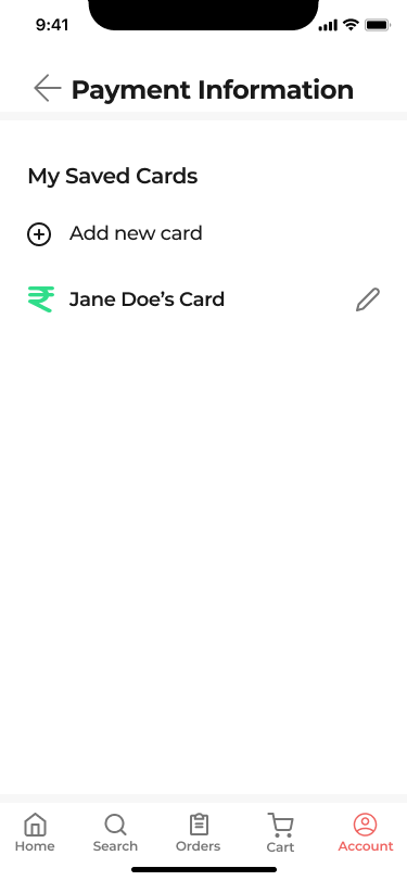
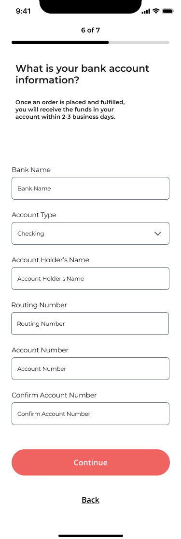
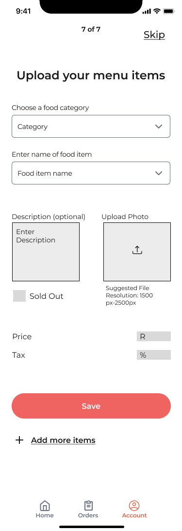
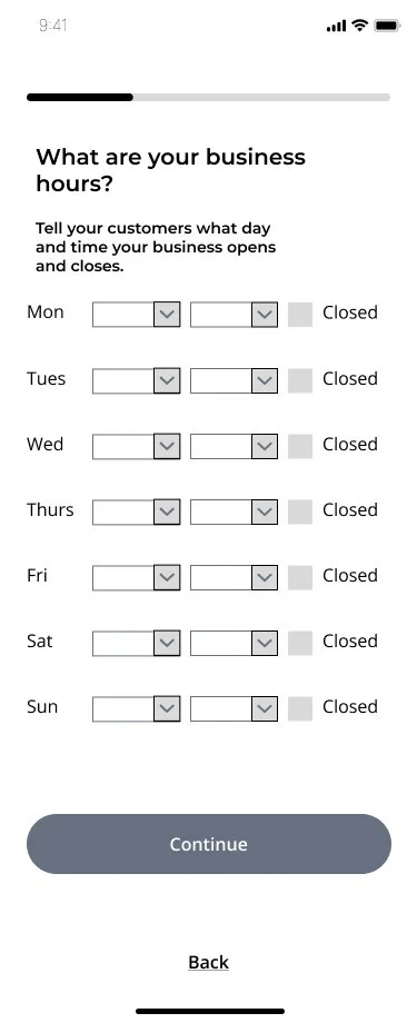
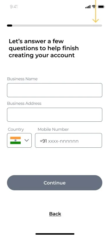
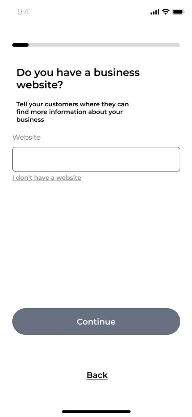
Vendor Side
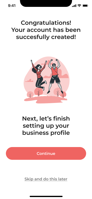
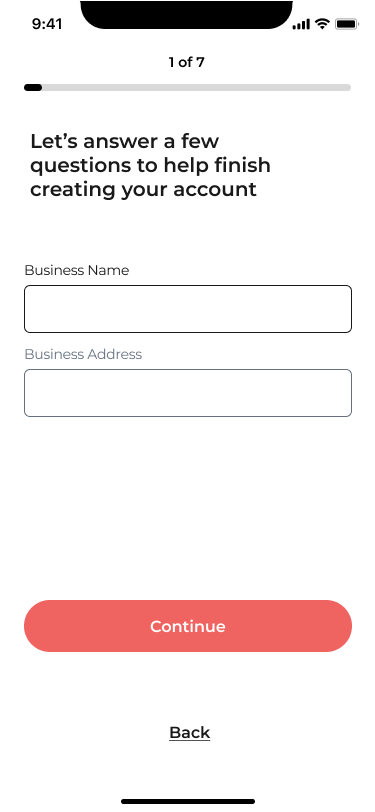
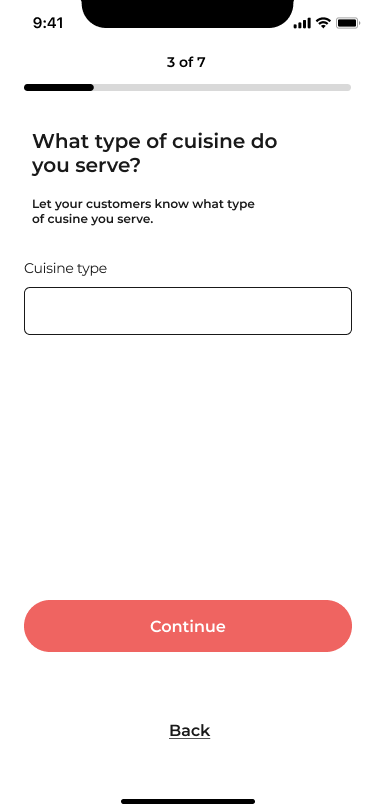
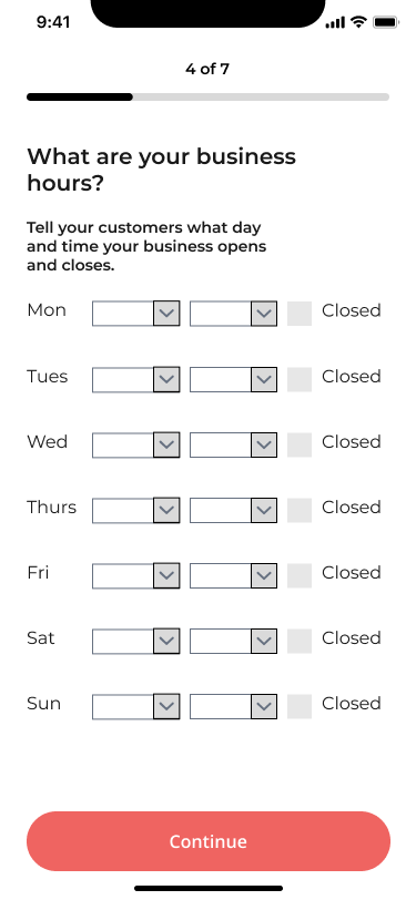
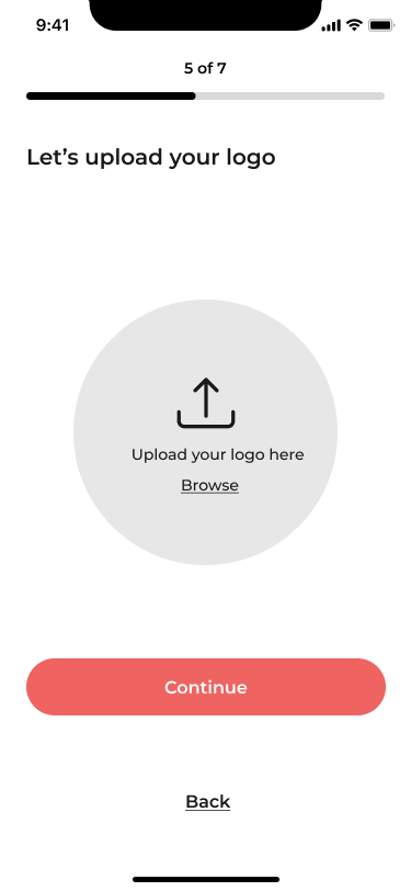
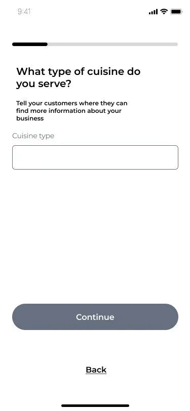
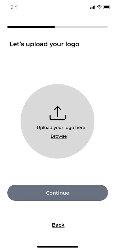
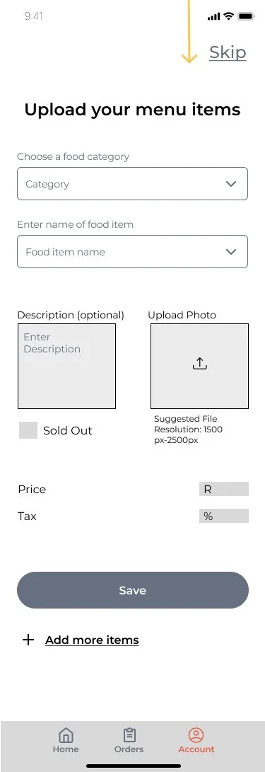
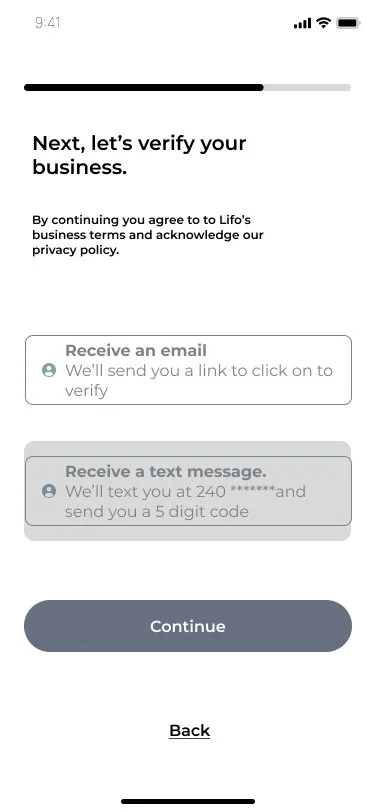
An intuitive business profile set up to help a technologically novice population get their restaurant online.
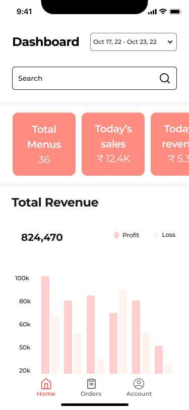
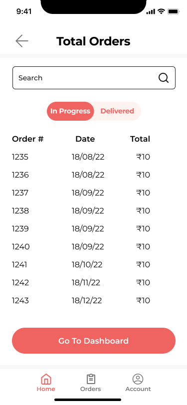
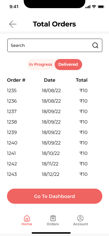
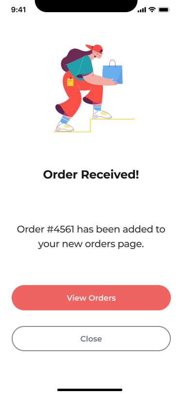
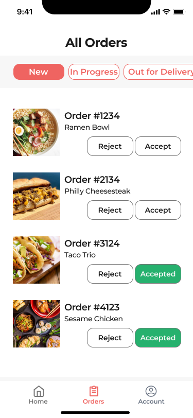
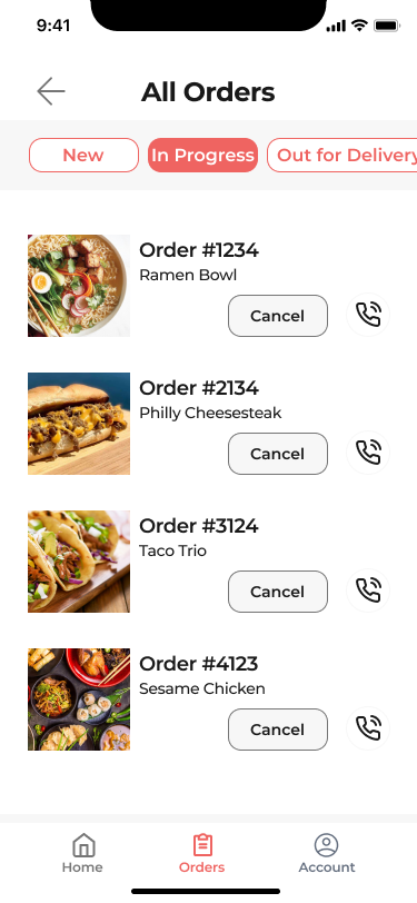
Order tracking and a total sales dashboard to create a one-stop shop for businesses to track their growth.
Student Side
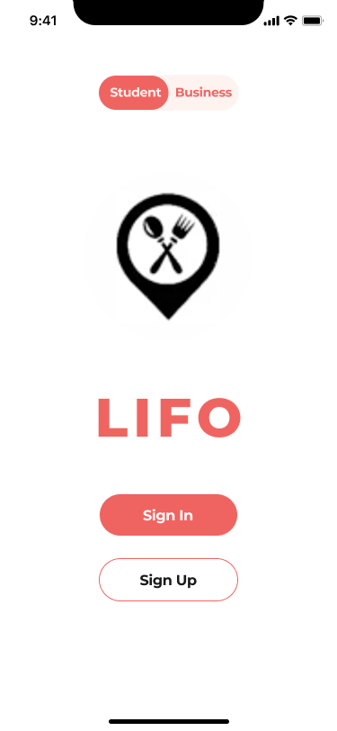
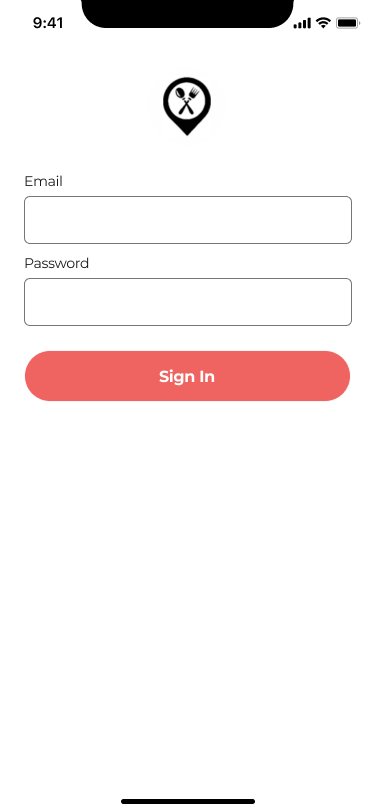
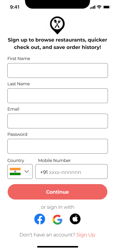
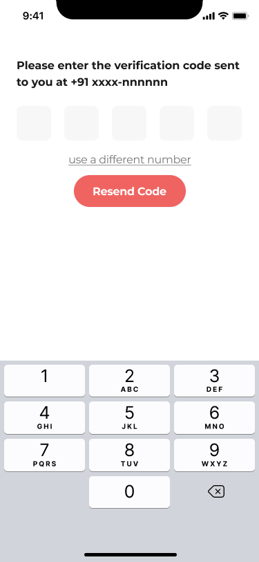
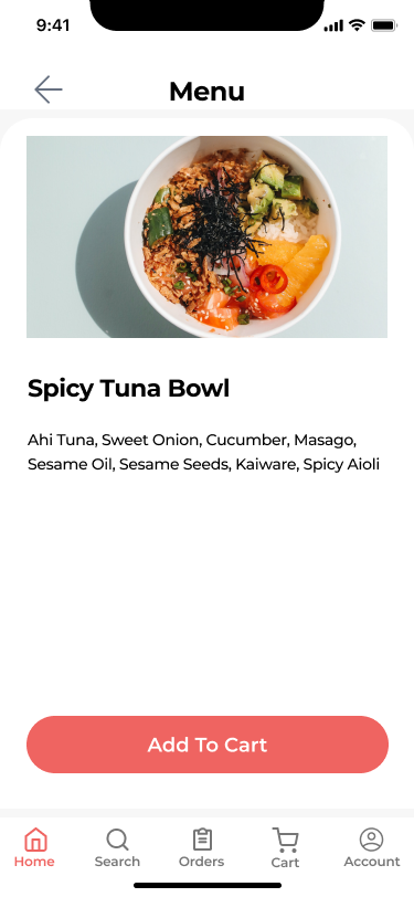
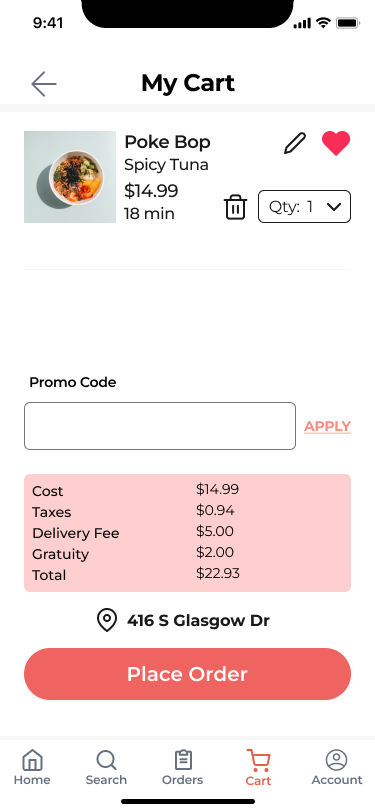
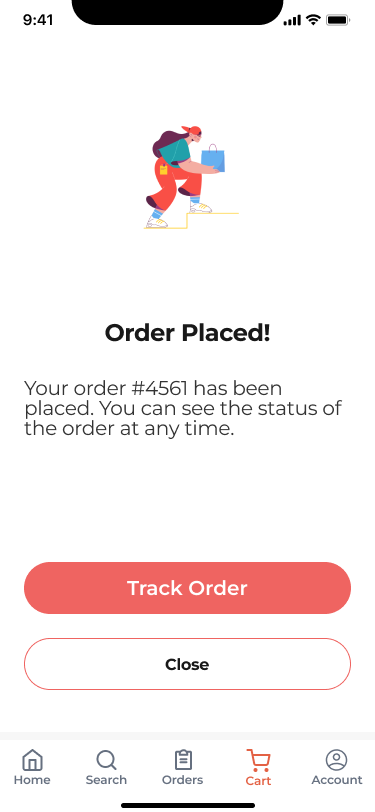
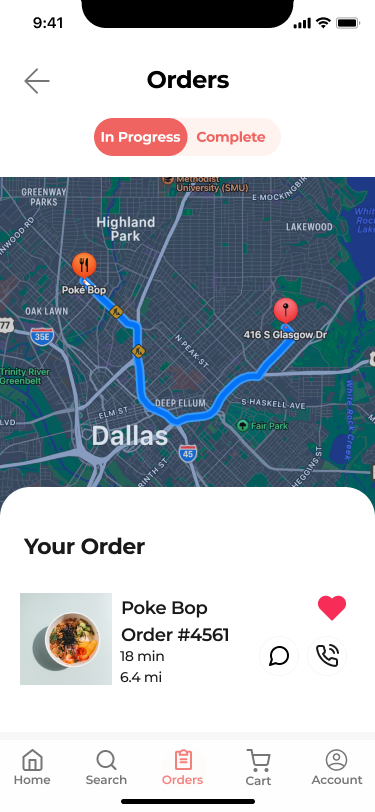
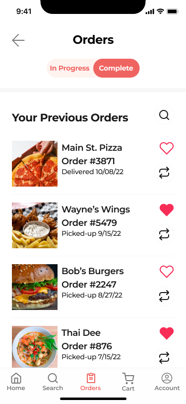
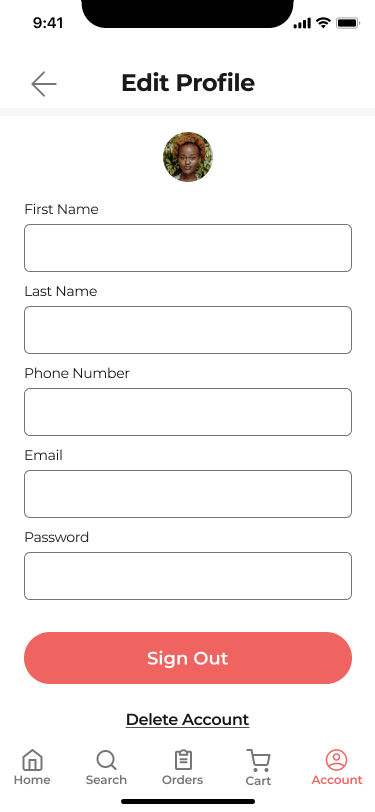
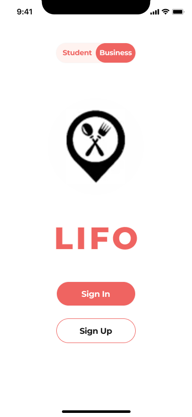
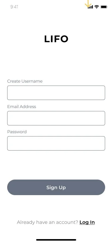
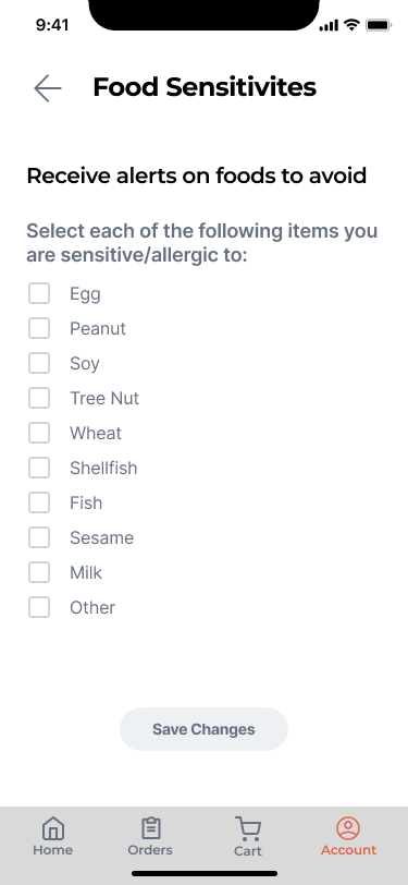
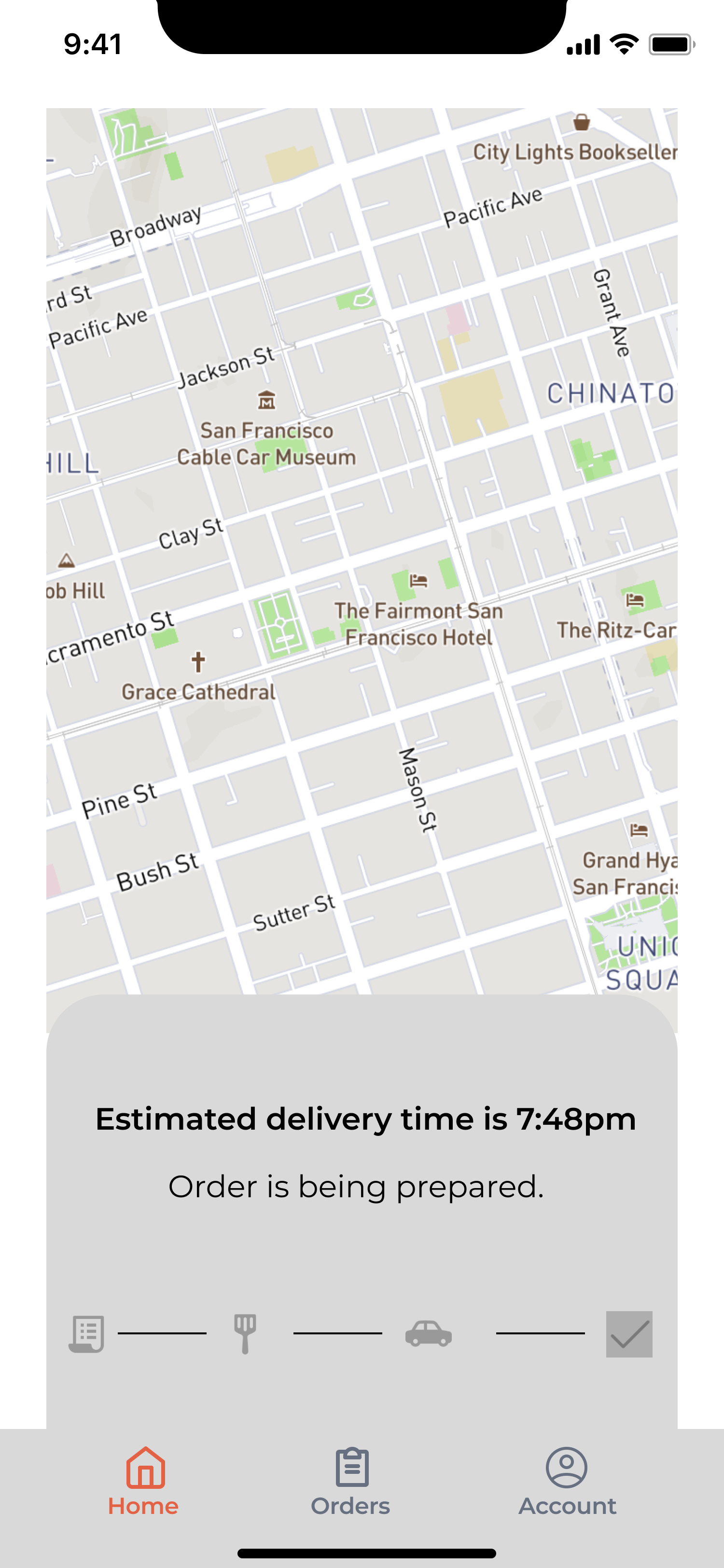
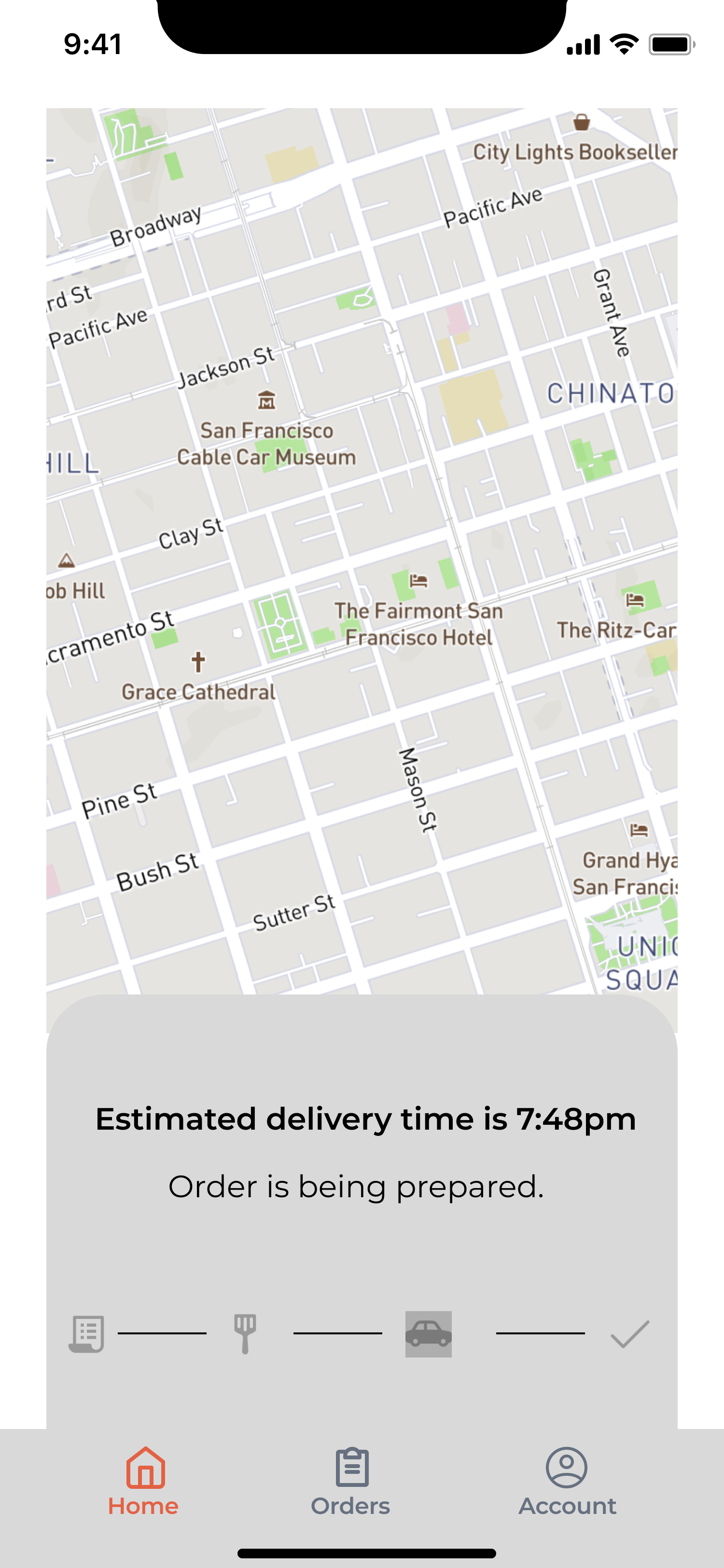
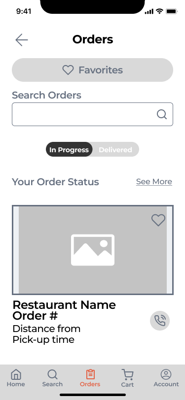
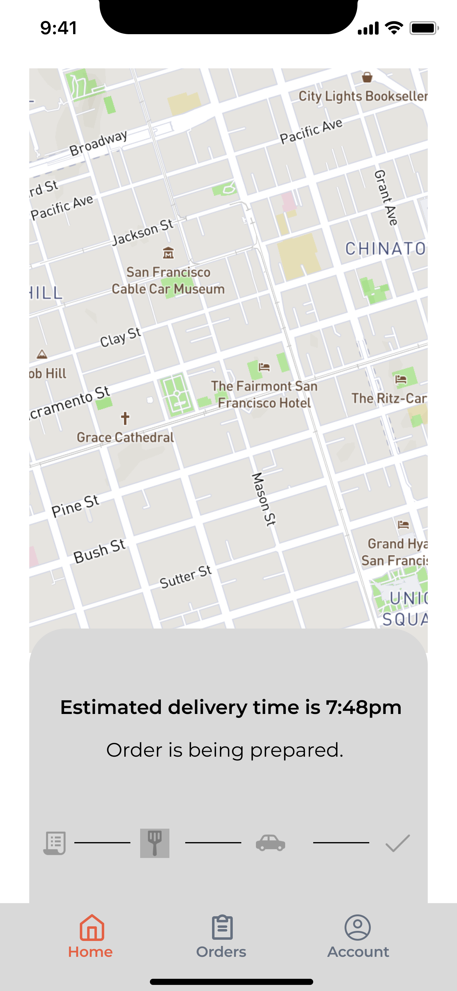
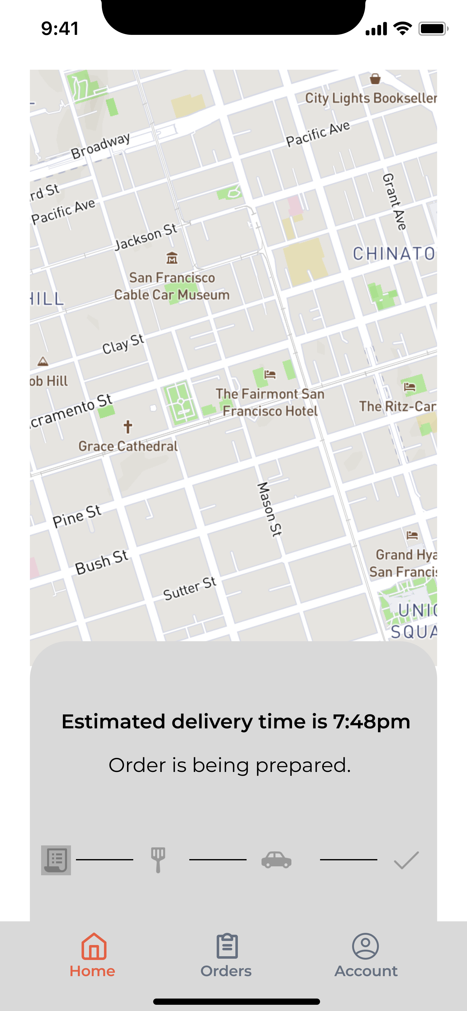
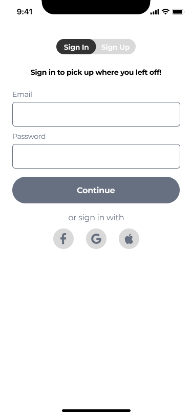
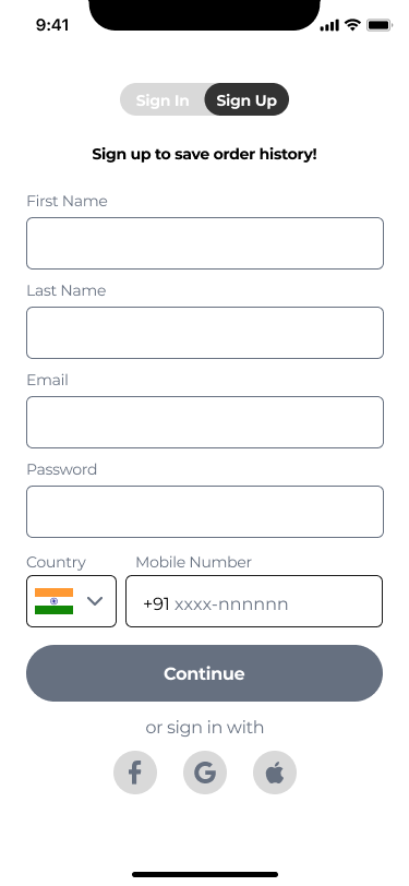
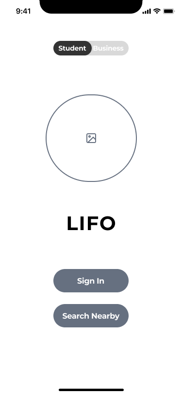
A seamless onboarding system to retain clients past profile creation
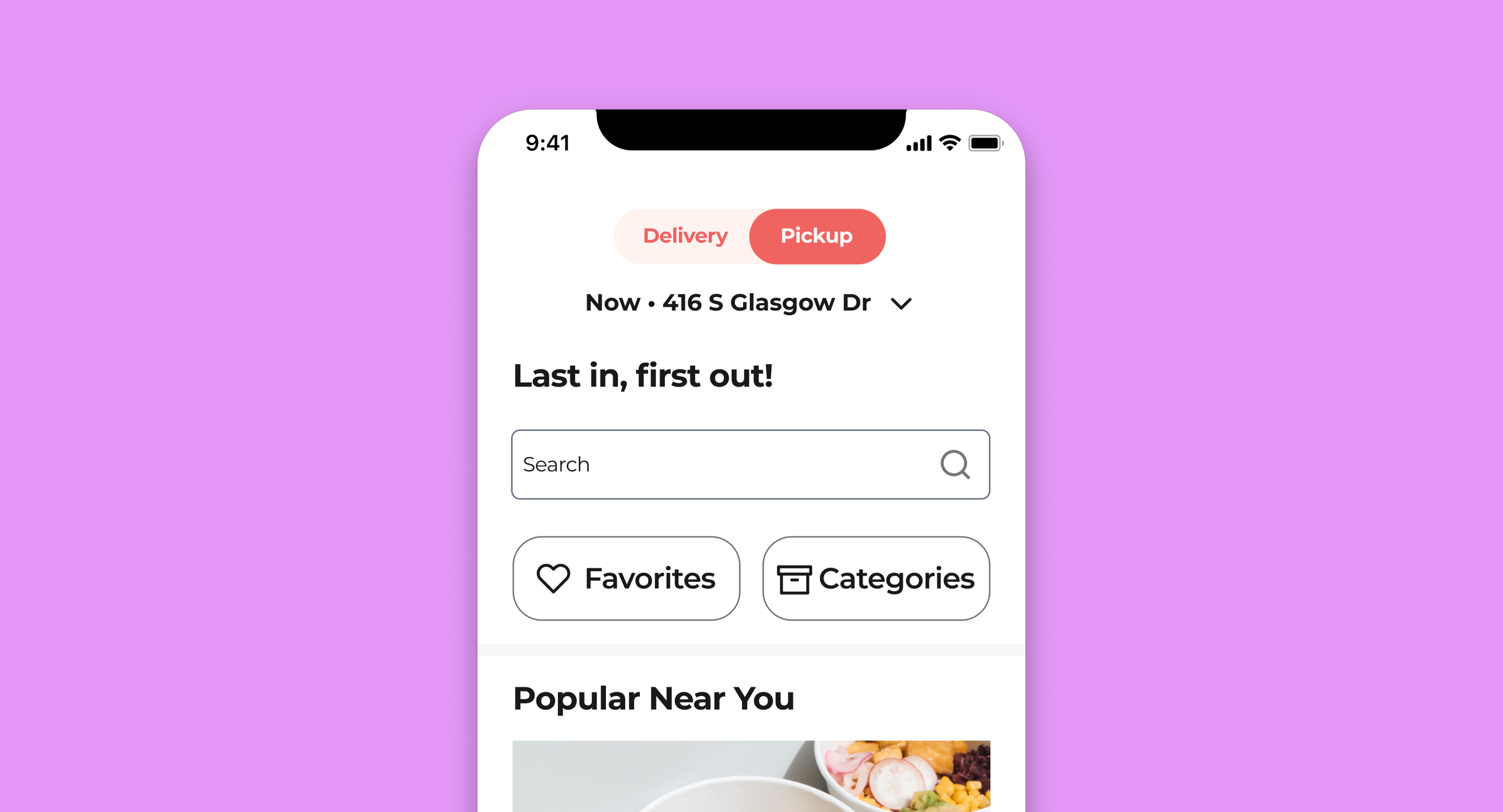
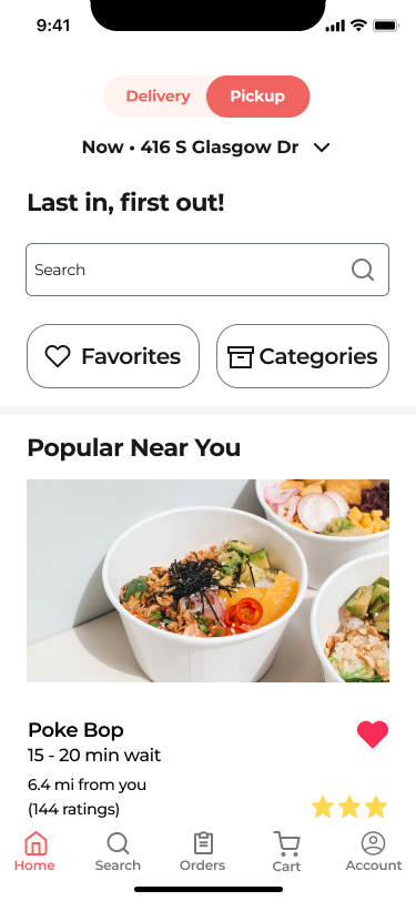
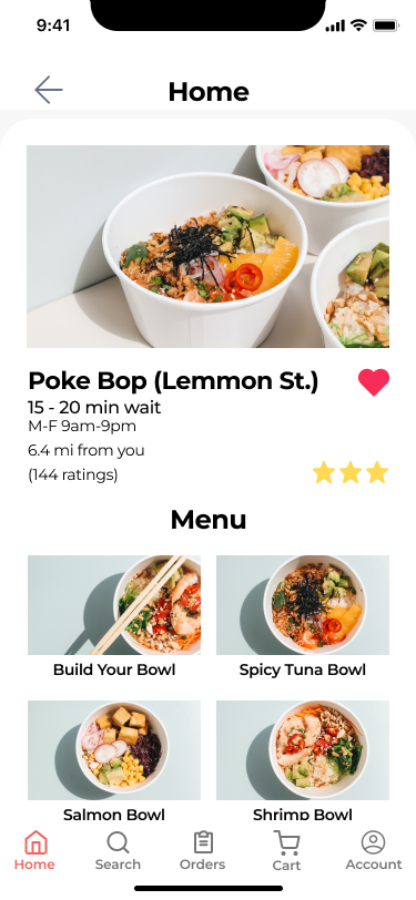
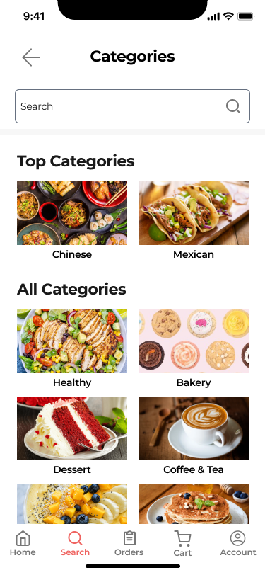
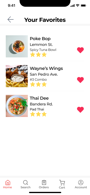
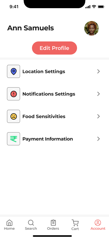
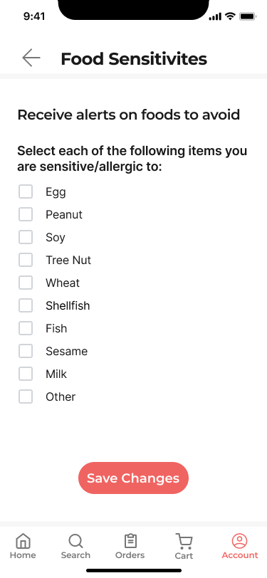
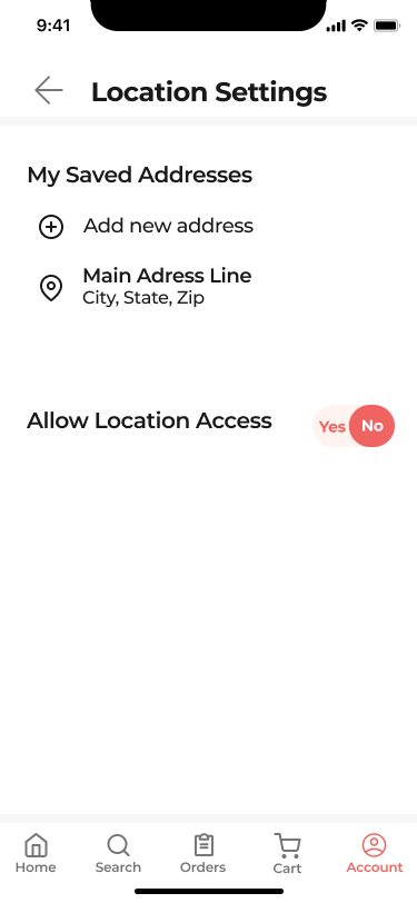
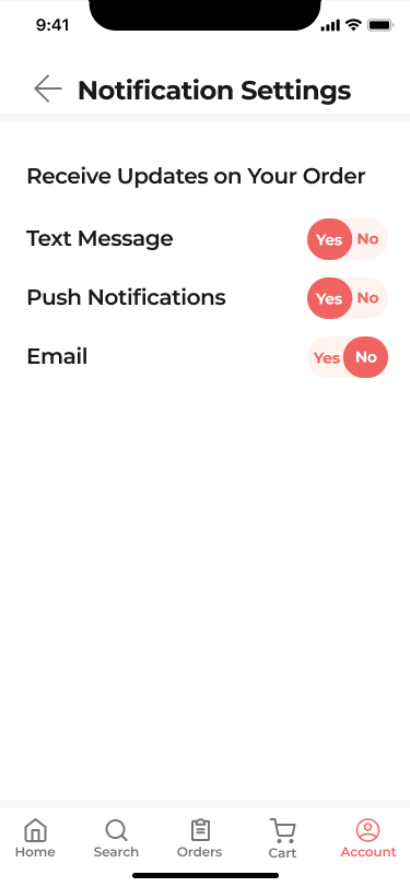
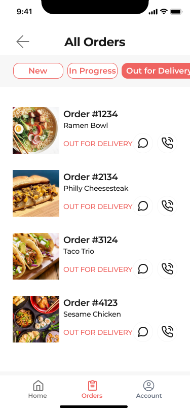
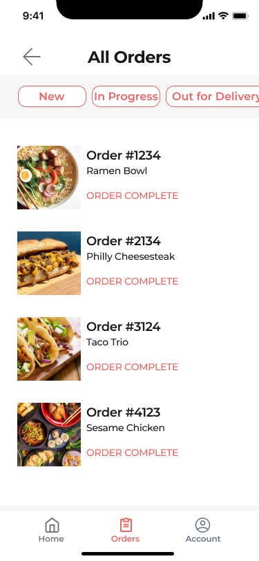
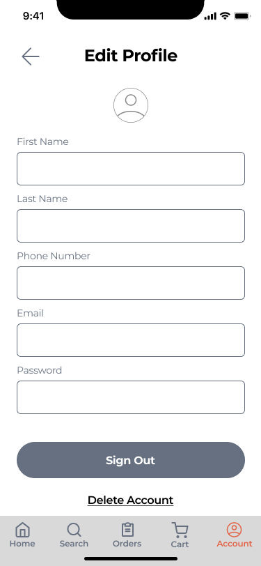
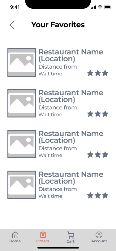
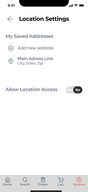
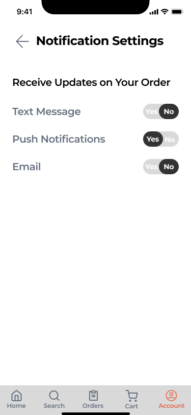
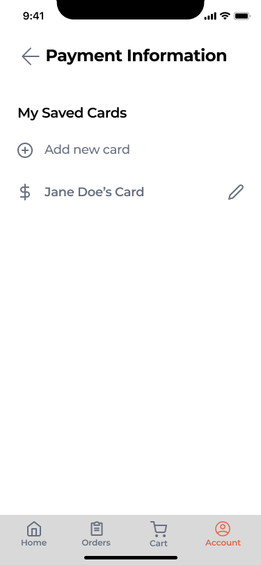
Prioritizing nearby vendors, categorizing specific food types, options to re-order regularly purchased items and a profile page to adjust personal settings at any moment.
Discovery & Research
Kick-Off Meeting
My team and I received a client brief to better understand the goals for the mobile app. From the brief, we learned that the client's audience are college students (ages 18-25, low income, impatient) and Indian local shop owners (ages 30-60, low income, technologically illiterate). These were important factors to consider, as the client defined success as improving the onboarding experience, increasing app usability and retention, and creating a more enjoyable overall user experience.
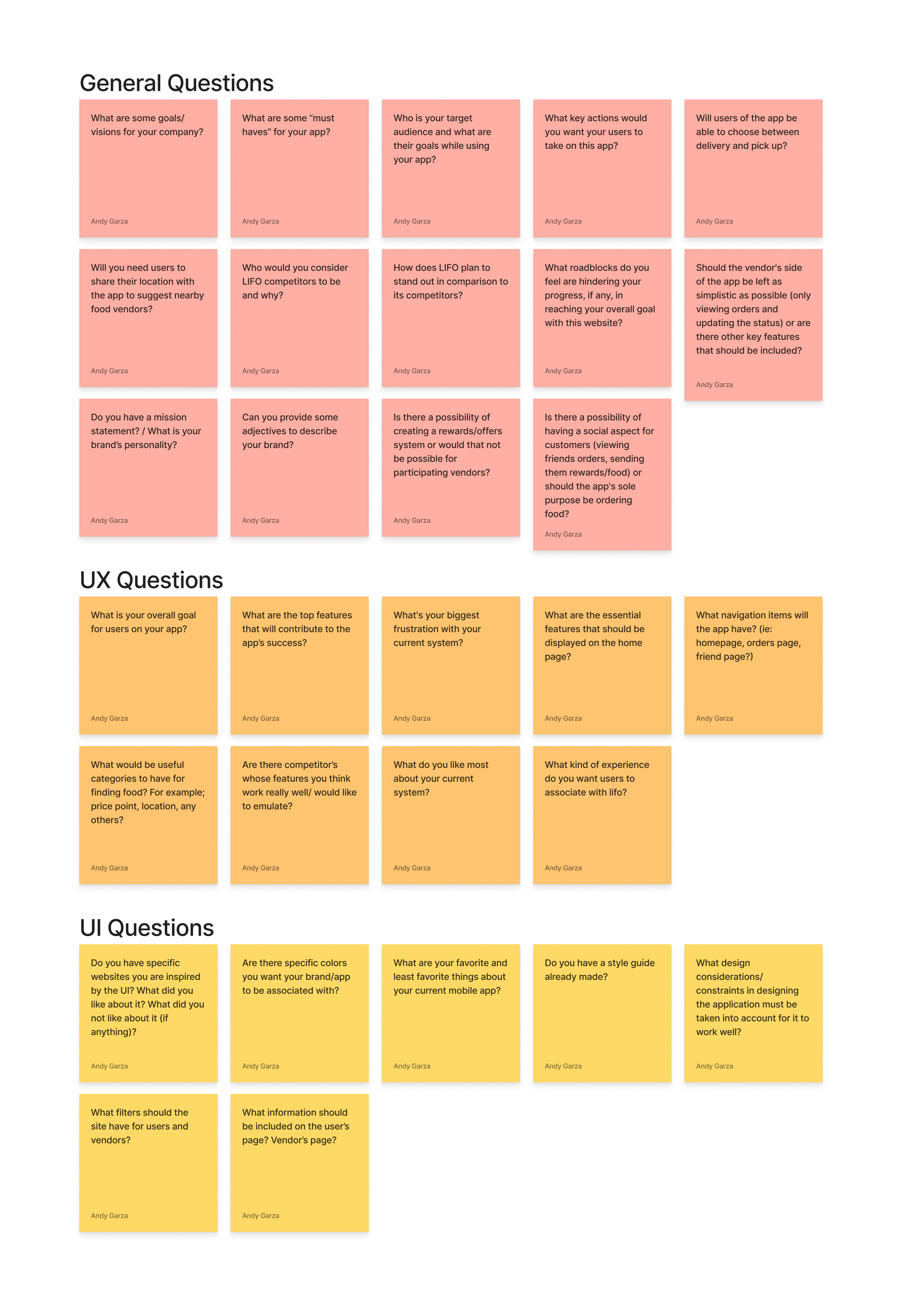
Client Questions
Following the client brief, my team and I still had a few questions. We received clarity on a few main points:
The client did not have a set style guide and wanted to explore a bright color scheme
The client wanted the app to better organized
The client was interested in exploring areas that would increase engagement and retention
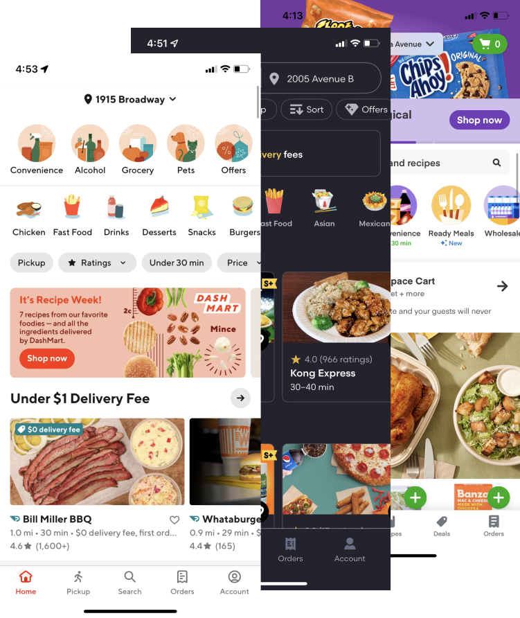
Competitive Analysis
To better understand the market the client was breaking into, I searched through and downloaded numerous food service mobile apps. I identified common themes and evaluated areas of opportunity to implement in LIFO.
I found that most food service mobile apps:
Feature nearby restaurants on the homepage for convenience
Categorize items for easier searching
Offer account creation to view order history
Stick to a strict color scheme to develop brand identity
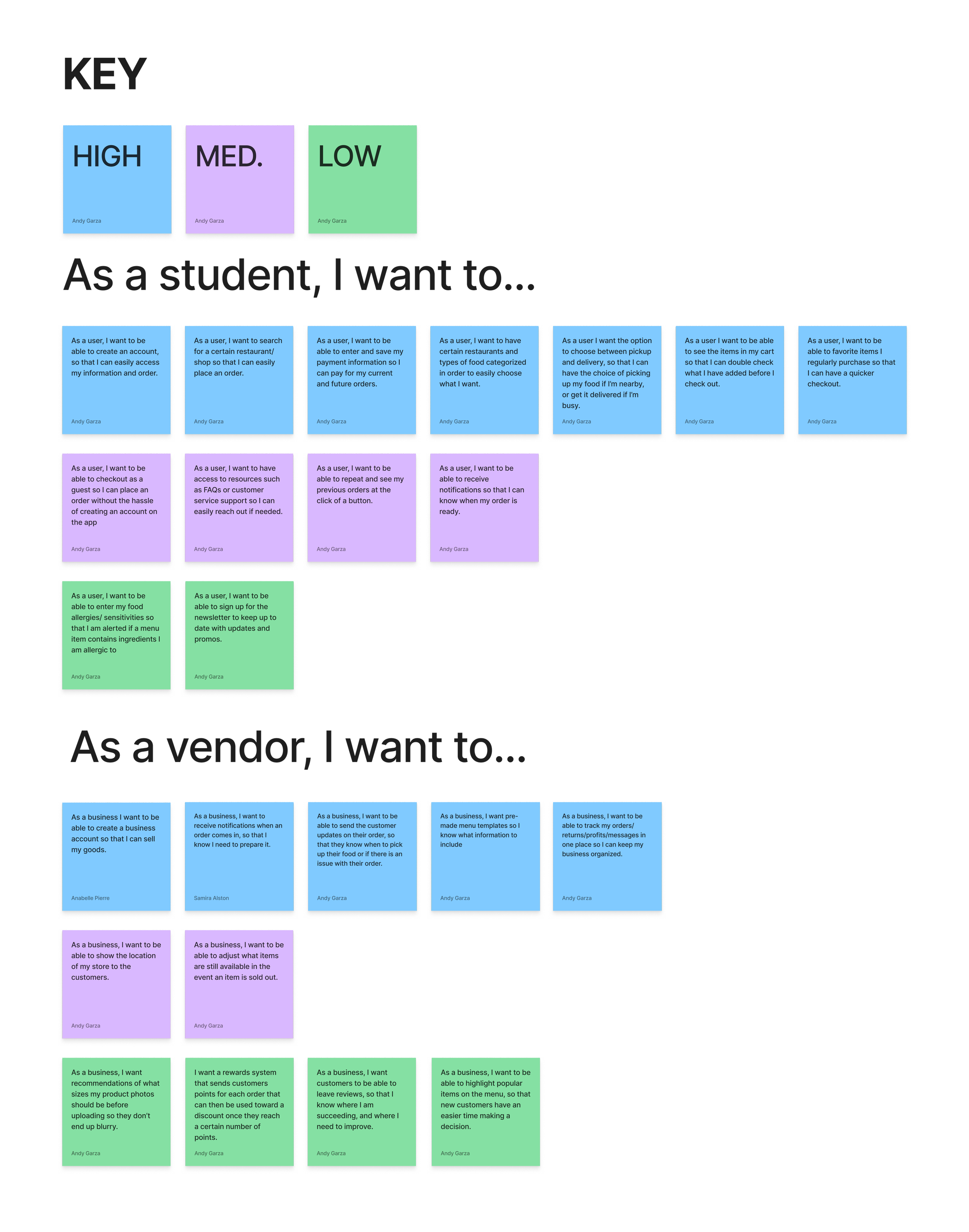
User Stories
After completing the competitive analysis, we came up with several user stories to help us begin to ideate features that would improve the app's usability. To narrow our focus, we organized our user stories from high to low priority.
Ideation
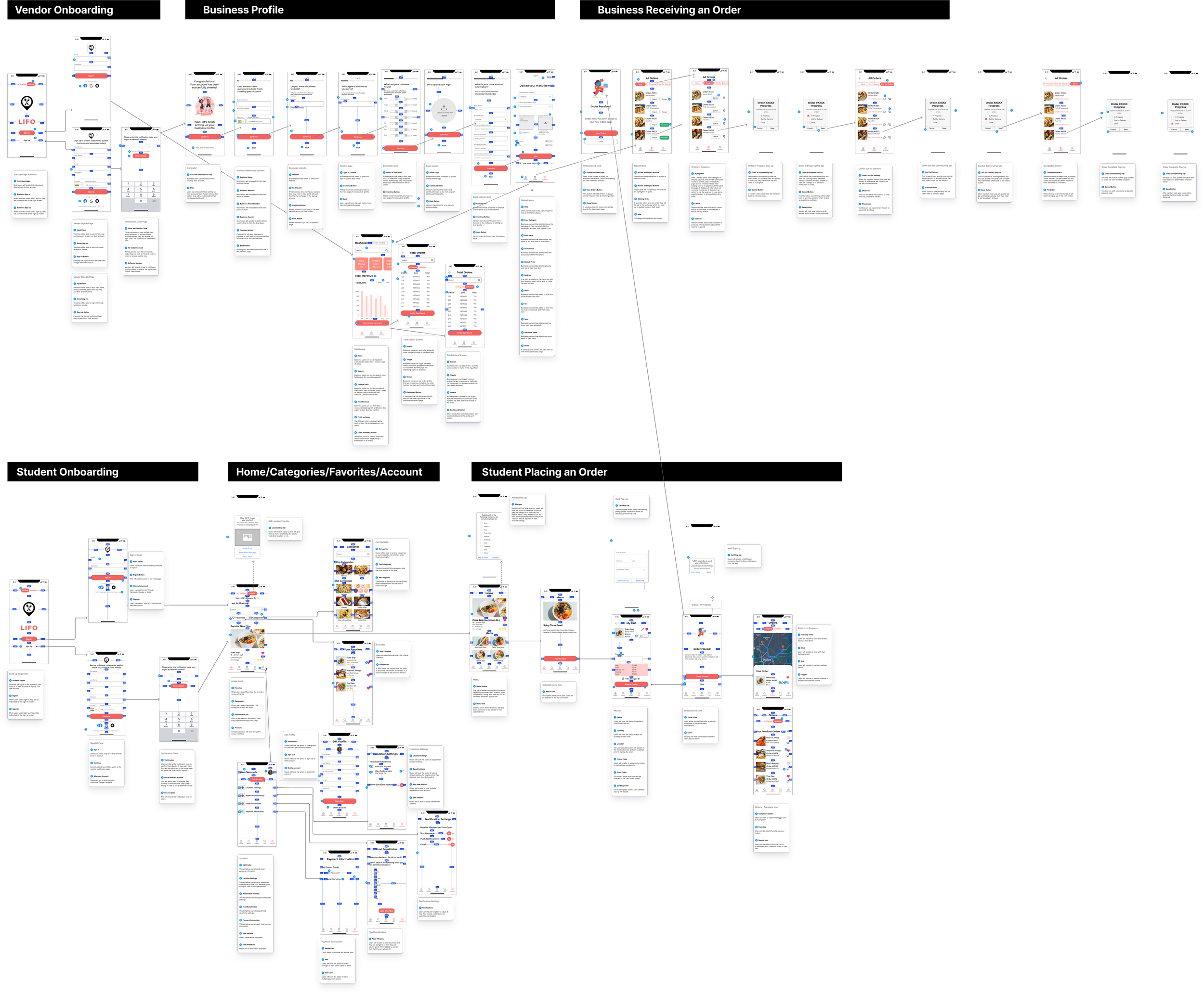
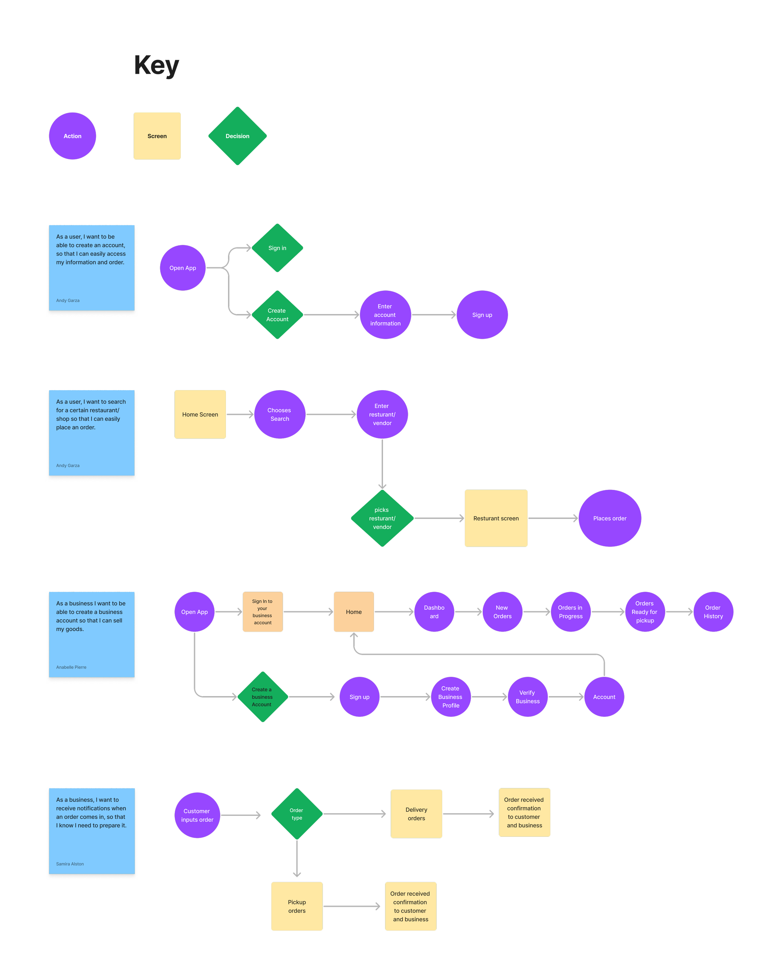
User Flows
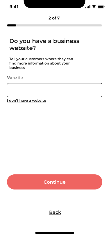
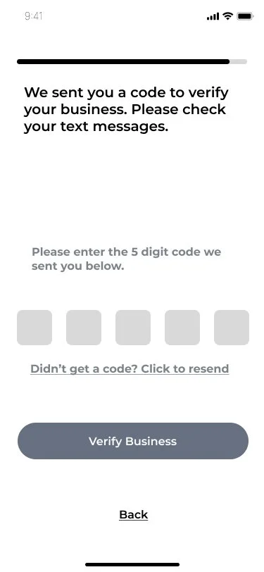
My team and I identified 4 user flows that were critical to the platform's functionality. I worked on the student account, and my other two team members worked on the vendor account. Each of us were responsible for wireframing and designing our designated user flows to ensure efficiency. We maintained communication throughout the design process to ensure a cohesive design.
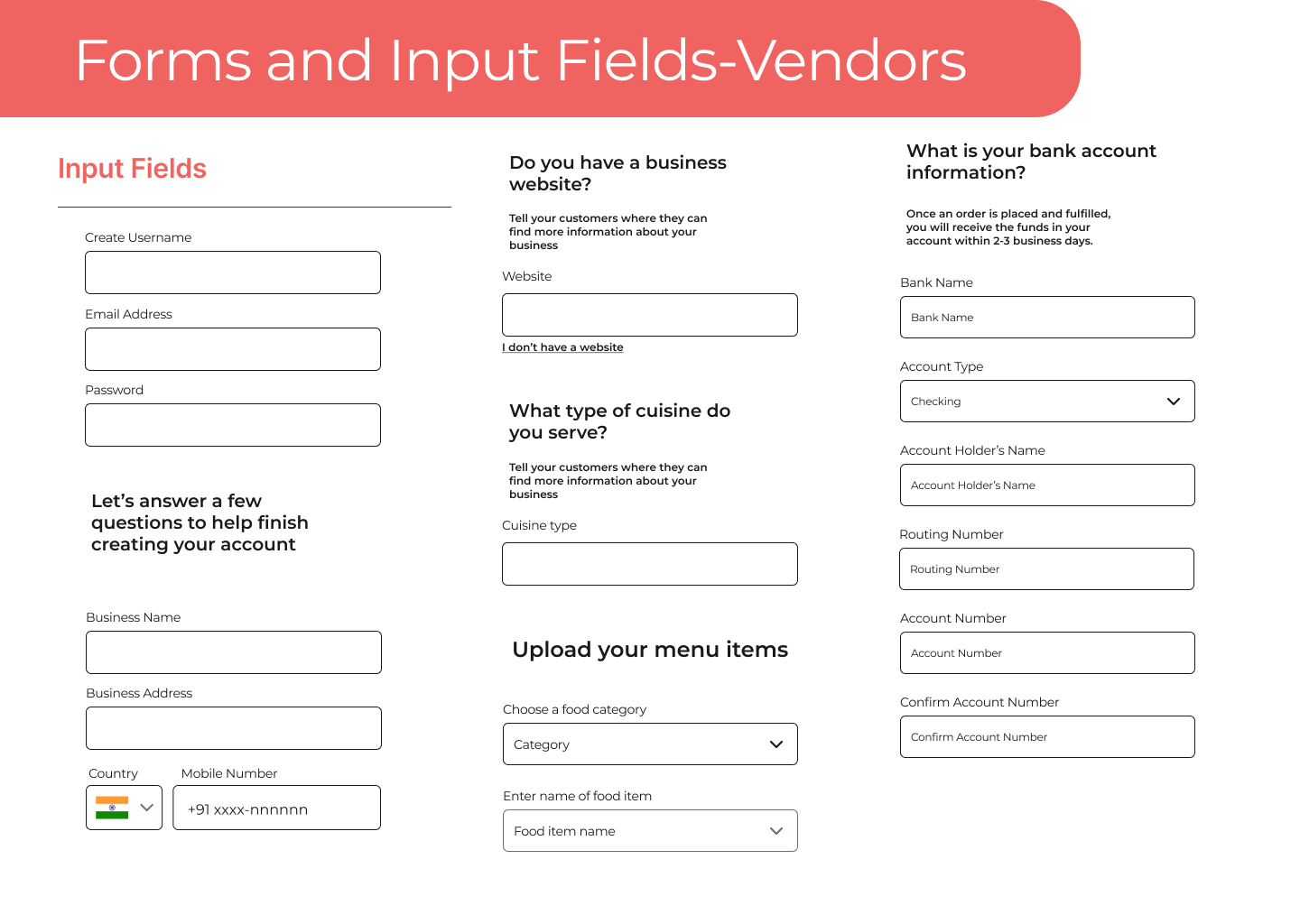
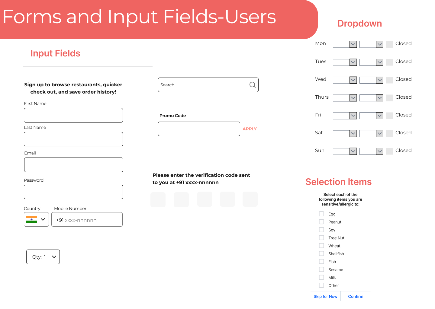
Wireframes
My team and I created medium fidelity wireframes to communicate our ideas to the client prior to proceeding with high fidelity mockups. I worked on the student account and my two other team members worked on the vendor account. We took inspiration from key competitors to better grasp how to make the platform intuitive and engaging.
Design
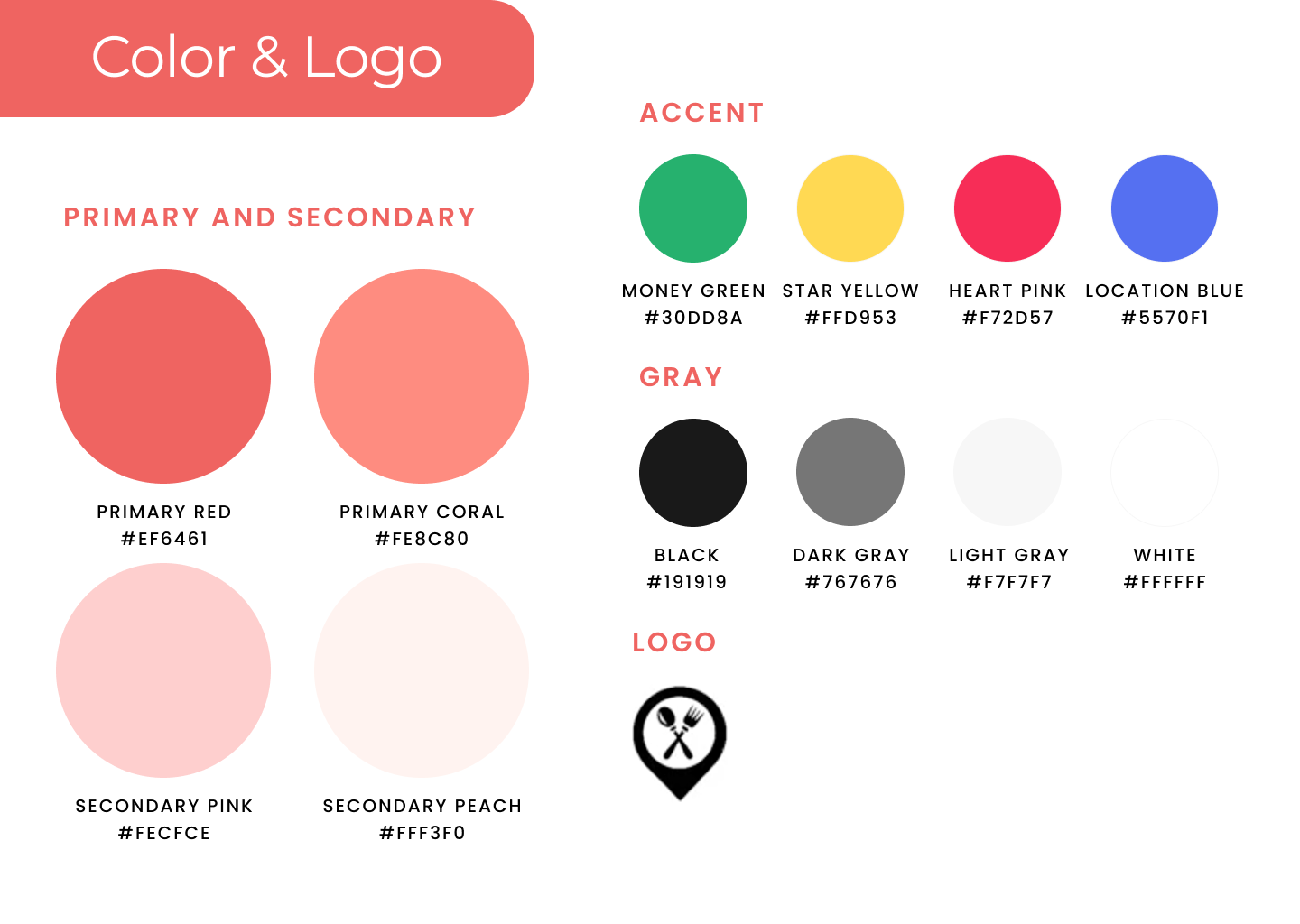
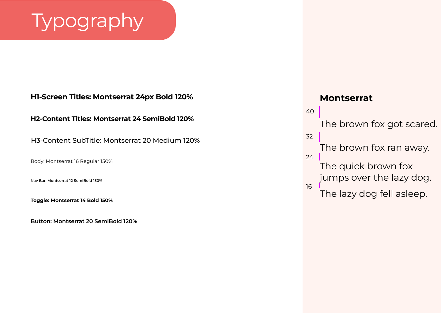
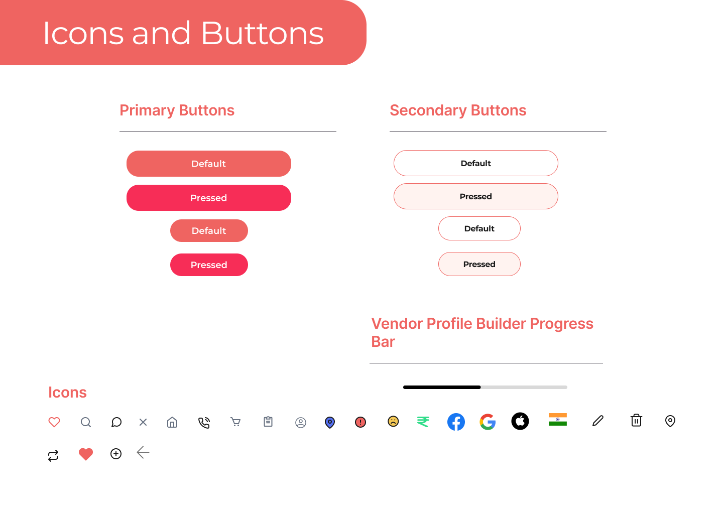
Style Guide
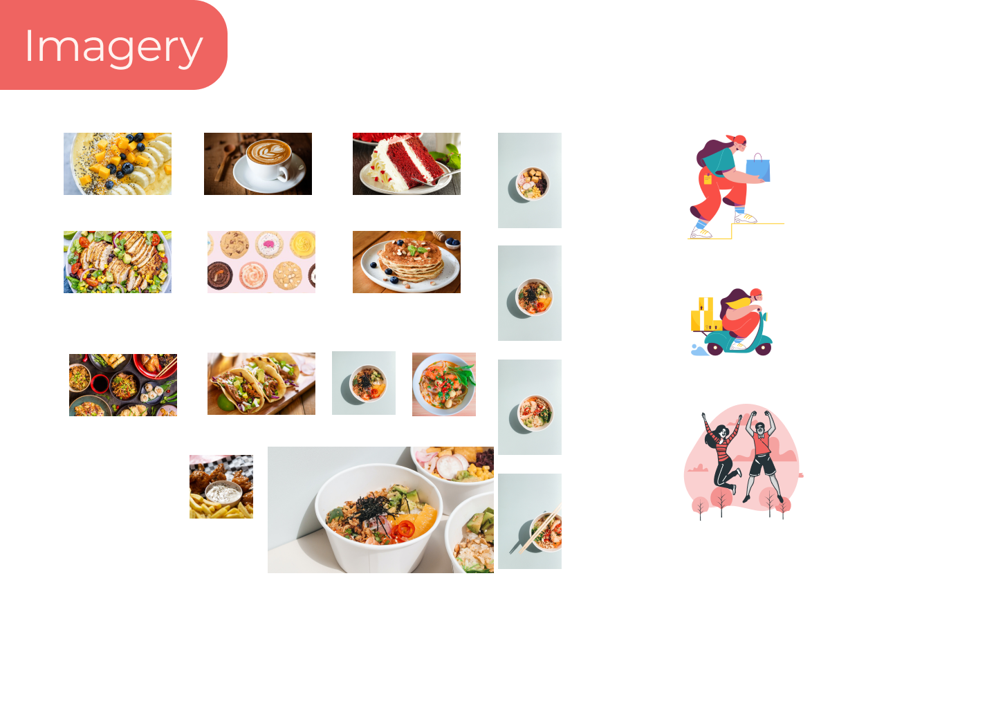
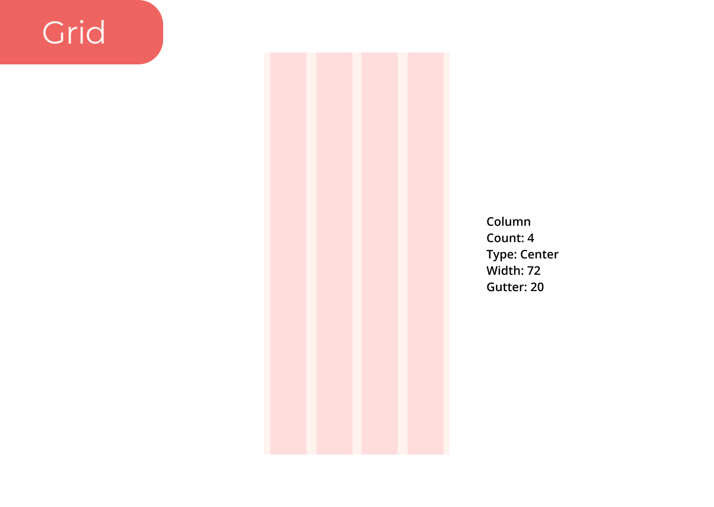
The style guide helped the team stay consistent with the use of colors, font sizes, UI elements, and grid system. The style guide served as the book of truth and was constantly referenced as we went through multiple iterations of the high-fidelity screens.
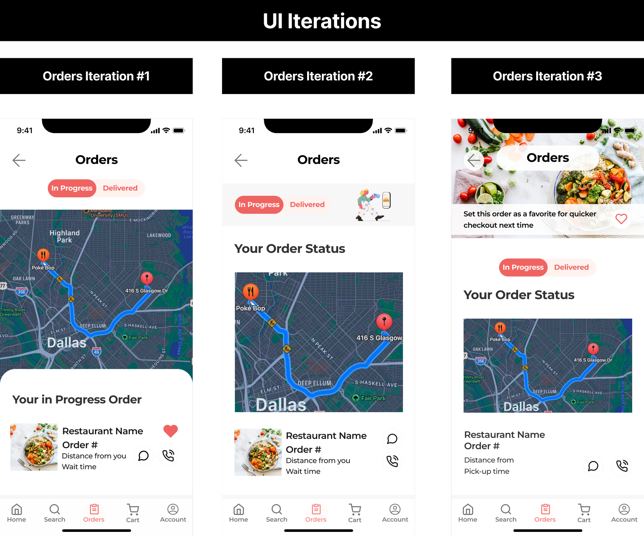
UI Iterations
The client shared with us that she really loves the interface of Snack Pass. I took inspiration from Snack Pass and Door Dash to create various iterations that were easy to navigate. I wanted LIFO to be user centered and stand out compared to other platforms.
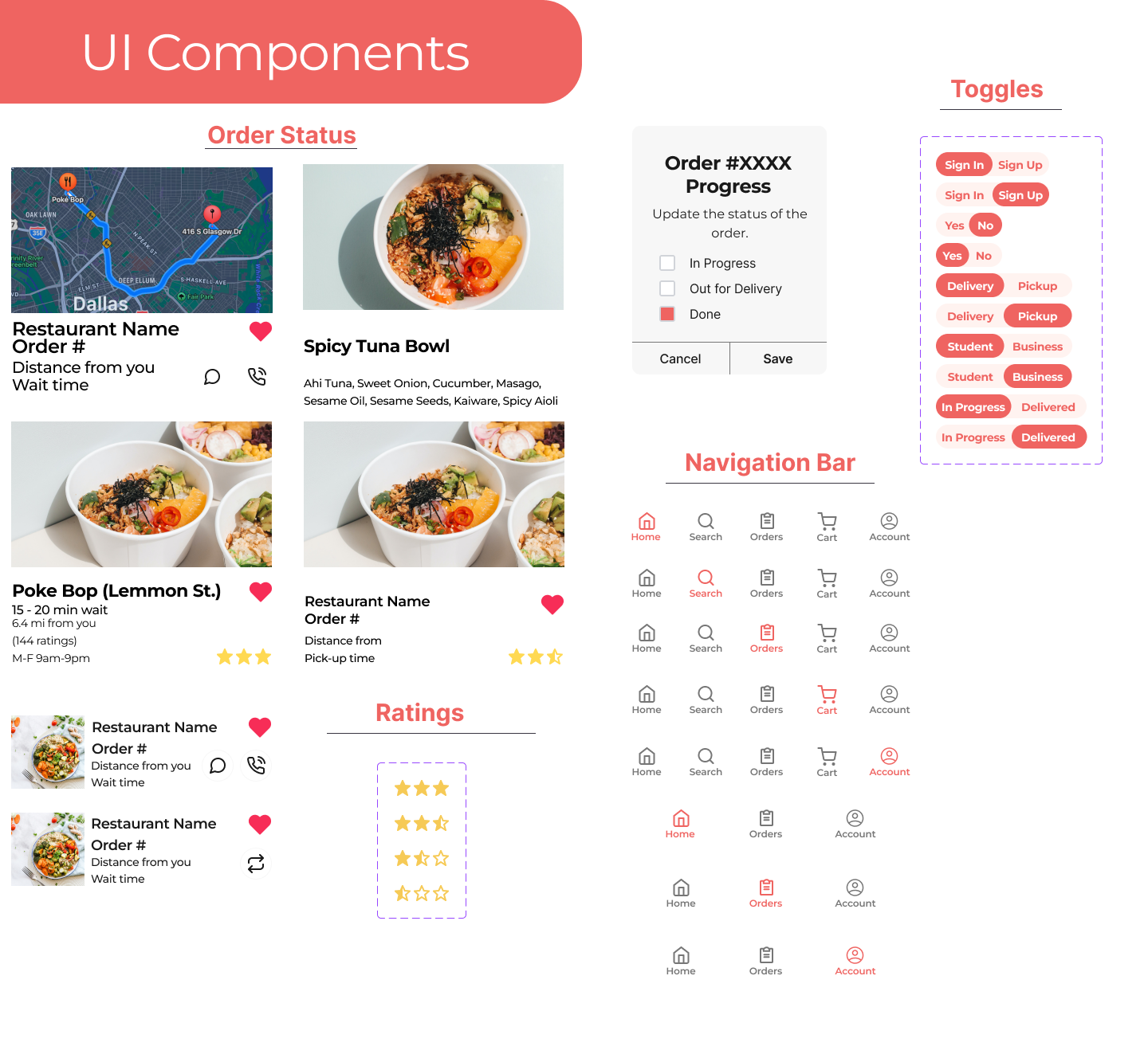
High Fidelity
After sharing UI iterations with the team, we determined iteration #1 would work best for LIFO's usability. I distributed this style throughout the student account high-fidelity screens. I also created components to ensure there was consistency throughout the screens for items used between both the student and vendor accounts.
Hand Off & Reflection
Developer Hand Off
Once the final HiFis were approved, we began to annotate all of our work so that the developer clearly understood how the flow works and on each screen, we provided the padding measurements of each component. The style guide was also shared with the client to maximize the developer hand-off process.
Reflection
Working on a platform that had two user types emphasized to me the importance of brand identity, cohesive design, and communication. My team and I constantly collaborated to ensure our screens worked harmoniously. This project forced me to consider the app from two perspectives; the vendor and the consumer.